本文主要是介绍《Python数据分析技术栈》第03章 03 可视化各级数据(Visualizing various levels of data),希望对大家解决编程问题提供一定的参考价值,需要的开发者们随着小编来一起学习吧!
03 可视化各级数据(Visualizing various levels of data)
《Python数据分析技术栈》第03章 03 可视化各级数据(Visualizing various levels of data)
Whenever you need to analyze data, first understand if the data is structured or unstructured. If the data is unstructured, convert it to a structured form with rows and columns, which makes it easier for further analysis using libraries like Pandas. Once you have data in this format, categorize each of the features or columns into the four levels of data and perform your analysis accordingly.
无论何时需要分析数据,首先要了解数据是结构化的还是非结构化的。如果是非结构化数据,则应将其转换为具有行和列的结构化形式,这样更便于使用 Pandas 等库进行进一步分析。有了这种格式的数据后,将每个特征或列归类到数据的四个层次,然后进行相应的分析。
Note that in this chapter, we only aim to understand how to categorize the variables in a dataset and identify the operations and plots that would apply for each category. The actual code that needs to be written to visualize the data is explained in Chapter 7.
请注意,在本章中,我们只想了解如何对数据集中的变量进行分类,并确定适用于每个类别的操作和绘图。为实现数据可视化而需要编写的实际代码将在第 7 章中讲解。
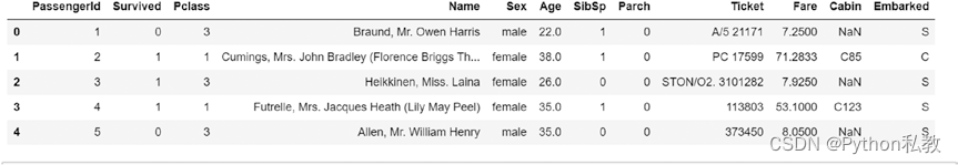
We look at how to classify the features and perform various operations using the famous Titanic dataset. The dataset can be imported from here: https://github.com/DataRepo2019/Data-files/blob/master/titanic.csv
我们将使用著名的泰坦尼克号数据集来研究如何对特征进行分类并执行各种操作。数据集可从此处导入: https://github.com/DataRepo2019/Data-files/blob/master/titanic.csv
Background information about the dataset: The RMS Titanic, a British passenger ship, sank on its maiden voyage from Southampton to New York on 15th April 1912, after it collided with an iceberg. Out of the 2,224 passengers, 1,500 died, making this event a tragedy of epic proportions. This dataset describes the survival status of the passengers and other details about them, including their class, name, age, and the number of relatives.
数据集背景信息: 1912 年 4 月 15 日,英国皇家泰坦尼克号客轮在从南安普顿到纽约的处女航中与冰山相撞沉没。在 2224 名乘客中,有 1500 人丧生,使这一事件成为史诗般的悲剧。该数据集描述了乘客的生还状况及其他详细信息,包括他们的等级、姓名、年龄和亲属人数。
The features in this dataset, classified according to the data level, are captured in Table 4-1.
表 4-1 根据数据级别对数据集中的特征进行了分类。
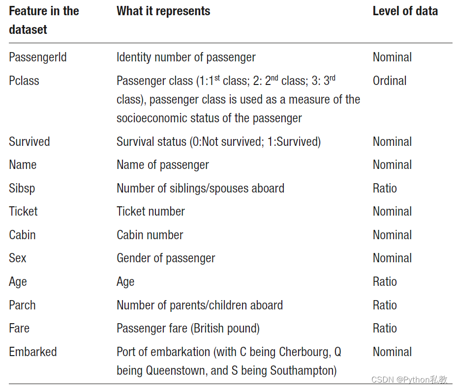
Let us now understand the rationale behind the classification of the features in this dataset.
现在,让我们来了解一下对该数据集中的特征进行分类的原理。
Nominal variables: Variables like “PassengerId”, “Survived”, “Name”, “Sex”, “Cabin”, and “Embarked” do not have any intrinsic ordering of their values. Note that some of these variables have numeric values, but these values are finite in number. We cannot perform an arithmetic operation on these values like addition, subtraction, multiplication, or division. One operation that is common with nominal variables is counting. A commonly used method in Pandas, value_counts (discussed in the next chapter), is used to determine the number of values per each unique category of the nominal variable. We can also find the mode (the most frequently occurring value). The bar graph is frequently used to visualize nominal data (pie charts can also be used), as shown in Figure 4-5.
名义变量: PassengerId"、“Survived”、“Name”、“Sex”、"Cabin "和 "Embarked "等变量的值没有内在顺序。需要注意的是,其中一些变量有数值,但这些数值的数量是有限的。我们无法对这些数值进行加、减、乘或除等算术运算。对名义变量常用的一种操作是计数。Pandas 中的一个常用方法 value_counts(将在下一章中讨论)用于确定标称变量中每个独特类别的值的数量。我们还可以找到模式(出现频率最高的值)。如图 4-5 所示,条形图常用于将名义数据可视化(也可以使用饼图)。
Ordinal variables: “Pclass” (or Passenger Class) is an ordinal variable since its values follow an order. A value of 1 is equivalent to first class, 2 is equivalent to the second class, and so on. These class values are indicative of socioeconomic status.
顺序变量: “Pclass”(或乘客等级)是一个顺序变量,因为它的值是有顺序的。数值 1 代表一等舱,2 代表二等舱,以此类推。这些等级值表明了社会经济地位。
We can find out the median value and percentiles. We can also count the number of values in each category, calculate the mode, and use plots like bar graphs and pie charts, just as we did for nominal variables.
我们可以找出中位值和百分位数。我们还可以计算每个类别中的数值个数、计算模式,并使用条形图和饼图等图表,就像我们对名义变量所做的那样。
In Figure 4-6, we have used a pie chart for the ordinal variable “Pclass”
在图 4-6 中,我们使用饼图来表示序数变量 “Pclass”。
Ratio Data: The “Age” and “Fare” variables are examples of ratio data, with the value zero as a reference point. With this type of data, we can perform a wide range of mathematical operations. For example, we can add all the fares and divide it by the total number of passengers to find the mean. We can also find out the standard deviation. A histogram, as shown in Figure 4-7, can be used to visualize this kind of continuous data to understand the distribution.
比率数据: 年龄 "和 "票价 "变量是比率数据的例子,以零值为参考点。利用这类数据,我们可以进行多种数学运算。例如,我们可以将所有票价相加,然后除以乘客总数,得出平均值。我们还可以求出标准差。直方图(如图 4-7 所示)可用于直观显示这类连续数据,以了解其分布情况。
In the preceding plots, we looked at the graphs for plotting individual categorical or continuous variables. In the following section, we understand which graphs to use when we have more than one variable or a combination of variables belong to different scales or levels.
在前面的绘图中,我们了解了用于绘制单个分类变量或连续变量的图形。在下一节中,我们将了解当有多个变量或变量组合属于不同尺度或级别时,应该使用哪种图形。
绘制混合数据(Plotting mixed data)
In this section, we’ll consider three scenarios, each of which has two variables that may or may not belong to the same level and discuss which plot to use for each scenario (using the same Titanic dataset).
在本节中,我们将考虑三种情况,每种情况都有两个变量,这两个变量可能属于也可能不 属于同一级别,并讨论每种情况下应使用哪种曲线图(使用相同的泰坦尼克数据集)。
One categorical and one continuous variable: A box plot shows the distribution, symmetry, and outliers for a continuous variable. A box plot can also show the continuous variable against a categorical variable. In Figure 4-8, the distribution of ‘Age’ (a ratio variable) for each value of the nominal variable – ‘Survived’ (0 is the value for passengers who did not survive and 1 is the value for those who did).
一个分类变量和一个连续变量: 方框图显示连续变量的分布、对称性和异常值。方框图还可以显示连续变量与分类变量的对比情况。在图 4-8 中,“年龄”(比率变量)在名义变量 “存活”(0 代表未存活乘客的值,1 代表存活乘客的值)的每个值上的分布情况。
Both continuous variables: Scatter plots are used to depict the relationship between two continuous variables. In Figure 4-9, we plot two ratio variables, ‘Age’ and ‘Fare’, on the x and y axes to produce a scatter plot.
都是连续变量: 散点图用于描述两个连续变量之间的关系。在图 4-9 中,我们将两个比率变量 "年龄 "和 "票价 "分别绘制在 x 轴和 y 轴上,从而得到散点图。
Both categorical variables: Using a clustered bar chart (Figure 4-10), you can combine two categorical variables with the bars depicted side by side to represent every combination of values for the two variables.
两个分类变量: 使用聚类条形图(图 4-10),可以将两个分类变量结合在一起,并列的条形图代表了这两个变量的所有数值组合。
We can also use a stacked bar chart to plot two categorical variables. Consider the following stacked bar chart, shown in Figure 4-11, plotting two categorical variables –“Pclass” and “Survived”
我们还可以使用堆叠条形图来绘制两个分类变量。下面是图 4-11 所示的堆叠条形图,其中绘制了两个分类变量–"Pclass "和 “Survived”。
In summary, you can use a scatter plot for two continuous variables, a stacked or clustered bar chart for two categorical variables, and a box plot when you want to display a continuous variable across different values of a categorical variable.
总之,您可以对两个连续变量使用散点图,对两个分类变量使用堆叠条形图或聚类条形图,当您想在分类变量的不同值之间显示连续变量时使用盒状图。
这篇关于《Python数据分析技术栈》第03章 03 可视化各级数据(Visualizing various levels of data)的文章就介绍到这儿,希望我们推荐的文章对编程师们有所帮助!