本文主要是介绍用HTML5实现灯笼效果,希望对大家解决编程问题提供一定的参考价值,需要的开发者们随着小编来一起学习吧!
本文介绍了两种实现效果:一种使用画布(canvas)标签/元素,另一种不用画布(canvas)标签/元素主要使用CSS实现。
使用画布(canvas)标签/元素实现,下面,在画布上,用JavaScript画两个红灯笼,并且红灯笼左右来回移动的源码:
<!DOCTYPE html>
<html>
<head><title>红灯笼</title><style>canvas {border: 1px solid black;background-color: blue; /*设置画布的背景色为蓝色*/}</style>
</head>
<body>
<!-- 设置画布宽高是500*300,单位是 px。 --><canvas id="canvas" width="500" height="300"></canvas><script>var canvas = document.getElementById('canvas');var context = canvas.getContext('2d');var angle1 = 0;var angle2 = 0;  // 使第二个灯笼的初始角度与第一个灯笼不同function drawLantern(x, y, radius, angle) {x += Math.sin(angle) * 20;// Draw the suspension linecontext.beginPath();context.moveTo(x, y - radius / 4);context.lineTo(x, 0);context.stroke();// Draw the top context.beginPath();context.arc(x, y, radius / 4, 0, Math.PI * 2);context.fillStyle = 'gold';context.fill();context.stroke();// Draw the main bodycontext.beginPath();context.arc(x, y, radius, 0, Math.PI * 2);context.fillStyle = 'red';context.fill();context.stroke();// Draw the bottomcontext.beginPath();context.arc(x, y + radius / 2, radius / 4, 0, Math.PI * 2);context.fillStyle = 'gold';context.fill();context.stroke();// Draw the tasselcontext.beginPath();context.moveTo(x, y + radius / 2);context.lineTo(x, y + radius * 1.2);context.moveTo(x - radius / 6, y + radius / 2);context.lineTo(x - radius / 6, y + radius * 1.2);context.moveTo(x + radius / 6, y + radius / 2);context.lineTo(x + radius / 6, y + radius * 1.2);context.stroke();}function animate() {context.clearRect(0, 0, canvas.width, canvas.height);context.fillStyle = 'blue';context.fillRect(0, 0, canvas.width, canvas.height);drawLantern(200, 200, 50, angle1);drawLantern(300, 200, 50, angle2);angle1 += 0.05;angle2 += 0.05;requestAnimationFrame(animate);}animate();</script>
</body>
</html>
运行效果如下:

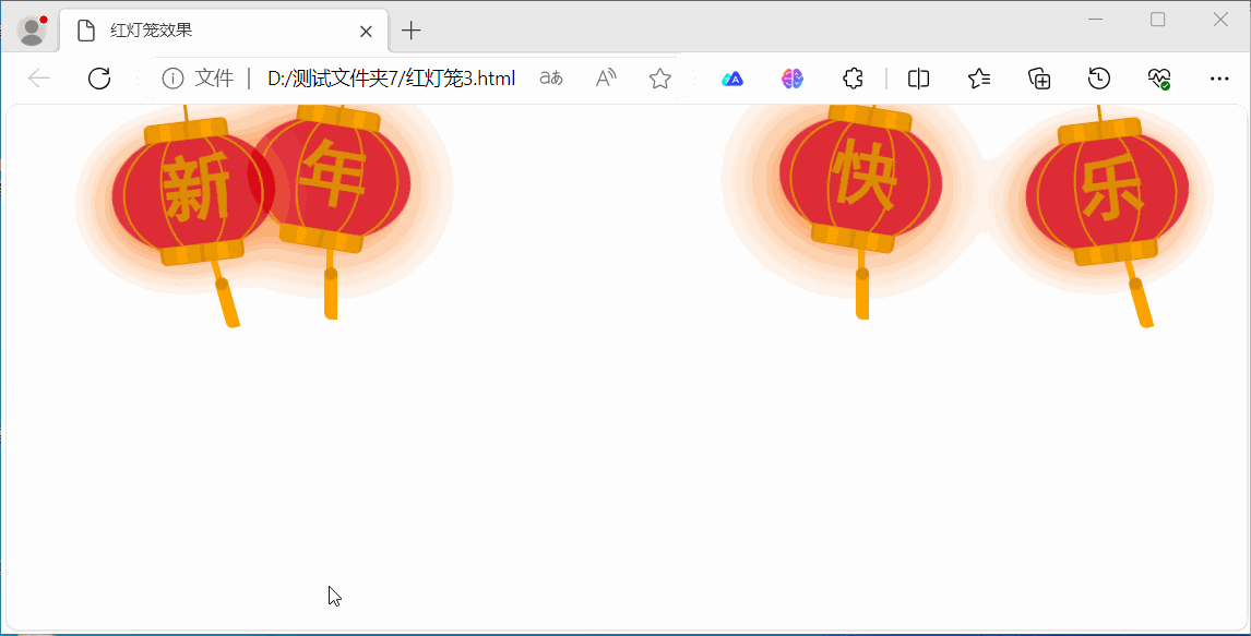
下面是另一种实现主要使用CSS实现,源码如下:
<!DOCTYPE html>
<html lang="en">
<head><meta charset="UTF-8"><title>红灯笼效果</title><!-- 灯笼代码↓,放在 head标签内-->
<div class="deng-box2"><div class="deng"><div class="xian"></div><div class="deng-a"><div class="deng-b"><div class="deng-t">年</div></div></div><div class="shui shui-a"><div class="shui-c"></div><div class="shui-b"></div></div></div>
</div>
<div class="deng-box3"><div class="deng"><div class="xian"></div><div class="deng-a"><div class="deng-b"><div class="deng-t">新</div></div></div><div class="shui shui-a"><div class="shui-c"></div><div class="shui-b"></div></div></div>
</div>
<div class="deng-box1"><div class="deng"><div class="xian"></div><div class="deng-a"><div class="deng-b"><div class="deng-t">乐</div></div></div><div class="shui shui-a"><div class="shui-c"></div><div class="shui-b"></div></div></div>
</div>
<div class="deng-box"><div class="deng"><div class="xian"></div><div class="deng-a"><div class="deng-b"><div class="deng-t">快</div></div></div><div class="shui shui-a"><div class="shui-c"></div><div class="shui-b"></div></div></div>
</div>
<style type="text/css">.deng-box {position: fixed;top: -40px;right: 150px;z-index: 9999;pointer-events: none;}.deng-box1 {position: fixed;top: -30px;right: 10px;z-index: 9999;pointer-events: none}.deng-box2 {position: fixed;top: -40px;left: 150px;z-index: 9999;pointer-events: none}.deng-box3 {position: fixed;top: -30px;left: 10px;z-index: 9999;pointer-events: none}.deng-box1 .deng,.deng-box3 .deng {position: relative;width: 120px;height: 90px;margin: 50px;background: #d8000f;background: rgba(216, 0, 15, .8);border-radius: 50% 50%;-webkit-transform-origin: 50% -100px;-webkit-animation: swing 5s infinite ease-in-out;box-shadow: -5px 5px 30px 4px #fc903d}.deng {position: relative;width: 120px;height: 90px;margin: 50px;background: #d8000f;background: rgba(216, 0, 15, .8);border-radius: 50% 50%;-webkit-transform-origin: 50% -100px;-webkit-animation: swing 3s infinite ease-in-out;box-shadow: -5px 5px 50px 4px #fa6c00}.deng-a {width: 100px;height: 90px;background: #d8000f;background: rgba(216, 0, 15, .1);margin: 12px 8px 8px 8px;border-radius: 50% 50%;border: 2px solid #dc8f03}.deng-b {width: 45px;height: 90px;background: #d8000f;background: rgba(216, 0, 15, .1);margin: -4px 8px 8px 26px;border-radius: 50% 50%;border: 2px solid #dc8f03}.xian {position: absolute;top: -20px;left: 60px;width: 2px;height: 20px;background: #dc8f03}.shui-a {position: relative;width: 5px;height: 20px;margin: -5px 0 0 59px;-webkit-animation: swing 4s infinite ease-in-out;-webkit-transform-origin: 50% -45px;background: orange;border-radius: 0 0 5px 5px}.shui-b {position: absolute;top: 14px;left: -2px;width: 10px;height: 10px;background: #dc8f03;border-radius: 50%}.shui-c {position: absolute;top: 18px;left: -2px;width: 10px;height: 35px;background: orange;border-radius: 0 0 0 5px}.deng:before {position: absolute;top: -7px;left: 29px;height: 12px;width: 60px;content: " ";display: block;z-index: 999;border-radius: 5px 5px 0 0;border: solid 1px #dc8f03;background: orange;background: linear-gradient(to right, #dc8f03, orange, #dc8f03, orange, #dc8f03)}.deng:after {position: absolute;bottom: -7px;left: 10px;height: 12px;width: 60px;content: " ";display: block;margin-left: 20px;border-radius: 0 0 5px 5px;border: solid 1px #dc8f03;background: orange;background: linear-gradient(to right, #dc8f03, orange, #dc8f03, orange, #dc8f03)}.deng-t {font-family: 黑体, Arial, Lucida Grande, Tahoma, sans-serif;font-size: 3.2rem;color: #dc8f03;font-weight: 700;line-height: 85px;text-align: center}.night .deng-box,.night .deng-box1,.night .deng-t {background: 0 0 !important}@-moz-keyframes swing {0% {-moz-transform: rotate(-10deg)}50% {-moz-transform: rotate(10deg)}100% {-moz-transform: rotate(-10deg)}}@-webkit-keyframes swing {0% {-webkit-transform: rotate(-10deg)}50% {-webkit-transform: rotate(10deg)}100% {-webkit-transform: rotate(-10deg)}}
</style>
<!-- 灯笼代码↑--></head>
<body></body>
</html>
运行效果如下:
附录
为HTML网页添加喜庆气氛的诸多方法https://blog.csdn.net/cnds123/article/details/128865230
用CSS画了个灯笼https://juejin.cn/post/7051370971932033038
这篇关于用HTML5实现灯笼效果的文章就介绍到这儿,希望我们推荐的文章对编程师们有所帮助!