本文主要是介绍[UI5 常用控件] 03.Icon, Avatar,Image,希望对大家解决编程问题提供一定的参考价值,需要的开发者们随着小编来一起学习吧!
文章目录
- 前言
- 1. Icon
- 2. Avatar
- 2.1 displayShape
- 2.2 initials
- 2.3 backgroundColor
- 2.4 Size
- 2.5 fallbackIcon
- 2.6 badgeIcon
- 2.7 badgeValueState
- 2.8 active
- 3. Image
前言
本章节记录常用控件Title,Link,Label。
其路径分别是:
- sap.m.Icon
- sap.m.Avatar
- sap.m.Image
1. Icon
- 常用属性有src, class, color, press等
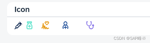
- View
<PanelheaderText="Icon"class="sapUiLargeMargin"
><HBox width="50%"><core:Iconsrc="sap-icon://syringe"class="size1"color="#031E48"><core:layoutData><FlexItemData growFactor="1" /></core:layoutData></core:Icon><core:Iconsrc="sap-icon://pharmacy"class="size2"color="#64E4CE"><core:layoutData><FlexItemData growFactor="2" /></core:layoutData></core:Icon><core:Iconsrc="sap-icon://electrocardiogram"class="size3"color="#E69A17"><core:layoutData><FlexItemData growFactor="3" /></core:layoutData></core:Icon><core:Iconsrc="sap-icon://doctor"class="size4"color="#1C4C98"><core:layoutData><FlexItemData growFactor="4" /></core:layoutData></core:Icon><core:Iconsrc="sap-icon://stethoscope"class="size5"color="#8875E7"press="handleStethoscopePress"><core:layoutData><FlexItemData growFactor="5" /></core:layoutData></core:Icon></HBox>
</Panel>
2. Avatar
2.1 displayShape
- 显示形状(方形,圆形)
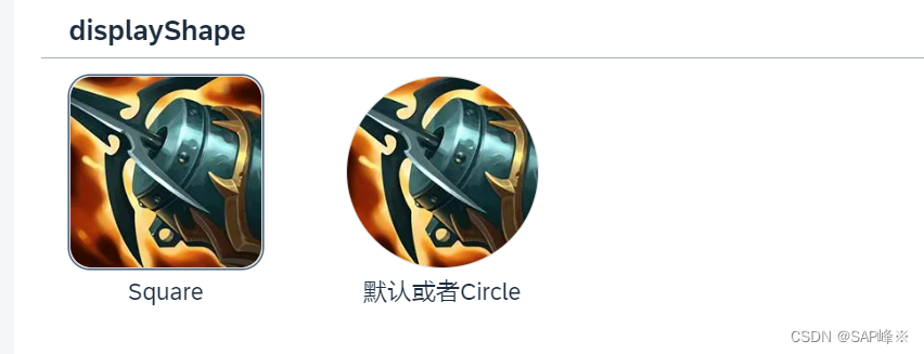
- View
<PanelheaderText="displayShape"class="sapUiLargeMarginBottom"
><HBox><VBox alignItems="Center"><Avatarsrc="img/1.webp"displaySize="XL"displayShape="Square"showBorder="true"press="onPress"/><Text text="Square" /></VBox><VBoxalignItems="Center"class="sapUiLargeMarginBegin"><Avatarsrc="img/1.webp"displaySize="XL"showBorder="true"press="onPress"/><Text text="默认或者Circle" /></VBox></HBox>
</Panel>
2.2 initials
- 显示initials文字
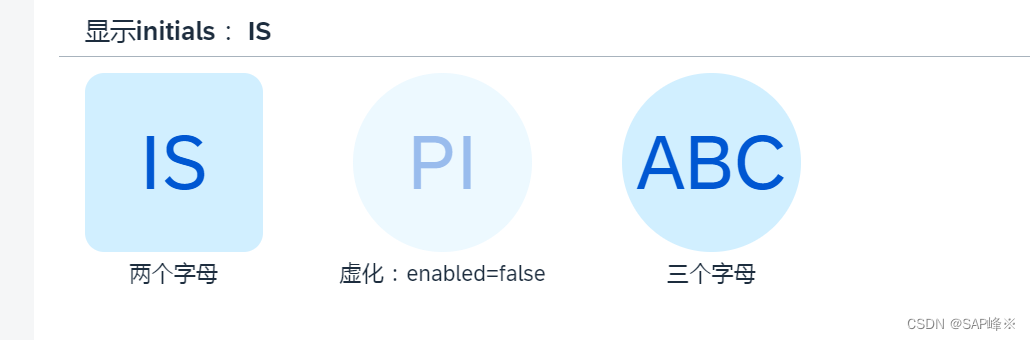
- View
<PanelheaderText="显示initials: IS"class="sapUiLargeMarginBottom"
><HBox><VBox alignItems="Center"><Avatarinitials="IS"displaySize="XL"displayShape="Square"press="onPress"/><Text text="两个字母" /></VBox><VBoxalignItems="Center"class="sapUiLargeMarginBegin"><Avatarenabled="false"initials="PI"displaySize="XL"press="onPress"/><Text text="虚化:enabled=false" /></VBox><VBoxalignItems="Center"class="sapUiLargeMarginBegin"><AvatardisplaySize="XL"press="onPress"initials="ABC"/><Text text="三个字母" /></VBox></HBox>
</Panel>
2.3 backgroundColor
- 背景色(Transparent,TileIcon, Placeholder, Random)
- Random会在每次渲染时随机分配颜色
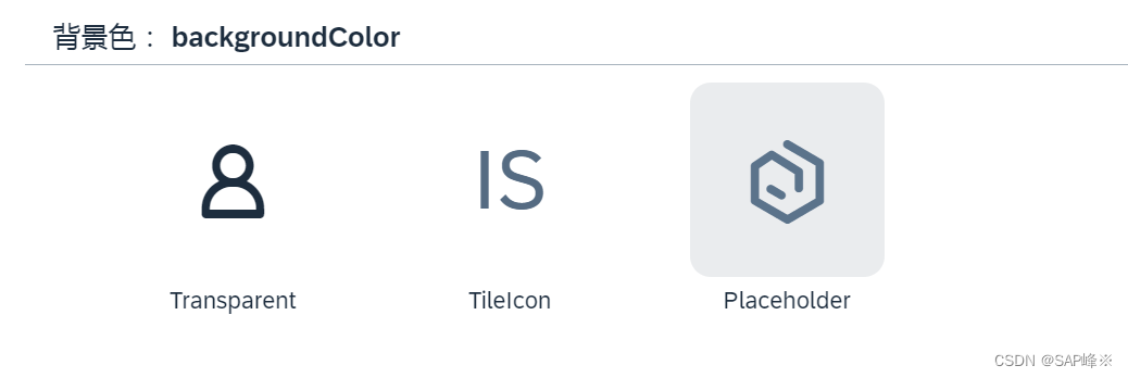
- View
<PanelheaderText="背景色: backgroundColor"class="sapUiLargeMarginBottom"
><HBox><VBoxalignItems="Center"class="sapUiLargeMarginBegin"><AvatardisplaySize="XL"backgroundColor="Transparent"press="onPress"/><Text text="Transparent" /></VBox><VBoxalignItems="Center"class="sapUiLargeMarginBegin"><Avatarinitials="IS"displaySize="XL"backgroundColor="TileIcon"press="onPress"/><Text text="TileIcon" /></VBox><VBoxalignItems="Center"class="sapUiLargeMarginBegin"><AvatardisplaySize="XL"backgroundColor="Placeholder"displayShape="Square"press="onPress"/><Text text="Placeholder" /></VBox></HBox>
</Panel>
2.4 Size
- 指定大小(XL,L,M,S,XS,Custom)
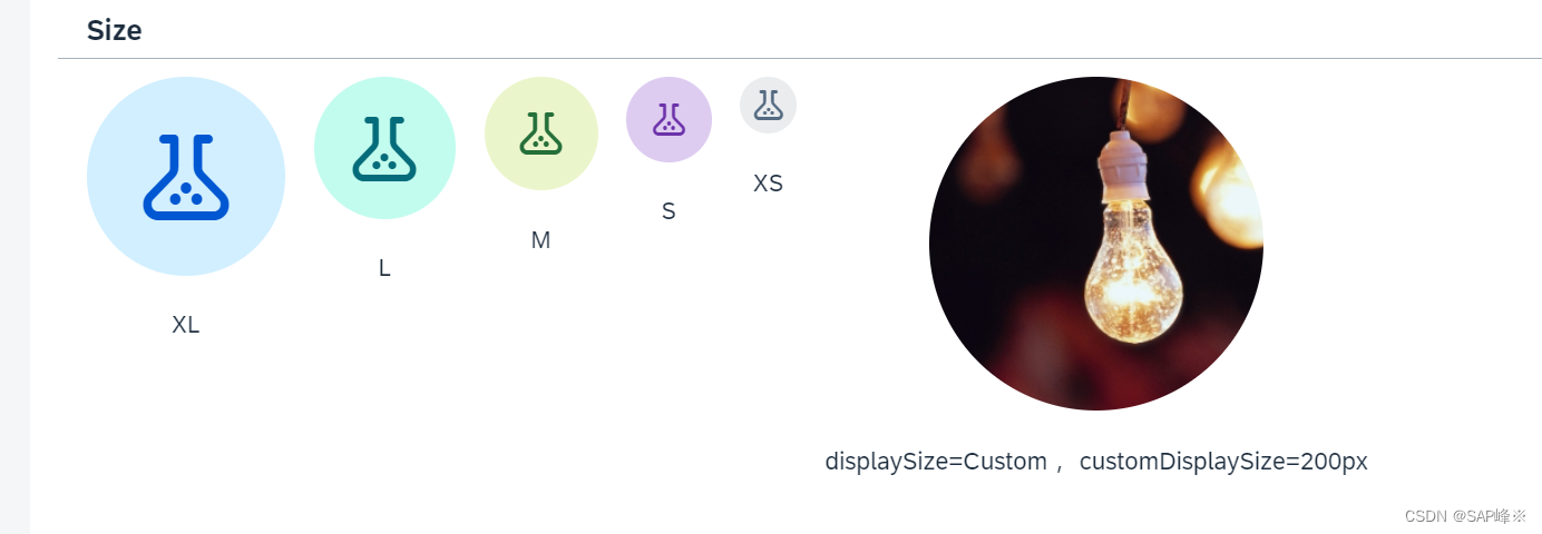
- View
<PanelheaderText="Size"class="sapUiLargeMarginBottom"
><HBox><VBoxalignItems="Center"class="sapUiSmallMarginEnd"><Avatarsrc="sap-icon://lab"displaySize="XL"backgroundColor="Accent6"/><Texttext="XL"class="sapUiSmallMarginTop"/></VBox><VBoxalignItems="Center"class="sapUiSmallMarginEnd"><Avatarsrc="sap-icon://lab"displaySize="L"backgroundColor="Accent7"/><Texttext="L"class="sapUiSmallMarginTop"/></VBox><VBoxalignItems="Center"class="sapUiSmallMarginEnd"><Avatarsrc="sap-icon://lab"displaySize="M"backgroundColor="Accent8"/><Texttext="M"class="sapUiSmallMarginTop"/></VBox><VBoxalignItems="Center"class="sapUiSmallMarginEnd"><Avatarsrc="sap-icon://lab"displaySize="S"backgroundColor="Accent9"/><Texttext="S"class="sapUiSmallMarginTop"/></VBox><VBoxalignItems="Center"class="sapUiSmallMarginEnd"><Avatarsrc="sap-icon://lab"displaySize="XS"backgroundColor="Accent10"/><Texttext="XS"class="sapUiSmallMarginTop"/></VBox><VBox alignItems="Center"><Avatarsrc="img/lamp.png"displaySize="Custom"customDisplaySize="200px"displayShape="Circle"/><Texttext="displaySize=Custom, customDisplaySize=200px"class="sapUiSmallMarginTop"/></VBox></HBox>
</Panel>
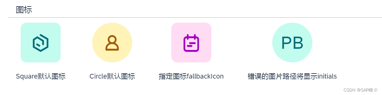
2.5 fallbackIcon
- Avatar会根据displayShape属性有默认图标,也可以指定图标。 如果指定路径有问题将会显示initials
- View
<PanelheaderText="图标"class="sapUiLargeMarginBottom"
><HBox><VBoxalignItems="Center"class="sapUiLargeMarginEnd"><AvatardisplaySize="L"displayShape="Square"backgroundColor="Random"/><Texttext="Square默认图标"class="sapUiSmallMarginTop"/></VBox><VBoxalignItems="Center"class="sapUiLargeMarginEnd"><AvatardisplaySize="L"displayShape="Circle"backgroundColor="Random"/><Texttext="Circle默认图标"class="sapUiSmallMarginTop"/></VBox><VBoxalignItems="Center"class="sapUiLargeMarginEnd"><AvatardisplaySize="L"displayShape="Square"fallbackIcon="sap-icon://accelerated"backgroundColor="Random"/><Texttext="指定图标fallbackIcon"class="sapUiSmallMarginTop"/></VBox><VBoxalignItems="Center"class="sapUiLargeMarginEnd"><AvatardisplaySize="L"initials="PB"src="{/test}"backgroundColor="Random"/><Texttext="错误的图片路径将显示initials"class="sapUiSmallMarginTop"textAlign="Center"/></VBox></HBox>
</Panel>
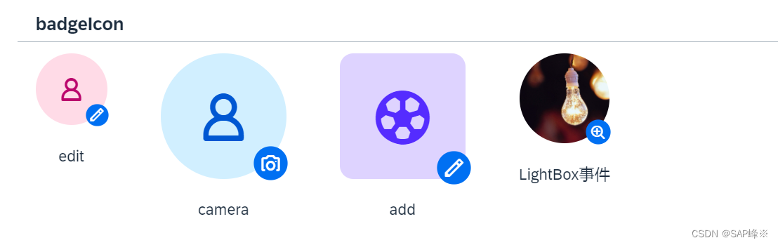
2.6 badgeIcon
-
badgeIcon只能在激活press属性并且在控制器里有对应function时激活
-
View
<PanelheaderText="badgeIcon"class="sapUiLargeMarginBottom"
><HBox><VBox alignItems="Center"><AvatardisplaySize="M"backgroundColor="Accent3"press="onPress"badgeIcon="sap-icon://edit"/><TexttextAlign="Center"text="edit"class="sapUiSmallMarginTop"/></VBox><VBoxalignItems="Center"class="sapUiLargeMarginBegin"><AvatardisplaySize="XL"press="onPress"badgeIcon="sap-icon://camera"badgeTooltip="Sabine Mayer"/><TexttextAlign="Center"text="camera"class="sapUiSmallMarginTop"/></VBox><VBoxalignItems="Center"class="sapUiLargeMarginBegin"><AvatardisplaySize="XL"backgroundColor="Accent5"src="sap-icon://soccer"displayShape="Square"press="onPress"badgeIcon="sap-icon://edit"/><TexttextAlign="Center"text="add"class="sapUiSmallMarginTop"/></VBox><VBoxalignItems="Center"class="sapUiLargeMarginBegin"><Avatarsrc="img/lamp.png"displaySize="L"displayShape="Circle"><detailBox><LightBox><LightBoxItemimageSrc="img/lamp.png"alt="灯泡"title="这是灯泡"subtitle="闪闪发光"/></LightBox></detailBox></Avatar><TexttextAlign="Center"text="LightBox事件"class="sapUiSmallMarginTop"/></VBox></HBox>
</Panel>
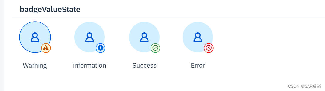
2.7 badgeValueState
- 会给badgeIcon上颜色
- View
<PanelheaderText="badgeValueState"class="sapUiLargeMarginBottom"
><HBox><VBoxalignItems="Center"class=""><AvatardisplaySize="M"imageFitType="Cover"badgeValueState="Warning"press="onPress"badgeIcon="sap-icon://alert"badgeTooltip="Sabine Mayer"/><TexttextAlign="Center"text="Warning"class="sapUiSmallMarginTop"/></VBox><VBoxalignItems="Center"class="sapUiLargeMarginBegin"><AvatardisplaySize="M"imageFitType="Cover"badgeValueState="Information"press="onPress"badgeIcon="sap-icon://information"badgeTooltip="Sabine Mayer"/><TexttextAlign="Center"text="information"class="sapUiSmallMarginTop"/></VBox><VBoxalignItems="Center"class="sapUiLargeMarginBegin"><AvatardisplaySize="M"imageFitType="Cover"badgeValueState="Success"press="onPress"badgeIcon="sap-icon://message-success"badgeTooltip="Sabine Mayer"/><TexttextAlign="Center"text="Success"class="sapUiSmallMarginTop"/></VBox><VBoxalignItems="Center"class="sapUiLargeMarginBegin"><AvatardisplaySize="M"imageFitType="Cover"badgeValueState="Error"press="onPress"badgeIcon="sap-icon://message-error"badgeTooltip="Sabine Mayer"/><TexttextAlign="Center"text="Error"class="sapUiSmallMarginTop"/></VBox></HBox>
</Panel>
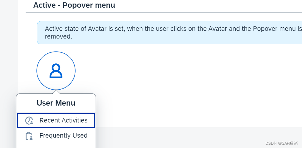
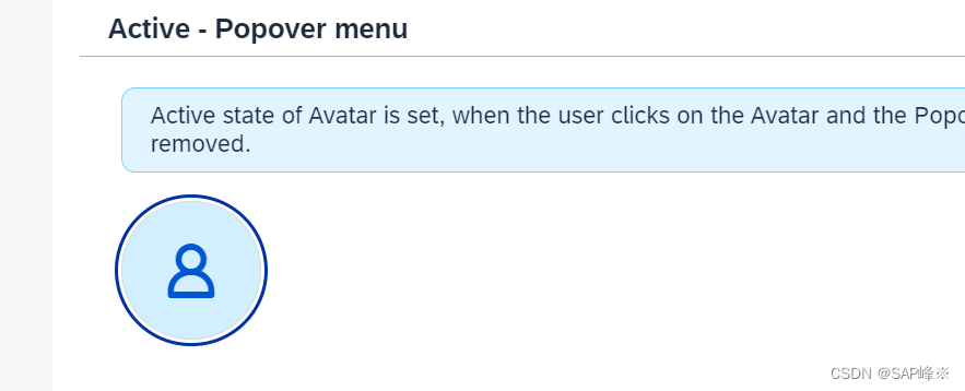
2.8 active
- 只有绑定press事件时才能激活该属性
- Active背景颜色和Non-Active背景颜色有差异
- View
<PanelheaderText="Active - Popover menu"class="sapUiLargeMarginBottom"
><VBox><MessageStriptext="Active state of Avatar is set, when the user clicks on the Avatar and the Popover menu is opened. When the menu is closed, Active state is removed."showIcon="false"showCloseButton="false"class="sapUiTinyMargin"/><HBox><Avatarid="myAvatar"active="false"displaySize="L"showBorder="true"class="sapUiTinyMargin"press="onPressPopover"/></HBox></VBox>
</Panel>
- 点击事件
onPressPopover: function (oEvent) {var oEventSource = oEvent.getSource(),bActive = this.oMyAvatar.getActive();this.oMyAvatar.setActive(!bActive);if (bActive) {this._oPopover.close();} else {this._oPopover.openBy(oEventSource);}}
3. Image
- Image可以显示主流图片文件,也可以显示BASE64图片文件
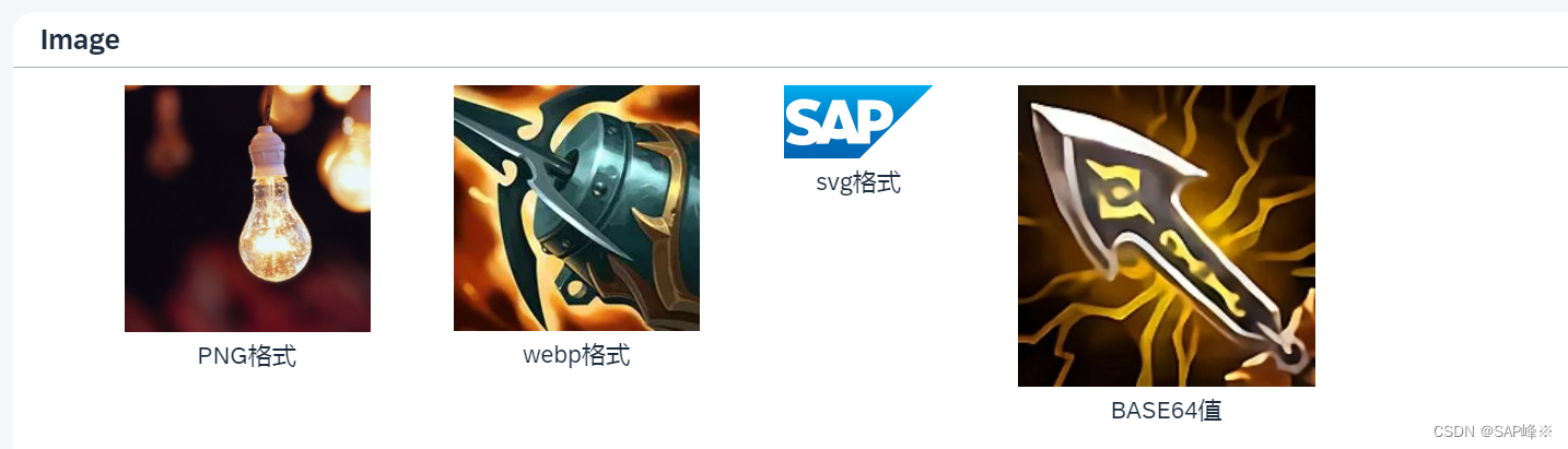
- View
<PanelheaderText="Image"class="sapUiLargeMargin"
><HBox width="50%"><VBoxalignItems="Center"class="sapUiLargeMarginBegin"><Imagesrc="img/lamp.png"width="150px"/><Texttext="PNG格式"class="sapUiSmallMarginBottom"/></VBox><VBoxalignItems="Center"class="sapUiLargeMarginBegin"><Imagesrc="img/1.webp"width="150px"/><Texttext="webp格式"class="sapUiSmallMarginBottom"/></VBox><VBoxalignItems="Center"class="sapUiLargeMarginBegin"><Image src="img/sap-logo.svg" /><Texttext="svg格式"class="sapUiSmallMarginBottom"/></VBox><VBoxalignItems="Center"class="sapUiLargeMarginBegin"><Image src="{/imgurl}" /><Texttext="BASE64值"class="sapUiSmallMarginBottom"/></VBox></HBox>
</Panel>
- 读取本地图片并转成base64
_convertImageToBase64: function (filePath) {return new Promise(function (resolve, reject) {// 创建一个XMLHttpRequest对象var xhr = new XMLHttpRequest();// 配置请求,使用GET方法获取文件xhr.open("GET", filePath, true);// 设置响应类型为blob(二进制数据)xhr.responseType = "blob";// 注册加载完成的回调函数xhr.onload = function () {if (xhr.status === 200) {// 读取到的文件数据var blob = xhr.response;// 创建一个FileReader对象var reader = new FileReader();// 注册读取完成的回调函数reader.onloadend = function () {// 获取Base64编码的文件内容var base64Data = reader.result;resolve(base64Data);};// 读取blob数据为Base64编码reader.readAsDataURL(blob);} else {reject(new Error("Failed to load the image."));}};// 注册错误回调函数xhr.onerror = function () {reject(new Error("Failed to make the request."));};// 发送请求xhr.send();});
}
- onInit中调用
// 调用函数将文件转换为base64编码
this._convertImageToBase64("img/2.jpg").then(function (base64Data) {that.getView().setModel(new JSONModel({ "imgurl": base64Data }))}).catch(function (error) {console.error(error);});
这篇关于[UI5 常用控件] 03.Icon, Avatar,Image的文章就介绍到这儿,希望我们推荐的文章对编程师们有所帮助!