本文主要是介绍ards数据集合 脓毒症 jimmy学徒 优秀代码 split灵活应用,希望对大家解决编程问题提供一定的参考价值,需要的开发者们随着小编来一起学习吧!
GEO Accession viewer
GEO Accession viewerNCBI's Gene Expression Omnibus (GEO) is a public archive and resource for gene expression data.![]() https://www.ncbi.nlm.nih.gov/geo/query/acc.cgi?acc=GSE65682
https://www.ncbi.nlm.nih.gov/geo/query/acc.cgi?acc=GSE65682
 2. 拿相应的细胞Marker进行注释再看看,其实前一个注释结果就够(T细胞Mareker) --------------------------p=DimPlot(sce,reduction = "umap",label=T )
sce.all = sce# yT1c=c("GNLY","PTGDS","GZMB","TRDC"),
# yT2c=c("TMN1","HMGB2","TYMS")
genes_to_check =list( naive=c("CCR7","SELL","TCF7","IL7R","CD27","CD28","LEF1","S1PR1"),CD8Trm=c("XCL1","XCL2","MYADM"),NKTc=c("GNLY","GZMA"), Tfh=c("CXCR5","BCL6","ICA1","TOX","TOX2","IL6ST"),th17=c("IL17A","KLRB1","CCL20","ANKRD28","IL23R","RORC","FURIN","CCR6","CAPG","IL22"),CD8Tem=c("CXCR4","GZMH","CD44","GZMK"),Treg=c("FOXP3","IL2RA","TNFRSF18","IKZF2"),naive=c("CCR7","SELL","TCF7","IL7R","CD27","CD28"),CD8Trm=c("XCL1","XCL2","MYADM"), MAIT=c("KLRB1","ZBTB16","NCR3","RORA"),yT1c=c("GNLY","PTGDS","GZMB","TRDC"),yT2c=c("TMN1","HMGB2","TYMS"),yt=c("TRGV9","TRDV2")
)
genes_to_check = lapply(genes_to_check, str_to_title)
dup=names(table(unlist(genes_to_check)))[table(unlist(genes_to_check))>1] #取出重名的marker基因
genes_to_check = lapply(genes_to_check, function(x) x[!x %in% dup]) #取出未重名的基因
p_all_markers=DotPlot(sce.all,  group.by = "RNA_snn_res.0.8",features = genes_to_check,scale = T,assay='RNA' )+theme(axis.text.x=element_text(angle=45,hjust = 1))
p_all_markers+p
ggsave('check_cd4_and_cd8T_markers.pdf',width = 9 )
# 拆成细胞类型对应的细胞list(CyclingT、CytoticT、NaiveT)
cell_list = split(colnames(sce.all),sce.all$celltype)
cell_list#获得相应细胞类型,对应的样本ID
names(cell_list)# 4.每个celltype不同分组之间差异分析 ----
dir.create("./by_celltype")
setwd("./by_celltype/")
getwd()
# 4.每个celltype不同分组之间差异分析 ----
dir.create("./by_celltype")
setwd("./by_celltype/")
getwd()# 利用FindAllMarkers进行差异分析---整个流程值得借鉴(针对每一种细胞类型在组别间分别进行差异分析)
# 保存每一种细胞类型的差异分析结果、对应细胞类型topMarker的Rdata、每种细胞类型top10气泡图与热图
for ( pro in names(cell_list) ) {#pro=names(cell_list)[1]sce=sce.all[,colnames(sce.all) %in% cell_list[[pro]]]sce <- CreateSeuratObject(counts = sce@assays$RNA@counts, meta.data = sce@meta.data, min.cells = 3, min.features = 200)  sce <- NormalizeData(sce)  sce = FindVariableFeatures(sce)sce = ScaleData(sce, vars.to.regress = c("nFeature_RNA","percent_mito"))Idents(sce)=sce$group #组别信息;后续用组别信息比较(赋值ident)table(Idents(sce))# 利用FindAllMarkers进行差异分析sce.markers <- FindAllMarkers(object = sce, only.pos = TRUE, logfc.threshold = 0.2,min.pct = 0.2, thresh.use = 0.2) write.csv(sce.markers,file=paste0(pro,'_sce.markers.csv'))sce.markers=sce.markers[order(sce.markers$cluster,sce.markers$avg_log2FC),]library(dplyr) top10 <- sce.markers %>% group_by(cluster) %>% top_n(10, avg_log2FC)# sce.Scale <- ScaleData(subset(sce,downsample=100),features =  unique(top10$gene)  )  sce.Scale <- ScaleData( sce ,features =  unique(top10$gene)  )  DoHeatmap(sce.Scale,features =  unique(top10$gene),# group.by = "celltype",assay = 'RNA', label = T)+scale_fill_gradientn(colors = c("white","grey","firebrick3"))ggsave(filename=paste0(pro,'_sce.markers_heatmap.pdf'),height = 8)p <- DotPlot(sce , features = unique(top10$gene)  ,assay='RNA'  )  + coord_flip()pggsave(plot=p, filename=paste0("check_top10-marker_by_",pro,"_cluster.pdf") ,height = 8)save(sce.markers,file=paste0(pro,'_sce.markers.Rdata')) }
细胞比例图library(ggsci)
ggplot(bar_per, aes(x = Var1, y = percent)) +geom_bar(aes(fill = Var2) , stat = "identity") + coord_flip() +theme(axis.ticks = element_line(linetype = "blank"),legend.position = "top",panel.grid.minor = element_line(colour = NA,linetype = "blank"), panel.background = element_rect(fill = NA),plot.background = element_rect(colour = NA)) +labs(y = "% Relative cell source", fill = NULL)+labs(x = NULL)+scale_fill_d3() #分组之间各种细胞占比ggsave("celltype_by_group_percent.pdf",units = "cm",width = 20,height = 12)
## 4.2 每种细胞类型中,各个样本所占比例 ----
bar_data <- as.data.frame(table(phe$celltype,phe$orig.ident))bar_per <- bar_data %>% group_by(Var1) %>%mutate(sum(Freq)) %>%mutate(percent = Freq / `sum(Freq)`)
bar_perwrite.csv(bar_per,file = "celltype_by_orig.ident_percent.csv")
ggplot(bar_per, aes(x = Var1, y = percent)) +geom_bar(aes(fill = Var2) , stat = "identity") + coord_flip() +theme(axis.ticks = element_line(linetype = "blank"),legend.position = "top",panel.grid.minor = element_line(colour = NA,linetype = "blank"), panel.background = element_rect(fill = NA),plot.background = element_rect(colour = NA)) +labs(y = "% Relative cell source", fill = NULL)+labs(x = NULL) ggsave("celltype_by_orig.ident_percent.pdf",units = "cm",width = 20,height = 12)
#自建函数# 自定义绘图函数,运行即可
head(phe)
plot_percent <- function(x,y){# x <- "group"# y <- "celltype"plot_data <- data.frame(table(phe[, x ],phe[, y ]))plot_data$Total <- apply(plot_data,1,function(x)sum(plot_data[plot_data$Var1 == x[1],3]))plot_data <- plot_data %>% mutate(Percentage = round(Freq/Total,3) * 100)pro <- xwrite.table(plot_data,paste0(pro,"_celltype_proportion.txt"),quote = F)th=theme(axis.text.x = element_text(angle = 45, vjust = 0.5, hjust=0.5)) library(paletteer) color <- c(paletteer_d("awtools::bpalette"),paletteer_d("awtools::a_palette"),paletteer_d("awtools::mpalette"))ratio1 <- ggplot(plot_data,aes(x = Var1,y = Percentage,fill = Var2)) +geom_bar(stat = "identity",position = "stack") +scale_fill_manual(values = color)+theme_classic() + theme(axis.title.x = element_blank()) + labs(fill = "Cluster") +th ratio1f=paste0('ratio_by_',x,'_VS_',y)h=floor(5+length(unique(plot_data[,1]))/2)w=floor(3+length(unique(plot_data[,2]))/2)ggsave(paste0('bar1_',f,'.pdf'),ratio1,height = h ,width = w ) pdf(paste0('balloonplot_',f,'.pdf'),height = 12 ,width = 20)balloonplot(table(phe[, x ],phe[, y ]))dev.off()plot_data$Total <- apply(plot_data,1,function(x)sum(plot_data[plot_data$Var1 == x[1],3]))plot_data<- plot_data %>% mutate(Percentage = round(Freq/Total,3) * 100)bar_Celltype=ggplot(plot_data,aes(x = Var1,y = Percentage,fill = Var2)) +geom_bar(stat = "identity",position = "stack") +theme_classic() + theme(axis.text.x=element_text(angle=45,hjust = 1)) + labs(fill = "Cluster")+facet_grid(~Var2,scales = "free")bar_Celltypeggsave(paste0('bar2_',f,'.pdf'),bar_Celltype,height = 8 ,width =  40)
}## 4.3 每个分组中,不同细胞类型所占比例 ----plot_percent("group","celltype")## 4.4 每个分组中,不同细胞类型所占比例 ----
plot_percent("orig.ident","celltype")
#分组富集分析
getwd() #"G:/linux study/hsp70_human/ref/201023国庆授课检查版/4_group"
setwd("G:/linux study/hsp70_human/ref/201023国庆授课检查版/4_group")
dir.create("../5_GO_KEGG")
setwd("../5_GO_KEGG/")
getwd() #"G:/linux study/hsp70_human/ref/201023国庆授课检查版/5_GO_KEGG"# 对各个亚群的topMarker基因进行降维聚类分群 -----------------------------------------------## 3.1 kegg and go by cluster ----
# 只针对find的各个亚群top基因
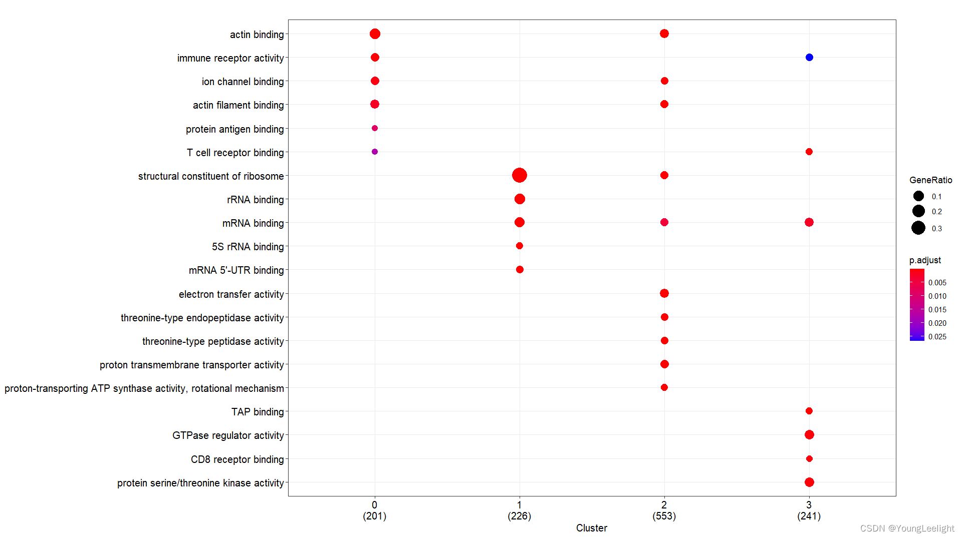
# 现在我们选择了COSG算法if(T){# 3.all 读取数据富集分析-## 3.1 kegg and go by cluster 可视化 ----f = '../3-cell/harmony-sce.markers.Rdata' #决定了找簇与簇的显著富集的KEGG通路# 这个Rdata数据源于step3.1,针对簇利用FindAllMarker找簇的Top Marker 基因if(file.exists(f)){load(file = f)sce.markers=sce.markers[sce.markers$avg_log2FC > 0,]top1000 <- sce.markers %>% group_by(cluster) %>% top_n(1000, avg_log2FC)head(top1000) library(ggplot2)ids=bitr(top1000$gene,'SYMBOL','ENTREZID','org.Mm.eg.db')top1000=merge(top1000,ids,by.x='gene',by.y='SYMBOL')gcSample=split(top1000$ENTREZID, top1000$cluster) #分组太强大了 切割 按照组别切割splitgcSample # entrez id , compareCluster names(gcSample)xx <- compareCluster(gcSample, fun="enrichKEGG",organism="mmu")str(xx)p=dotplot(xx) p+ theme(axis.text.x = element_text(angle = 45, vjust = 0.5, hjust=0.5))ggsave('compareCluster-KEGG-top1000-cluster.pdf',width = 18,height = 8)xx <- compareCluster(gcSample, fun="enrichGO",OrgDb='org.Mm.eg.db')summary(xx)p=dotplot(xx) p+ theme(axis.text.x = element_text(angle = 90, vjust = 0, hjust=1))ggsave('compareCluster-GO-top1000-cluster.pdf',width = 15,height = 12)}}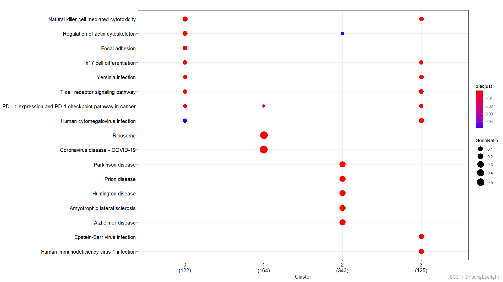
这篇关于ards数据集合 脓毒症 jimmy学徒 优秀代码 split灵活应用的文章就介绍到这儿,希望我们推荐的文章对编程师们有所帮助!