本文主要是介绍css实现简单的抽奖动画效果和旋转效果,还有春联效果,希望对大家解决编程问题提供一定的参考价值,需要的开发者们随着小编来一起学习吧!
使用css的animation和transform和transition可以实现简单的图片放大缩小,旋转,位移的效果,由此可以延伸的动画效果还是挺多的,比如图片慢慢放大,图片慢慢旋转并放大,图片慢慢变化位置等等,
抽奖动画效果图
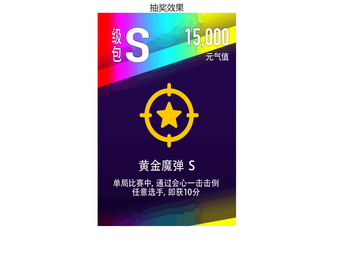
实现的原理也很简单,就是通过使用动画animation和关键动画帧来实现的,可以使用缩放来进行平滑的过渡效果,下面是源码:
<!DOCTYPE html>
<html lang="en"><head><meta charset="UTF-8" /><meta name="viewport" content="width=device-width, initial-scale=1.0" /><title>Document</title></head><body><div class="center"><div>抽奖效果</div><imgsrc="https://img-blog.csdnimg.cn/67fc9799ae8e48749e82cf70b179895b.png"class="card"/></div><style>.center {width: 500px;margin: 0 auto;text-align: center;}.card {width: 260px;height: 400px;animation: showImg 3s linear 1;}@keyframes showImg {0% {transform: scale(0.1) rotate(0);}50% {transform: scale(0.5) rotate(360deg);}100% {transform: scale(1) rotate(720deg);}}</style></body>
</html>
图片慢慢旋转动画
图片慢慢旋转是通过rotate来实现的,并且鼠标放上去之后,会有暂停的效果:下面的动图有卡顿的效果,实际情况非常丝滑

旋转图片的源代码:
<!DOCTYPE html>
<html lang="en"><head><meta charset="UTF-8" /><meta name="viewport" content="width=device-width, initial-scale=1.0" /><title>Document</title></head><body><div class="wrap"><div class="source"></div><div class="avatar"></div></div></body><style>body {background-color: black;padding-top: 100px;}.wrap {margin: 0 auto;display: flex;flex-direction: row;justify-content: center;align-items: center;}.source {width: 100px;height: 100px;margin-right: 20px;background-image: url('./assets/ball.png');background-position: center;background-size: 100% 100%;animation: circle 1s linear infinite;}.avatar {width: 100px;height: 100px;border-radius: 50%;background-image: url('https://profile-avatar.csdnimg.cn/f6acd04828d84240afc2739fe039fd49_weixin_44786530.jpg!1');background-position: center;background-size: 100% 100%;animation: circle 2s linear infinite;}.source:hover {animation-play-state: paused;}.avatar:hover {animation-play-state: paused;}@keyframes circle {0% {transform: rotate(0deg);}10% {transform: rotate(36deg);}20% {transform: rotate(72deg);}30% {transform: rotate(108deg);}40% {transform: rotate(144deg);}50% {transform: rotate(180deg);}60% {transform: rotate(216deg);}70% {transform: rotate(252deg);}80% {transform: rotate(288deg);}90% {transform: rotate(324deg);}100% {transform: rotate(360deg);}}</style>
</html>
春联效果
春节快要到了,所以春联也整起来吧,使用了变换中的旋转,还有变化中心位置的修改,效果图如下: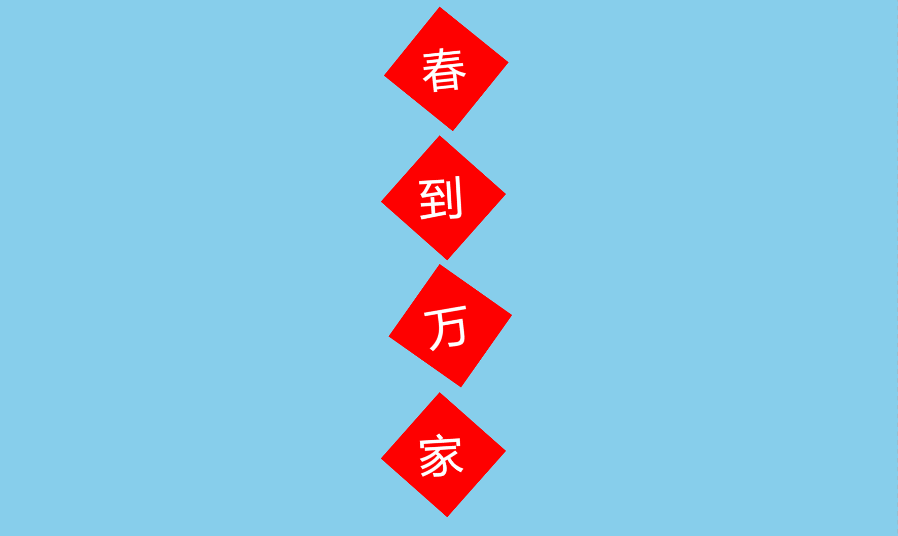
源代码:
<!DOCTYPE html>
<html lang="en"><head><meta charset="UTF-8" /><meta name="viewport" content="width=device-width, initial-scale=1.0" /><title>Document</title></head><body><div class="wrap"><div class="card"><div class="text">春</div></div><div class="two"><div class="text">到</div></div><div class="three"><div class="text">万</div></div><div class="for"><div class="text">家</div></div></div><style>* {padding: 0;margin: 0;box-sizing: border-box;}html,body {width: 100%;height: 100%;background-color: skyblue;}.wrap {width: 100px;/* margin-top: 200px; */margin: 100px auto;}.card {width: 100px;height: 100px;background-color: red;transform: rotate(45deg);transform-origin: left top;animation: shark 3s infinite ease-in-out -6s;}.two {width: 100px;height: 100px;margin-top: 45px;background-color: red;transform: rotate(45deg);transform-origin: left top;animation: shark 2s infinite ease-in-out -5s;}.three {width: 100px;height: 100px;margin-top: 45px;background-color: red;transform: rotate(45deg);transform-origin: left top;animation: shark 3s infinite ease-in-out -4s;}.for {width: 100px;height: 100px;margin-top: 45px;background-color: red;transform: rotate(45deg);transform-origin: left top;animation: shark 2s infinite ease-in-out -3s;}.text {font-size: 50px;color: white;transform: rotate(-45deg) translate(10px, 10px);}@keyframes shark {0% {transform: rotate(30deg);}50% {transform: rotate(60deg);}100% {transform: rotate(30deg);}}</style></body>
</html>
这篇关于css实现简单的抽奖动画效果和旋转效果,还有春联效果的文章就介绍到这儿,希望我们推荐的文章对编程师们有所帮助!