本文主要是介绍鸢尾花的可视化(散点图、小提琴图、以及pyearchs平行坐标图),希望对大家解决编程问题提供一定的参考价值,需要的开发者们随着小编来一起学习吧!
一、鸢尾花散点图
import matplotlib.pyplot as plt
import numpy as np
import pandas as pd# 数据准备
from sklearn import datasetsiris = datasets.load_iris()
x, y = iris.data, iris.target
pd_iris = pd.DataFrame(np.hstack((x, y.reshape(150, 1))),columns=['sepal_length', 'sepal_width', 'petal_length', 'petal_width', 'class'])
print(pd_iris)
plt.figure(dpi=150)  # 设置图的分辨率# plt.style.use('Solarize_Light2')  # 使用Solarize_Light2风格绘图 橘色加白色网格线
# plt.style.use('seaborn-white')  #风格为全白
plt.style.use('seaborn')  #风格为浅蓝色加白色网格线iris_type = pd_iris['class'].unique()  # 根据class列将点分为三类,获得三种类型[0. 1. 2.]
print(iris_type)iris_name = iris.target_names  # 获取每一类的名称
# print(iris_name)#['setosa' 'versicolor' 'virginica']colors = ['#c72e29', '#098154', '#fb832d']  # 三种不同颜色
markers = ['$\clubsuit$', 'o', '^']  # 三种不同图形 #$\clubsuit$  ♣形状  '^'为三角形状for i in range(len(iris_type)):plt.scatter(pd_iris.loc[pd_iris['class'] == iris_type[i], 'sepal_length'],  # 传入数据xpd_iris.loc[pd_iris['class'] == iris_type[i], 'sepal_width'],  # 传入数据ys=50,  # 散点图形(marker)的大小c=colors[i],  # marker颜色marker=markers[i],  # marker形状# marker=matplotlib.markers.MarkerStyle(marker = markers[i],fillstyle='full'),#设置marker的填充alpha=0.8,  # marker透明度,范围为0-1facecolors='r',  # marker的填充颜色,当上面c参数设置了颜色,优先cedgecolors='none',  # marker的边缘线色linewidths=1,  # marker边缘线宽度,edgecolors不设置时,该参数不起作用label=iris_name[i])  # 后面图例的名称取自labelplt.legend(loc='upper right')
plt.show()
说明其中代码难点
#取出setosa组的子dataFrame 而且全是setosa类别
setosa=pd_iris[pd_iris['class'] == iris_type[0]]
# print(setosa)#pd.loc[行,列],在行的选择中引入了条件选取
B=pd_iris.loc[pd_iris['class'] == iris_type[0], 'sepal_length']
# print(B)
散点图如下:

二、鸢尾花的箱型图
import matplotlib.pyplot as plt
import numpy as np
import pandas as pd# 数据准备
from sklearn import datasetsiris = datasets.load_iris()
x, y = iris.data, iris.target
pd_iris = pd.DataFrame(np.hstack((x, y.reshape(150, 1))),columns=['sepal_length', 'sepal_width', 'petal_length', 'petal_width', 'class'])
print(pd_iris)
plt.figure(dpi=150)  # 设置图的分辨率
plt.style.use('seaborn-white')  #风格为全白color_list=["#D1B6E1",'#30A9DE','#58C9B9','#9DC8C8']
lables=['sepal_length', 'sepal_width', 'petal_length', 'petal_width']f=plt.boxplot(pd_iris[['sepal_length', 'sepal_width', 'petal_length', 'petal_width']],labels=['sepal_length', 'sepal_width', 'petal_length', 'petal_width'],patch_artist=True,sym='o',#异常值的形状showbox=True,showmeans = True,widths=0.2)for box, c in zip(f['boxes'], color_list):  # 对箱线图设置颜色box.set(color=c, linewidth=2)box.set(facecolor=c)# 这里设置的是各个box的其他属性
for whisker in f['whiskers']: #设置箱型图的端点与箱子的连接线whisker.set(color='r', linewidth=0.5)
for cap in f['caps']:  #设置箱型图的端点线cap.set(color='g', linewidth=1)
for median in f['medians']:  #设置medians线median.set(color='DarkBlue', linewidth=1)
for flier in f['fliers']:flier.set(marker='o', color='y', alpha=0.5)
for means in f['means']:means.set(color='black')plt.title('my boxplot')
plt.show()
箱型图如下:

三、鸢尾花的小提琴图
import matplotlib.pyplot as plt
import numpy as np
import pandas as pd
import seaborn as sns# 数据准备
from sklearn import datasetsiris = datasets.load_iris()
x, y = iris.data, iris.target
pd_iris = pd.DataFrame(np.hstack((x, y.reshape(150, 1))),columns=['sepal_length', 'sepal_width', 'petal_length', 'petal_width', 'class'])
print(pd_iris)
plt.figure(dpi=150)  # 设置图的分辨率
plt.style.use('seaborn-white')  #风格为全白label = ['sepal_length', 'sepal_width', 'petal_length', 'petal_width']
font_1 = {"size": 14}sns.violinplot(data =pd_iris[['sepal_length', 'sepal_width', 'petal_length', 'petal_width']])
plt.xlabel("category", font_1)
plt.ylabel("Length or width", font_1)
plt.xticks(ticks = [0, 1, 2 ,3], labels = label, fontsize = 11)
plt.yticks(fontsize = 12)
plt.show()
小提琴图如下:

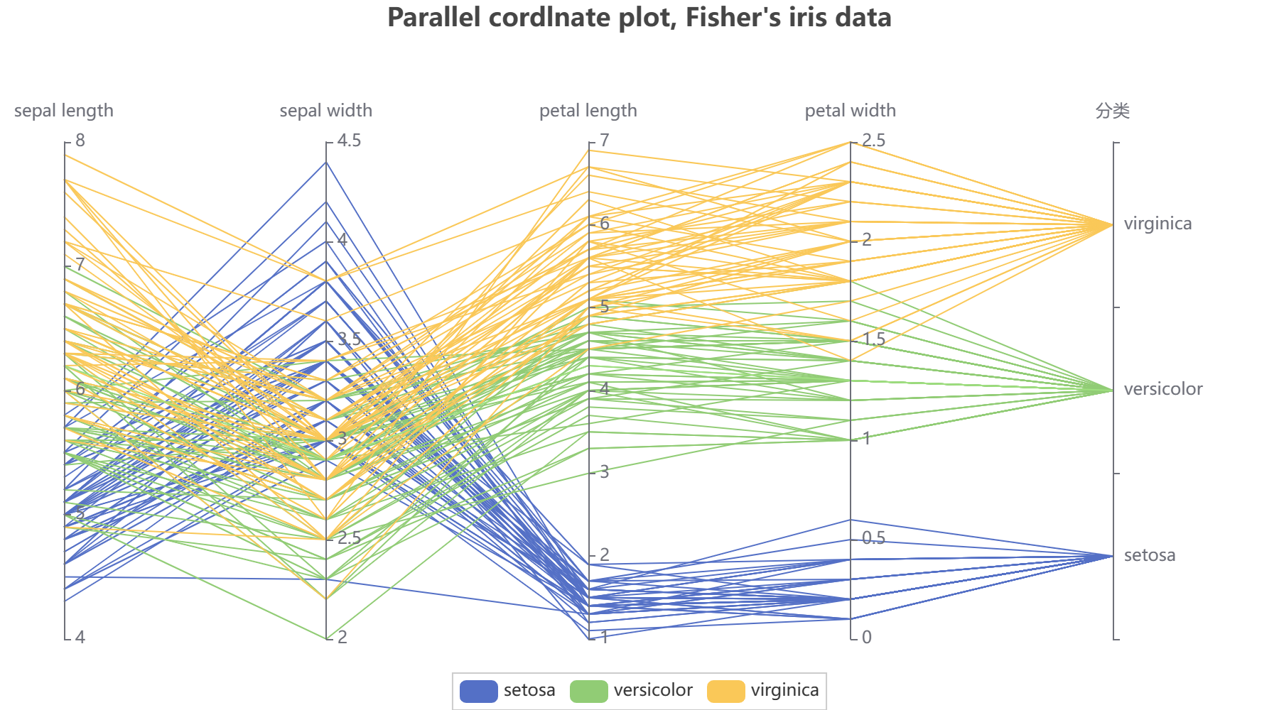
四、鸢尾花的平行坐标图
from pyecharts import options as opts
from pyecharts.charts import Parallel
import pandas as pd#读数据
result=pd.read_csv('iris.csv')
print(result)
#分组,按照花的类型分组
A=result[result['species']=='setosa']
B=result[result['species']=='versicolor']
C=result[result['species']=='virginica']
print(result['sepal_length'].max())
#Iris-setosa的数据
data1=[]
for a in range(0,len(A)):   # 计算列表A的长度,进行循环切片data1.append(A.values.tolist()[a][0:])
#Iris-versicolor的数据
data2=[]
for b in range(0,len(B)):data2.append(B.values.tolist()[b][0:])
#Iris-virginica的数据
data3=[]
for c in range(0,len(C)):data3.append(C.values.tolist()[c][0:])
#输出数据看数据的形式是否正确
print(data1,'\n',data2,'\n',data3)c = (     Parallel().add_schema([opts.ParallelAxisOpts(dim=0, name="sepal length",is_scale=True ,min_=4,max_=8),opts.ParallelAxisOpts(dim=1, name="sepal width",is_scale=True,min_=2,max_=4.5),opts.ParallelAxisOpts(dim=2, name="petal length",is_scale=True,min_=1,max_=7),opts.ParallelAxisOpts(dim=3, name="petal width",is_scale=True,min_=0,max_=2.5),#自动划分范围is_scale=Trueopts.ParallelAxisOpts(dim=4,  name="分类", type_="category",data=["setosa", "versicolor", "virginica"]),]).add("setosa", data1).add("versicolor", data2).add("virginica", data3).set_global_opts(title_opts=opts.TitleOpts(title="Parallel cordlnate plot, Fisher's iris data",pos_top="top",pos_right="center"),legend_opts=opts.LegendOpts( pos_top="bottom",pos_right="center"),yaxis_opts=opts.AxisOpts(min_='dataMin',max_="dataMax")).render("parallel.html")
)
平行坐标图如下:
这篇关于鸢尾花的可视化(散点图、小提琴图、以及pyearchs平行坐标图)的文章就介绍到这儿,希望我们推荐的文章对编程师们有所帮助!