本文主要是介绍Flutter笔记:Widgets Easier组件库(9)使用弹窗,希望对大家解决编程问题提供一定的参考价值,需要的开发者们随着小编来一起学习吧!
- 文章信息 - Author: 李俊才 (jcLee95)
Visit me at CSDN: https://jclee95.blog.csdn.net
My WebSite:http://thispage.tech/
Email: 291148484@163.com.
Shenzhen China
Address of this article:https://blog.csdn.net/qq_28550263/article/details/138342949
HuaWei:https://bbs.huaweicloud.com/blogs/426780
组件库地址:
- Pub.Dev:https://pub.dev/packages/widgets_easier
- GitHub:https://github.com/jacklee1995/widgets_easier
【介绍】:本文介绍Flutter Widgets Easier组件库中的基本弹窗组件。
1. 概述
1.1 关于Widgets Easier
本库是一个 Flutter 组件库,旨在提供用于Flutter开发的组件,使得开发者能够更简单地构建出更丰富地界面效果。项目地址为:
-
https://github.com/jacklee1995/widgets_easier
-
https://pub.dev/packages/widgets_easier
1.2 模块安装
在你的Flutter项目中,运行下面的命令:
flutter pub add widgets_easier
即可安装最新版本的 Widgets Easier 库。
2. 消息型弹窗
2.1 弹窗构成
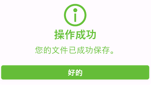
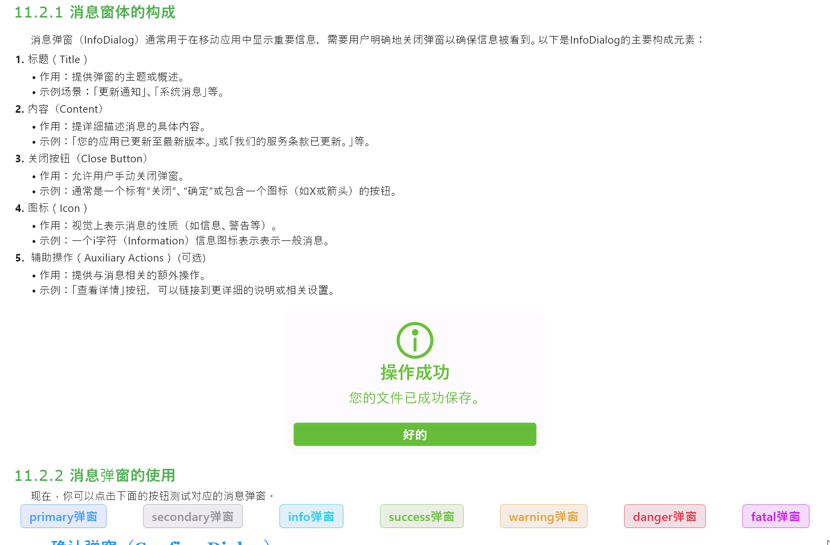
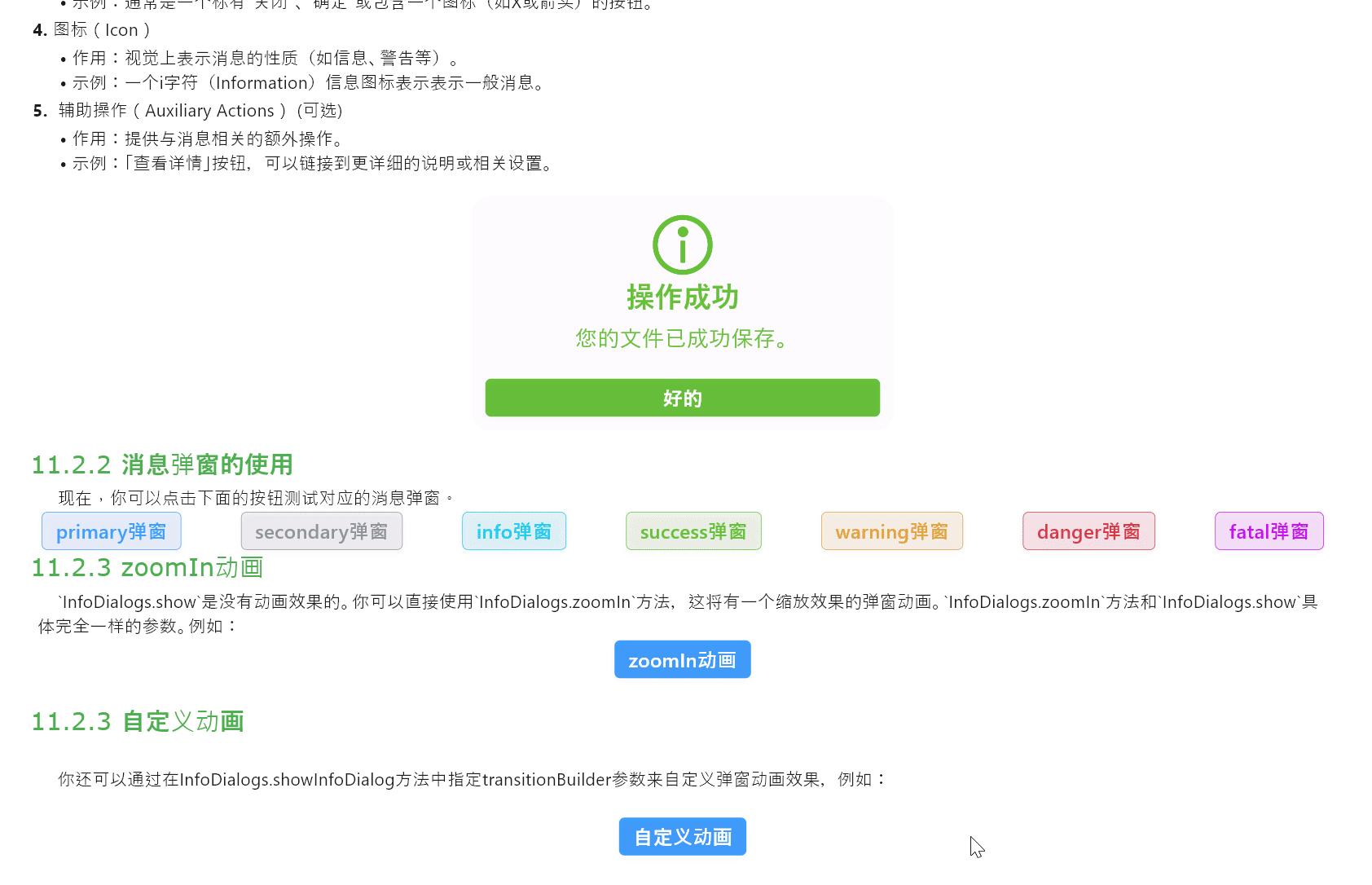
消息弹窗(InfoDialog)通常用于在移动应用中显示重要信息,需要用户明确地关闭弹窗以确保信息被看到。以下是InfoDialog的主要构成元素:
-
图标(可选)
-
标题(Title)
-
内容(Content)
-
关闭按钮(Close Button)
InfoDialogs是一种消息式的弹窗,这种弹窗只有一个按钮。你可以为InfoDialogs指定一个type属性,这将拥有语义性色彩。它的弹窗体看起来是这样的:
例如:
Row(mainAxisAlignment: MainAxisAlignment.spaceAround,children: [SemanticButton(text: 'primary弹窗',type: SemanticEnum.primary,isOutlined: true,onTap: () => InfoDialogs.show(context,title: "你好啊!",message: "这是一个primary消息弹窗",buttonText: "我知道了",onTapDismiss: () {Navigator.of(context).pop();},type: SemanticEnum.primary,),),const Gap(10),SemanticButton(text: 'secondary弹窗',type: SemanticEnum.secondary,isOutlined: true,onTap: () => InfoDialogs.show(context,title: "你好啊!",message: "这是一个secondary消息弹窗",buttonText: "我知道了",onTapDismiss: () {Navigator.of(context).pop();},type: SemanticEnum.secondary,),),const Gap(10),SemanticButton(text: 'info弹窗',type: SemanticEnum.info,isOutlined: true,onTap: () => InfoDialogs.show(context,title: "你好啊!",message: "这是一个info消息弹窗",buttonText: "我知道了",onTapDismiss: () {Navigator.of(context).pop();},type: SemanticEnum.info,),),const Gap(10),SemanticButton(text: 'success弹窗',type: SemanticEnum.success,isOutlined: true,onTap: () => InfoDialogs.show(context,title: "你好啊!",message: "这是一个success消息弹窗",buttonText: "我知道了",onTapDismiss: () {Navigator.of(context).pop();},type: SemanticEnum.success,),),const Gap(10),SemanticButton(text: 'warning弹窗',type: SemanticEnum.warning,isOutlined: true,onTap: () => InfoDialogs.show(context,title: "你好啊!",message: "这是一个warning消息弹窗",buttonText: "我知道了",onTapDismiss: () {Navigator.of(context).pop();},type: SemanticEnum.warning,),),const Gap(10),SemanticButton(text: 'danger弹窗',type: SemanticEnum.danger,isOutlined: true,onTap: () => InfoDialogs.show(context,title: "你好啊!",message: "这是一个danger消息弹窗",buttonText: "我知道了",onTapDismiss: () {Navigator.of(context).pop();},type: SemanticEnum.danger,),),const Gap(10),SemanticButton(text: 'fatal弹窗',type: SemanticEnum.fatal,isOutlined: true,onTap: () => InfoDialogs.show(context,title: "你好啊!",message: "这是一个fatal消息弹窗",buttonText: "我知道了",onTapDismiss: () {Navigator.of(context).pop();},type: SemanticEnum.fatal,),),],
)
InfoDialogs.show是没有动画效果的。你可以直接使用InfoDialogs.zoomIn方法,这将有一个缩放效果的弹窗动画。InfoDialogs.zoomIn方法和InfoDialogs.show具体完全一样的参数。例如:
SemanticButton(text: 'zoomIn动画',shrink: true,onTap: () => InfoDialogs.zoomIn(context,title: "你好啊!",message: "这是一个fatal消息弹窗",buttonText: "我知道了",onTapDismiss: () {Navigator.of(context).pop();},),
)
其效果如下:
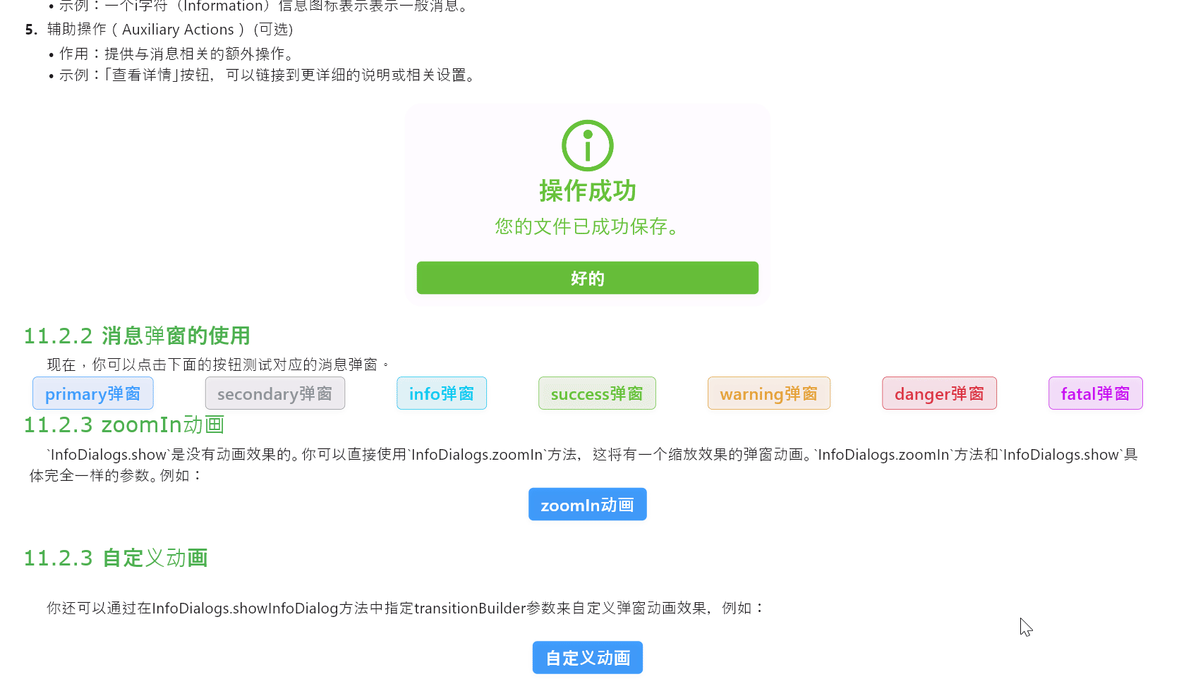
你还可以通过在InfoDialogs.showInfoDialog方法中指定transitionBuilder参数来自定义弹窗动画效果,例如:
SemanticButton(text: '自定义动画',shrink: true,onTap: () => InfoDialogs.showInfoDialog(context,title: "你好啊!",message: "这是一个消息弹窗",buttonText: "我知道了",transitionBuilder:(context, animation, secondaryAnimation, child) {return AnimateStyles.backInDown(animation, child);},onTapDismiss: () {Navigator.of(context).pop();},),
)
注:这里使用的
AnimateStyles.backInDown动画需要单独安装:flutter pub add flutter_easy_animations
其效果如下:
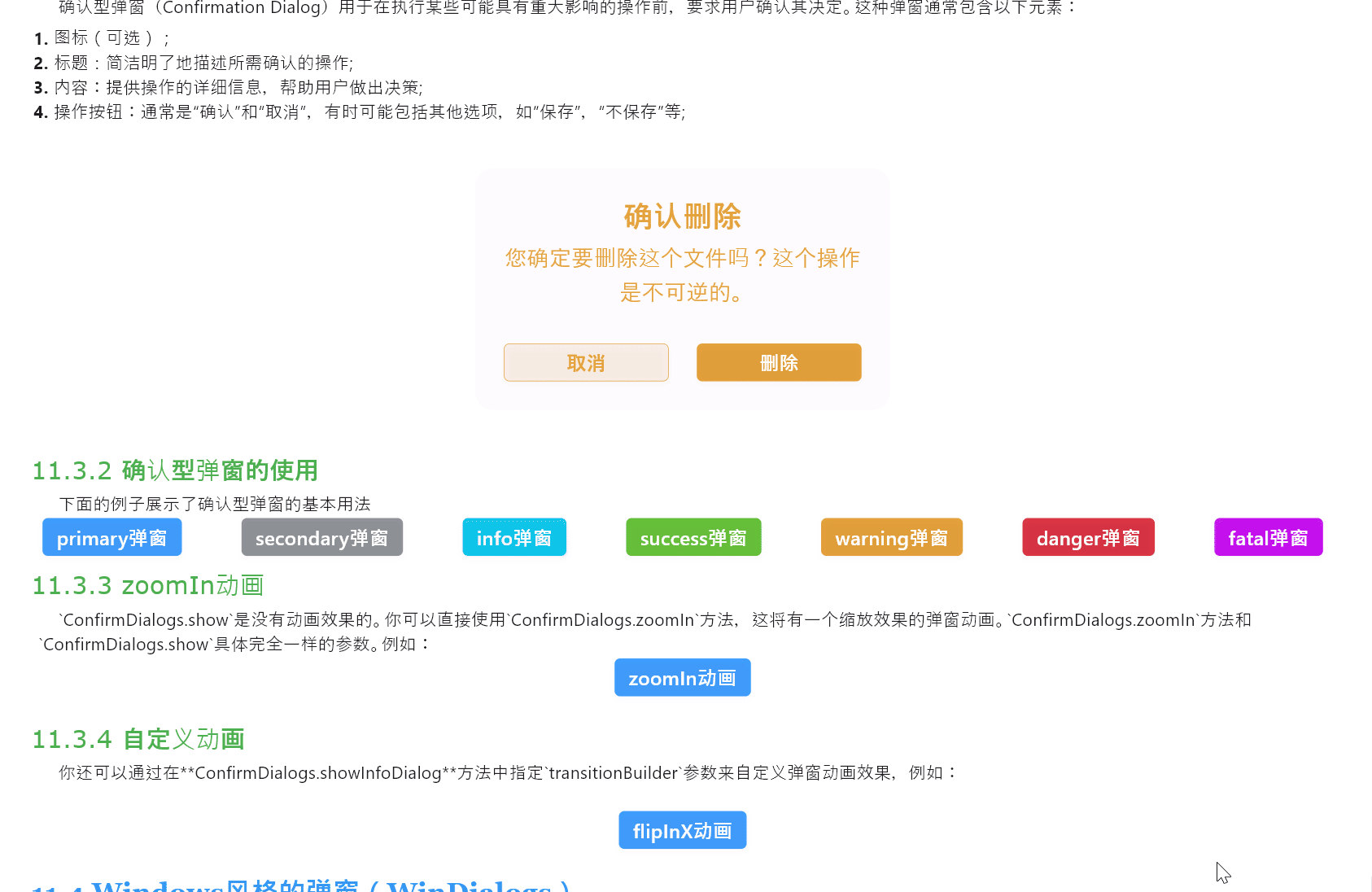
3. 确认型弹窗
3.1 弹窗构成
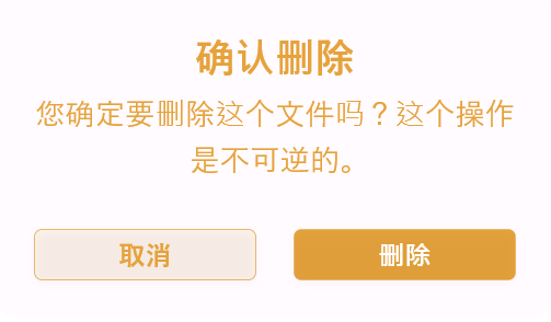
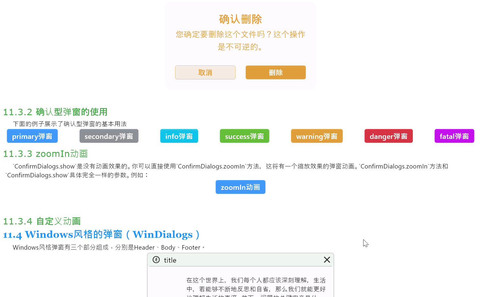
确认型弹窗(Confirmation Dialog)用于在执行某些可能具有重大影响的操作前,要求用户确认其决定。这种弹窗通常包含以下元素:
-
图标(可选);
-
标题:简洁明了地描述所需确认的操作;
-
内容:提供操作的详细信息,帮助用户做出决策;
-
操作按钮:通常是“确认”和“取消”,有时可能包括其他选项,如“保存”,“不保存”等;
其消息窗体看起来是这样的:
3.2 使用语义
你可以为ConfirmDialogs指定一个type属性,这将拥有语义性色彩。它的弹窗体看起来是这样的:
例如:
Row(mainAxisAlignment: MainAxisAlignment.spaceAround,children: [SemanticButton(text: 'primary弹窗',type: SemanticEnum.primary,onTap: () => ConfirmDialogs.show(context,title: "你确定吗",message: "这个是primary确认弹窗",confirmButtonText: "确定",cancelButtonText: "真的确定",onTapCancel: () {Navigator.of(context).pop();},onTapConfirm: () {Navigator.of(context).pop();},type: SemanticEnum.primary,),),const Gap(10),SemanticButton(text: 'secondary弹窗',type: SemanticEnum.secondary,onTap: () => ConfirmDialogs.show(context,title: "你确定吗",message: "这个是secondary确认弹窗",confirmButtonText: "确定",cancelButtonText: "真的确定",onTapCancel: () {Navigator.of(context).pop();},onTapConfirm: () {Navigator.of(context).pop();},type: SemanticEnum.secondary,),),const Gap(10),SemanticButton(text: 'info弹窗',type: SemanticEnum.info,onTap: () => ConfirmDialogs.show(context,title: "你确定吗",message: "这个是info确认弹窗",confirmButtonText: "确定",cancelButtonText: "真的确定",onTapCancel: () {Navigator.of(context).pop();},onTapConfirm: () {Navigator.of(context).pop();},type: SemanticEnum.info,),),const Gap(10),SemanticButton(text: 'success弹窗',type: SemanticEnum.success,onTap: () => ConfirmDialogs.show(context,title: "你确定吗",message: "这个是success确认弹窗",confirmButtonText: "确定",cancelButtonText: "真的确定",onTapCancel: () {Navigator.of(context).pop();},onTapConfirm: () {Navigator.of(context).pop();},type: SemanticEnum.success,),),const Gap(10),SemanticButton(text: 'warning弹窗',type: SemanticEnum.warning,onTap: () => ConfirmDialogs.show(context,title: "你确定吗",message: "这个是warning确认弹窗",confirmButtonText: "确定",cancelButtonText: "真的确定",onTapCancel: () {Navigator.of(context).pop();},onTapConfirm: () {Navigator.of(context).pop();},type: SemanticEnum.warning,),),const Gap(10),SemanticButton(text: 'danger弹窗',type: SemanticEnum.danger,onTap: () => ConfirmDialogs.show(context,title: "你确定吗",message: "这个是danger确认弹窗",confirmButtonText: "确定",cancelButtonText: "真的确定",onTapCancel: () {Navigator.of(context).pop();},onTapConfirm: () {Navigator.of(context).pop();},type: SemanticEnum.danger,),),const Gap(10),SemanticButton(text: 'fatal弹窗',type: SemanticEnum.fatal,onTap: () => ConfirmDialogs.show(context,title: "你确定吗",message: "这个是fatal确认弹窗",confirmButtonText: "确定",cancelButtonText: "真的确定",onTapCancel: () {Navigator.of(context).pop();},onTapConfirm: () {Navigator.of(context).pop();},type: SemanticEnum.fatal,),),],
)
3.2 zoomIn动画
ConfirmDialogs.show是没有动画效果的。你可以直接使用ConfirmDialogs.zoomIn方法,这将有一个缩放效果的弹窗动画。ConfirmDialogs.zoomIn方法和ConfirmDialogs.show具体完全一样的参数。例如:
SemanticButton(text: 'zoomIn动画',shrink: true,onTap: () => ConfirmDialogs.zoomIn(context,title: "你确定吗",message: "这个是确认弹窗",confirmButtonText: "确定",cancelButtonText: "真的确定",onTapCancel: () {Navigator.of(context).pop();},onTapConfirm: () {Navigator.of(context).pop();},),
)
其效果如下:
3.3 自定义动画
你还可以通过在ConfirmDialogs.showInfoDialog方法中指定transitionBuilder参数来自定义弹窗动画效果,例如:
SemanticButton(text: 'flipInX动画',shrink: true,onTap: () => ConfirmDialogs.showConfirmDialog(context,transitionBuilder:(context, animation, secondaryAnimation, child) {return AnimateStyles.flipInX(animation, child);},title: "你确定吗",message: "这个是确认弹窗",confirmButtonText: "确定",cancelButtonText: "真的确定",onTapCancel: () {Navigator.of(context).pop();},onTapConfirm: () {Navigator.of(context).pop();},),
)
注:这里使用的
AnimateStyles.flipInX动画需要单独安装:flutter pub add flutter_easy_animations
其效果如下:
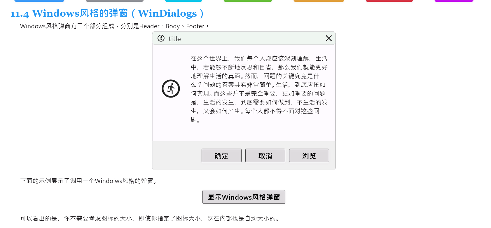
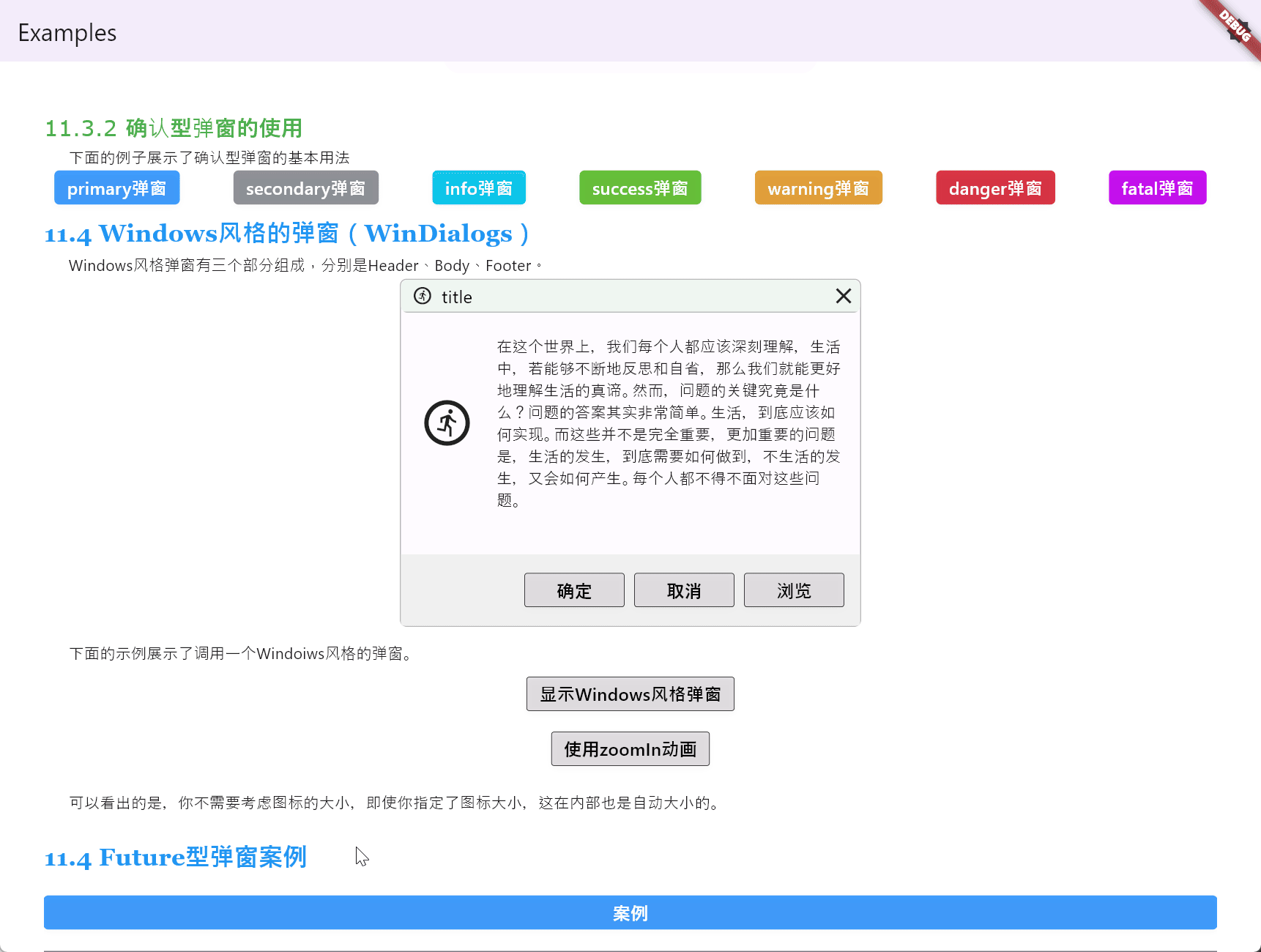
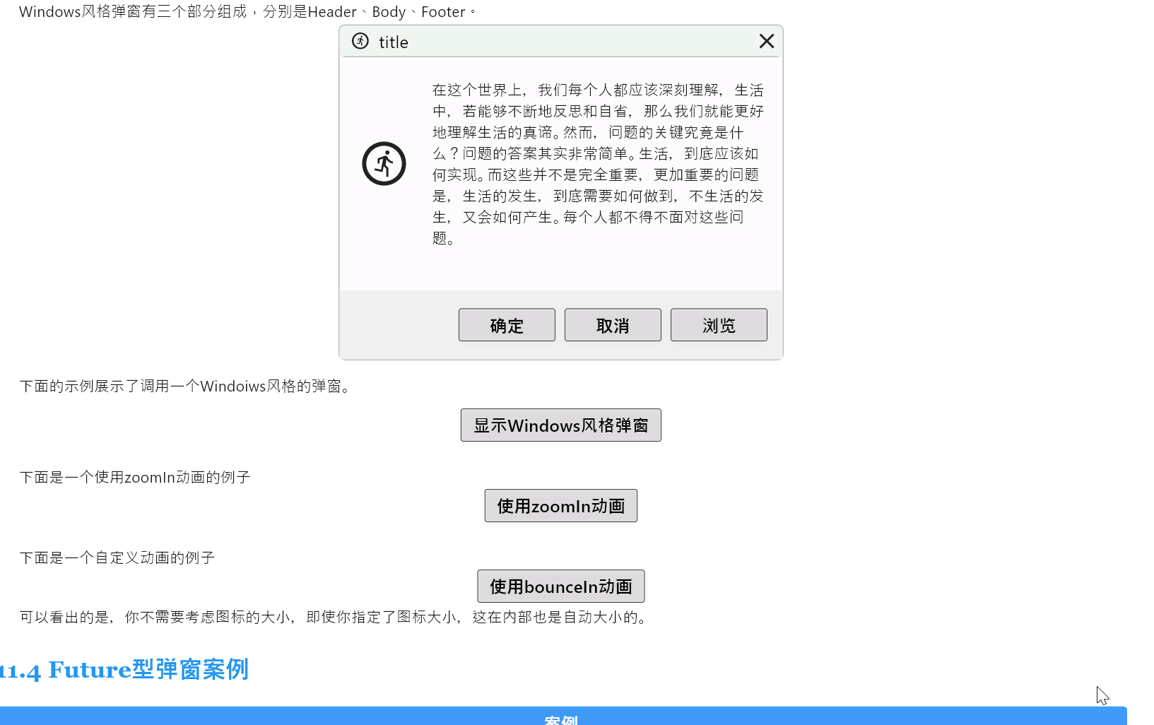
4. Windows风格弹窗
4.1 基本用法
WinDialogs是一种模仿Windows风格的弹窗。下面的示例展示了调用一个Windoiws风格的弹窗:
SemanticButton(text: '显示Windows风格弹窗',isOutlined: true,shrink: true,radius: 2,color: Colors.black,onTap: () => WinDialogs.show(context,title: 'title',icon: const Icon(Icons.run_circle_outlined),text: '在这个世界上,我们每个人都应该深刻理解,生活中,若能够不断地反思和自省,那么我们就能更好地理解生活的真谛。',contents: Row(children: [const Text('打开(O):'),const Gap(10),Expanded(child: Container(height: 25,decoration: BoxDecoration(border: Border.all(color: Colors.grey,width: 1,),borderRadius: BorderRadius.circular(2),),),),],),actions: [SemanticButton(text: '确定',width: 90,isOutlined: true,radius: 2,color: Colors.black,onTap: () {},),const Gap(10),SemanticButton(text: '取消',width: 90,isOutlined: true,radius: 2,color: Colors.black,onTap: () {},),const Gap(10),SemanticButton(text: '浏览',width: 90,isOutlined: true,radius: 2,color: Colors.black,onTap: () {},),],),
),
效果如图所示:
4.2 zoomIn动画
与之前的弹窗一样,你可以使用zoomIn方法来设置一个从小到大的弹窗动画效果,该方法用于与show方法一样的参数:
4.3 自定义动画
如果你打算自定义弹窗动画,这也是和之前的弹窗一样的。你可以使用showWinDialog,并通过transitionBuilder参数指定一个动画。例如:
SemanticButton(text: '使用bounceIn动画',isOutlined: true,shrink: true,radius: 2,color: Colors.black,onTap: () => WinDialogs.showWinDialog(context,transitionBuilder:(context, animation, secondaryAnimation, child) {return AnimateStyles.bounceIn(animation, child);},title: 'title',icon: const Icon(Icons.run_circle_outlined),text: '在这个世界上,我们每个人都应该深刻理解,生活中,若能够不断地反思和自省,那么我们就能更好地理解生活的真谛。',contents: Row(children: [const Text('打开(O):'),const Gap(10),Expanded(child: Container(height: 25,decoration: BoxDecoration(border: Border.all(color: Colors.grey,width: 1,),borderRadius: BorderRadius.circular(2),),),),],),actions: [SemanticButton(text: '确定',width: 90,isOutlined: true,radius: 2,color: Colors.black,onTap: () {},),const Gap(10),SemanticButton(text: '取消',width: 90,isOutlined: true,radius: 2,color: Colors.black,onTap: () {},),const Gap(10),SemanticButton(text: '浏览',width: 90,isOutlined: true,radius: 2,color: Colors.black,onTap: () {},),],其效果如下:
注:这里使用的
AnimateStyles.rollIn动画需要单独安装:flutter pub add flutter_easy_animations
这篇关于Flutter笔记:Widgets Easier组件库(9)使用弹窗的文章就介绍到这儿,希望我们推荐的文章对编程师们有所帮助!