本文主要是介绍前端三剑客 —— CSS (第六节),希望对大家解决编程问题提供一定的参考价值,需要的开发者们随着小编来一起学习吧!
目录
内容回顾:
弹性布局属性介绍
案例演示
商品案例
布局分析
登录案例
网格布局
内容回顾:
变量:定义变量使用 --名称:值; 使用变量: 属性名:var(--名称);
倒影: -webkit-box-reflect 了解
页面布局
table 布局 了解
div+css 盒子模型 左外边距 左边线 左内边距 内容 右内边距 右边线 右外边距
box-sizing:border-box;
弹性布局属性介绍
--- flex - direction :指定弹性容器中子元素的排列方式,默认是以水平轴为主轴,垂直轴为辅助轴。有以下几个值:
row:默认值,水平排列
Row-reverse:水平反向排列
column:垂直排列
column-reverse:垂直反向排列
--- flex - wrap :设置弹性盒子的子元素超出父容器时是否换行,有以下几个值:
nowrap:不换行,默认值
wrap:换行
wrap-reverse:换行并反向排列
--- flex-flow:它是上面两个的简写方式
--- align-items:设置弹性盒子元素再侧轴(纵轴)方向上的对齐方式,有以下几个值:
flex-start:顶对齐,默认值
Flex-end:底对齐
center:垂直居中对齐
baseline:基线对齐
stretch:拉伸充满容器
--- align-content:修改flex-wrap属性的行为,类似于align-items,但不是设置子元素对齐,而是设置行对齐
---justify-content:设置弹性盒子元素在主轴(横轴)方向上的对齐方式,有以下几个值:
flex-start:左对齐
flex-end:右对齐
center:水平居中对齐
space-around:子元素的左右空白相等对齐方式
space-betwee:子元素平均分配空白,则左右两边对齐
space-evenly:子元素平均分配空白对象
案例演示
<!DOCTYPE html>
<html lang="en">
<head>
<meta charset="UTF-8">
<title>弹性布局属性介绍</title>
<style>
* {
margin: 0;
padding: 0;
}
ul {
width: 600px;
height: 300px;
border: 1px solid #666666;
list-style: none;
display: flex;
flex-direction: row;
flex-wrap: wrap; /*nowrap,wrap, wrap-reverse*/
/*align-items: flex-start;*/
/*align-items: flex-end;*/
/*align-items: center;*/
/*align-items: baseline;*/
/*align-items: stretch;*/
/*justify-content: flex-start;*/
/*justify-content: flex-end;*/
/*justify-content: center;*/
/*justify-content: space-around;*/
/*justify-content: space-between;*/
justify-content: space-evenly;
}
li {
width: 150px;
/*height: 100px;*/
background: #317FE5;
}
li:first-child {
background: #C44F00;
}
li:nth-child(2) {
background: blue;
}
li:nth-child(3) {
background: red;
}
li:nth-child(4) {
background: #317FE5;
}
li:nth-child(5) {
background: #2A3C5C;
}
li:nth-child(6) {
background: #8B0000;
}
li:nth-child(7) {
background: #333333;
}
li:nth-child(8) {
background: blueviolet;
}
</style>
</head>
<body>
<ul>
<li>1</li>
<li>2</li>
<li>3</li>
<!--<li>4</li>-->
<!--<li>5</li>-->
<!--<li>6</li>-->
<!--<li>7</li>-->
<!--<li>8</li>-->
</ul>
</body>
</html>
商品案例

<!DOCTYPE html>
<html lang="en">
<head>
<meta charset="UTF-8">
<title>弹性布局案例</title>
<style>
* {
margin: 0;
padding: 0;
box-sizing: border-box;
font-size: 14px;
}
:root {
--letterspace: 3px;
}
.container {
width: 1100px;
height: 600px;
margin: 0 auto;
}
ul {
width: 100%;
height: 100%;
list-style: none;
display: flex;
flex-wrap: wrap;
justify-content: space-between;
}
li {
width: 260px;
height: 270px;
display: flex;
flex-direction: column;
}
li > img {
width: 260px;
}
li div.title {
width: 100%;
height: 30px;
background: #FB4E52;
padding: 3px;
display: flex;
justify-content: space-between;
}
li div.title .name {
width: 50%;
background: #9D0002;
color: white;
text-align: center;
letter-spacing: var(--letterspace);
}
li div.title .comfort {
width: 50%;
background: #ffffff;
text-align: center;
letter-spacing: var(--letterspace);
}
li div.footer {
width: 100%;
height: 30px;
background: white;
display: flex;
justify-content: space-between;
}
li div.footer .price {
width: 50%;
color: red;
font-weight: bold;
}
li div.footer .popularity {
width: 50%;
color: #989A9E;
font-size: 12px;
text-align: right;
padding-right: 5px;
}
</style>
</head>
<body>
<div class="container">
<ul>
<li>
<img src="image/111405.png">
<div class="title">
<span class="name">蕾丝薄杯</span>
<span class="comfort">舒适透气</span>
</div>
<div class="footer">
<span class="price">¥2581</span>
<span class="popularity">2000人付款</span>
</div>
</li>
<li>
<img src="image/111405.png">
<div class="title">
<span class="name">蕾丝薄杯</span>
<span class="comfort">舒适透气</span>
</div>
<div class="footer">
<span class="price">¥2581</span>
<span class="popularity">2000人付款</span>
</div>
</li>
<li>
<img src="image/111405.png">
<div class="title">
<span class="name">蕾丝薄杯</span>
<span class="comfort">舒适透气</span>
</div>
<div class="footer">
<span class="price">¥2581</span>
<span class="popularity">2000人付款</span>
</div>
</li>
<li>
<img src="image/111405.png">
<div class="title">
<span class="name">蕾丝薄杯</span>
<span class="comfort">舒适透气</span>
</div>
<div class="footer">
<span class="price">¥2581</span>
<span class="popularity">2000人付款</span>
</div>
</li>
<li>
<img src="image/111405.png">
<div class="title">
<span class="name">蕾丝薄杯</span>
<span class="comfort">舒适透气</span>
</div>
<div class="footer">
<span class="price">¥2581</span>
<span class="popularity">2000人付款</span>
</div>
</li>
<li>
<img src="image/111405.png">
<div class="title">
<span class="name">蕾丝薄杯</span>
<span class="comfort">舒适透气</span>
</div>
<div class="footer">
<span class="price">¥2581</span>
<span class="popularity">2000人付款</span>
</div>
</li>
<li>
<img src="image/111405.png">
<div class="title">
<span class="name">蕾丝薄杯</span>
<span class="comfort">舒适透气</span>
</div>
<div class="footer">
<span class="price">¥2581</span>
<span class="popularity">2000人付款</span>
</div>
</li>
<li>
<img src="image/111405.png">
<div class="title">
<span class="name">蕾丝薄杯</span>
<span class="comfort">舒适透气</span>
</div>
<div class="footer">
<span class="price">¥2581</span>
<span class="popularity">2000人付款</span>
</div>
</li>
</ul>
</div>
</body>
</html>
布局分析

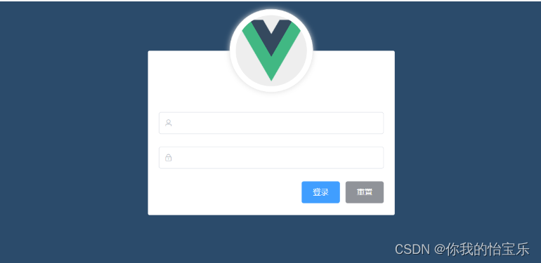
登录案例
<!DOCTYPE html>
<html lang="en">
<head>
<meta charset="UTF-8">
<title>弹性布局之登录案例</title>
<style>
* {
margin: 0;
padding: 0;
box-sizing: border-box;
}
body {
background: #2B4B6B;
}
.container {
width: 450px;
height: 300px;
background: white;
border-radius: 5px;
position: absolute;
left: 50%;
top: 50%;
transform: translate(-50%, -50%);
}
.logo_box {
position: absolute;
left: 50%;
width: 130px;
height: 130px;
border-radius: 50%;
border: 1px solid #eeeeee;
padding: 10px;
box-shadow: 0 0 10px #dddddd;
transform: translate(-50%, -50%);
background: white;
}
.logo_box > img {
position: absolute;
left: 10px;
top: 10px;
width: 110px;
height: 110px;
background: #eeeeee;
border-radius: 50%;
}
.info_box {
margin: 90px auto;
width: 90%;
height: 150px;
display: flex;
flex-direction: column; /* 将纵轴变为主轴 */
justify-content: space-around;
position: relative;
}
.info_box > .account > input {
border: 1px solid #EDEFF3;
height: 25px;
border-radius: 5px;
outline: none;
padding-left: 30px;
}
.info_box > .account > img {
width: 20px;
height: 20px;
position: absolute;
left: 5px;
top: 15px;
}
.info_box > .passwd > input {
border: 1px solid #EDEFF3;
height: 25px;
border-radius: 5px;
outline: none;
padding-left: 30px;
}
.info_box > .passwd > img {
width: 20px;
height: 20px;
position: absolute;
left: 5px;
top: 62px;
}
.info_box > input:focus {
border: 1px solid #409EFF;
}
.btn_box {
width: 100%;
height: 30px;
display: flex;
justify-content: flex-end;
align-items: center;
}
.btn_box > input {
width: 60px;
height: 30px;
margin-left: 5px;
color: white;
}
.btn_box > input[type="reset"] {
background: #909399;
border: none;
border-radius: 3px;
}
.btn_box > input[type="submit"] {
background: #409EFF;
border: none;
border-radius: 3px;
}
</style>
</head>
<body>
<div class="container">
<div class="logo_box">
<img src="image/logo.png">
</div>
<form action="" method="post">
<div class="info_box">
<div class="account">
<img src="image/man.png">
<input type="text" name="username">
</div>
<div class="passwd">
<img src="image/lock.png">
<input type="password" name="password">
</div>
<div class="btn_box">
<input type="submit" value="登录">
<input type="reset" value="重置">
</div>
</div>
</form>
</div>
</body>
</html>
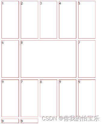
网格布局
前面的弹性布局只适合用于对一维布局,而对于二维布局就不行,我们就需要要用网格布局来实现。通过行(row)和列(column)来构成。
下面以一个简单案例来演示网格布局如何使用。案例的效果图如下:
<!DOCTYPE html>
<html lang="en">
<head>
<meta charset="UTF-8">
<title>网格布局</title>
<style>
.box {
/* 定义容器的大小 */
width: 500px;
height: 400px;
/* 1. 启用网格布局*/
display: grid;
/* 2. 设置网格布局的列数,需要使用 grid-template-columns 属性,它的值可以是固定值,也可以是百分比 */
/*grid-template-columns: 20% 20% 20% 20% 20%;*/
grid-template-columns: repeat(5, 1fr); /* 重复 5 次(即 5 列), 1fr 表示等比例 */
/* 2. 设置网格布局的行数,需要使用 grid-template-rows 属性,它的值可以是固定值,也可以是百分比 */
/*grid-template-rows: 200px 200px 200px;*/
grid-template-rows: repeat(3, 200px);
/* 3. 设置单元格的间距 */
grid-gap: 10px;
}
.box > div {
border: 1px solid red;
}
.box > .test {
/*grid-row-start: 2; !* 指定开始行所在位置,这个值包含 *!*/
/*grid-row-end: 3; !* 指定结束行所在位置,这个值不包含 *!*/
/*grid-column-start: 2; !* 指定开始的列所在位置,这个值是包含的 *!*/
/*grid-column-end: 5; !* 指定结束的列所在位置,这个值不包含 *!*/
/* 上面的写法可以简化为下面的写法,格式为:开始行(或列)的位置 / 结束行(或列)的位置 */
/*grid-row: 2 / 3;*/
/*grid-column: 2 / 5;*/
/* 还可以简化为如下的写法:格式为:开始行位置 / 开始列位置 / 结束行位置 / 结束列位置 */
grid-area: 2 / 2 / 3 / 5;
}
</style>
</head>
<body>
<div class="box">
<div>1</div>
<div>2</div>
<div>3</div>
<div>4</div>
<div>5</div>
<div>6</div>
<div>7</div>
<div class="test">8</div>
<div>9</div>
<div>7</div>
<div>8</div>
<div>9</div>
<div>9</div>
<div>9</div>
<div>9</div>
</div>
</body>
</html>
这篇关于前端三剑客 —— CSS (第六节)的文章就介绍到这儿,希望我们推荐的文章对编程师们有所帮助!