本文主要是介绍JetPackCompose之Text使用指北,希望对大家解决编程问题提供一定的参考价值,需要的开发者们随着小编来一起学习吧!

Jetpack Compose系列(6) - 文本组件
对应View体系中传统的TextView,Jetpack Compose中用Text组件来显示文本信息。跟其他组件一样,它在构造函数里就包含控制文本显示样式的一些属性,下面是其参数及解释:
@Composable
fun Text(text: String, //显示的文本modifier: Modifier = Modifier, //修饰符color: Color = Color.Unspecified, //文字颜色fontSize: TextUnit = TextUnit.Unspecified, //文字大小fontStyle: FontStyle? = null, //文字风格,可设置为斜体ItalicfontWeight: FontWeight? = null, //文字权重,可设置加粗等fontFamily: FontFamily? = null, //文字字体letterSpacing: TextUnit = TextUnit.Unspecified, //文字间距textDecoration: TextDecoration? = null, //文字修饰(下划线等)textAlign: TextAlign? = null, //文字对齐方式lineHeight: TextUnit = TextUnit.Unspecified, //文字行高overflow: TextOverflow = TextOverflow.Clip, //文字溢出处理softWrap: Boolean = true, //文字是否换行maxLines: Int = Int.MAX_VALUE, //文本最大行数onTextLayout: (TextLayoutResult) -> Unit = {}, //文字布局发生变化时的回调style: TextStyle = LocalTextStyle.current //文本的样式配置
)
我们一般将常用的文本放在string.xml文件中,如果想要获取这里的资源,可以通过stringResource来获取,这个在上一篇文章提到过,这里再说一次Compose中各种资源的获取方式:
文本 -> stringResource(R.string.app_name)颜色 -> colorResource(R.color.black)尺寸 -> dimensionResource(R.dimen.padding_small)图片 -> painterResource(R.drawable.ic_logo)
常见的文本样式
最常见的Text文本样式莫过于Hello Android官方生成的使用以 String 作为参数的 Text 组件:
@Composable
fun Greeting(name: String) {Text(text = "Hello $name!")
}
当然,平时正式开发里都是将String写在string.xml中调用,对应代码如下:
//string.xml中:
<string name="app_title_hello">Hello</string>//....kt中:
@Composable
fun Greeting(name: String) {Text(stringResource(R.string.app_title_hello) + name)
}
Text的属性可以单独设置,也可以同时设置:
@Composable
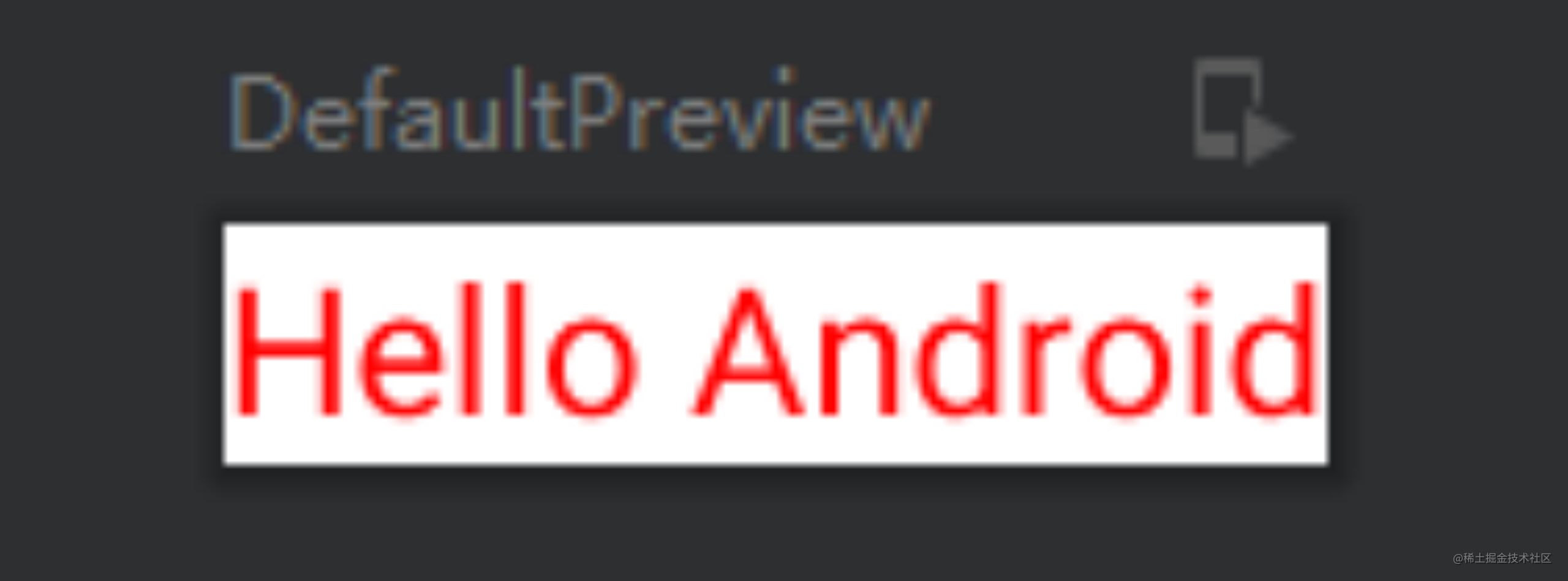
fun Greeting(name: String) {Column() {//基础使用Text(stringResource(R.string.app_title_hello) + name)//文字大小,sp关键字需要导入Text("Hello Android", fontSize = 30.sp)//斜体Text("Hello Android", fontStyle = FontStyle.Italic)//字体加粗Text("Hello Android", fontWeight = FontWeight.Bold)//文字溢出(显示省略号) repeat是重复的意思,文本内容是20个Hello Android组成的字符串Text(text = "Hello Android".repeat(20),overflow = TextOverflow.Ellipsis,maxLines = 2)}
}
对应的生成效果为:
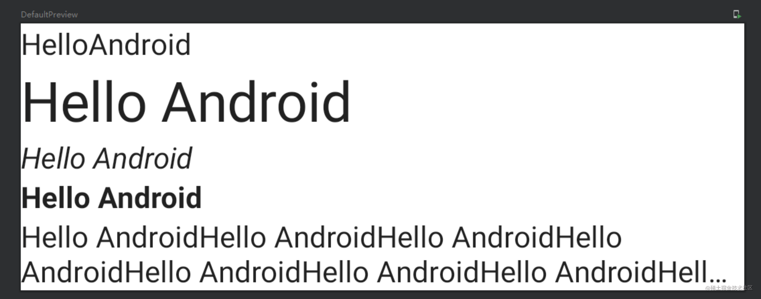
各基础属性及显示可以从图中一览。
fontWeight(权重)
fontWeight : 文字权重,可设置加粗。取值范围:1 - 1000。其中W100 ~ W900为其伴生对象里的默认取值,方便调用。具体数值如下:
companion object {/** [Thin] */@Stableval W100 = FontWeight(100)/** [ExtraLight] */@Stableval W200 = FontWeight(200)/** [Light] */@Stableval W300 = FontWeight(300)/** [Normal] / regular / plain */@Stableval W400 = FontWeight(400)/** [Medium] */@Stableval W500 = FontWeight(500)/** [SemiBold] */@Stableval W600 = FontWeight(600)/** [Bold] */@Stableval W700 = FontWeight(700)/** [ExtraBold] */@Stableval W800 = FontWeight(800)/** [Black] */@Stableval W900 = FontWeight(900)/** Alias for [W100] */@Stableval Thin = W100/** Alias for [W200] */@Stableval ExtraLight = W200/** Alias for [W300] */@Stableval Light = W300/** The default font weight - alias for [W400] */@Stableval Normal = W400/** Alias for [W500] */@Stableval Medium = W500/** Alias for [W600] */@Stableval SemiBold = W600/*** A commonly used font weight that is heavier than normal - alias for [W700]*/@Stableval Bold = W700/** Alias for [W800] */@Stableval ExtraBold = W800/** Alias for [W900] */@Stableval Black = W900/** A list of all the font weights. */internal val values: List<FontWeight> = listOf(W100,W200,W300,W400,W500,W600,W700,W800,W900)
}
其权重从Thin到Black依次增大,对应字体依次增粗。
fontSize(大小字号)
即设置字体大小,fontSize为类型为TextUnit,而Compose框架中扩展了Int函数dp、sp,所以直接调用即可。这里还可以直接调用TextUnit中的新单位em,1em = 16px
Text("Hello Android",fontSize = 30.dp)
Text("Hello Android",fontSize = 30.em)
color(字体颜色)
文字颜色可以通过color属性配置,也可通过配置资源文件,从color.xml中读取:
Text("Hello Android",color = Color.Blue)
Text("Hello Android",color = colorResource(R.color.purple_200))
fontStyle(文字风格)
用来设置斜体,该类为枚举类型,支持设置正常和斜体。
Text("Hello Android", fontStyle = FontStyle.Italic)
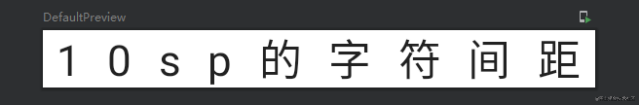
letterSpacing(文字字符间距)
letterSpacing配置字间距属性,这里注意单位必须使用sp,不能使用dp。
Text(text = "10sp的字符间距", letterSpacing = 10.sp)
注意这里是文字中每个字符的间距:
lineHeight(文字行高)
lineHeight配置文字行高,类似于TextVIew中的android:lineSpacingExtra和android:lineSpacingMultiplier组合效果,单位同字间距一样也是sp,且必须多行文字才会有效果。
Text(text = "行高间距",lineHeight = 40.sp)
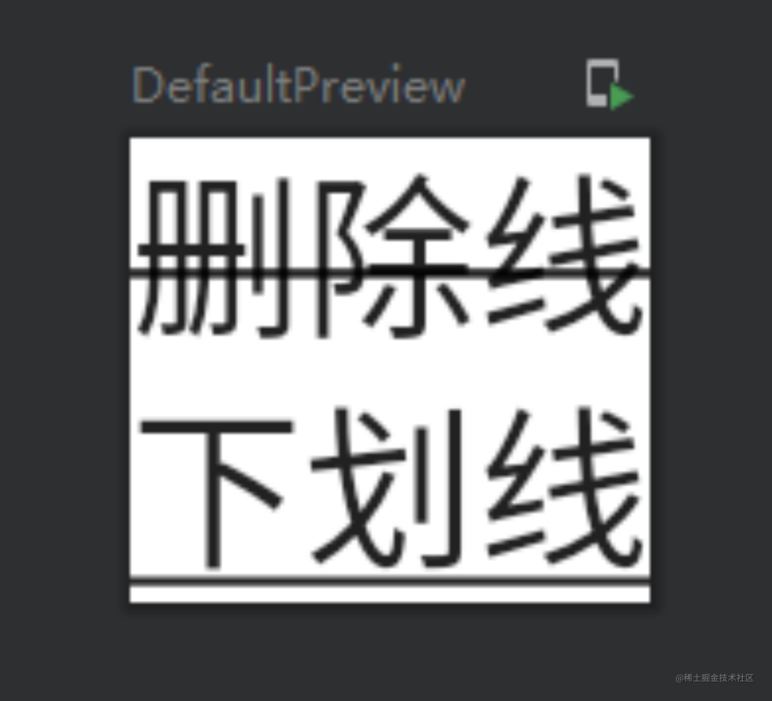
textDecoration(删除线、下划线)
textDecoration属性配置删除线、下划线,属性类型为TextDecoration。例如:
Column() {Text(text = "删除线",textDecoration = TextDecoration.LineThrough)Text(text = "下划线",textDecoration = TextDecoration.Underline)
}
对应效果为:
textAlign(对齐方式)
textAlign属性配置文本对齐方式(如果设置了text宽度,则文本长度要小于宽度,否则无效果):
Text(text = "对齐",textAlign = TextAlign.End)
Text(text = "对齐",textAlign = TextAlign.End,modifier = Modifier.width(200.dp))
可以看出TextAlign是个枚举类,其伴生对象就声明了内置的对齐方向:
companion object {/** Align the text on the left edge of the container. */val Left = TextAlign(1)/** Align the text on the right edge of the container. */val Right = TextAlign(2)/** Align the text in the center of the container. */val Center = TextAlign(3)/*** Stretch lines of text that end with a soft line break to fill the width of* the container.** Lines that end with hard line breaks are aligned towards the [Start] edge.*/val Justify = TextAlign(4)/*** Align the text on the leading edge of the container.** For Left to Right text ([ResolvedTextDirection.Ltr]), this is the left edge.** For Right to Left text ([ResolvedTextDirection.Rtl]), like Arabic, this is the right edge.*/val Start = TextAlign(5)/*** Align the text on the trailing edge of the container.** For Left to Right text ([ResolvedTextDirection.Ltr]), this is the right edge.** For Right to Left text ([ResolvedTextDirection.Rtl]), like Arabic, this is the left edge.*/val End = TextAlign(6)/*** Return a list containing all possible values of TextAlign.*/fun values(): List<TextAlign> = listOf(Left, Right, Center, Justify, Start, End)
}
这里说明一下,默认情况下,Text 会根据其内容值选择自然的文字对齐方式:对于从左到右书写的文字,如拉丁语、西里尔文或朝鲜文,向 Text 容器的左边缘对齐;对于从右到左书写的文字,如阿拉伯语或希伯来语,向 Text 容器的右边缘对齐。
如果你要手动设置方向,最好分别使用 TextAlign.Start 和 TextAlign.End(而不要使用 TextAlign.Left 和 TextAlign.Right),这样系统就可以根据具体语言的首选文字方向,将你的设置解析为向 Text 的右边缘对齐。比如,TextAlign.End 对于法语文字将向右侧对齐,而对于阿拉伯语文字则将向左侧对齐,但无论对于哪种文字,TextAlign.Right 都将向右侧对齐。
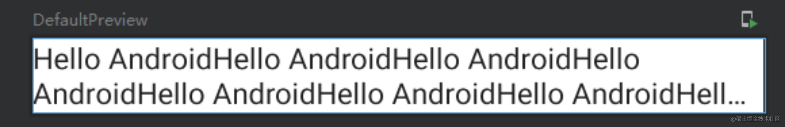
overflow+maxLines(文字溢出)
TextView可以通过android:ellipsize="end"和android:lines="1"来实现溢出后省略号表示,Compose中则是maxLines和overflow属性来实现。默认是截取效果:
Text(text = "Hello Android".repeat(20),overflow = TextOverflow.Ellipsis,maxLines = 2)
对应效果如下:
这里还有个属性,softWrap,是否自动换行,经常配合一起使用。
textStyle
textStyle可以设置Text的颜色、字号、行高、文本缩进、倒影等属性效果。其属性如下:
@Immutable
class TextStyle(val color: Color = Color.Unspecified,val fontSize: TextUnit = TextUnit.Unspecified,val fontWeight: FontWeight? = null,val fontStyle: FontStyle? = null,val fontSynthesis: FontSynthesis? = null,val fontFamily: FontFamily? = null,val fontFeatureSettings: String? = null,val letterSpacing: TextUnit = TextUnit.Unspecified,val baselineShift: BaselineShift? = null,val textGeometricTransform: TextGeometricTransform? = null,val localeList: LocaleList? = null,val background: Color = Color.Unspecified,val textDecoration: TextDecoration? = null,val shadow: Shadow? = null,val textAlign: TextAlign? = null,val textDirection: TextDirection? = null,val lineHeight: TextUnit = TextUnit.Unspecified,val textIndent: TextIndent? = null
)
例如如下示例:
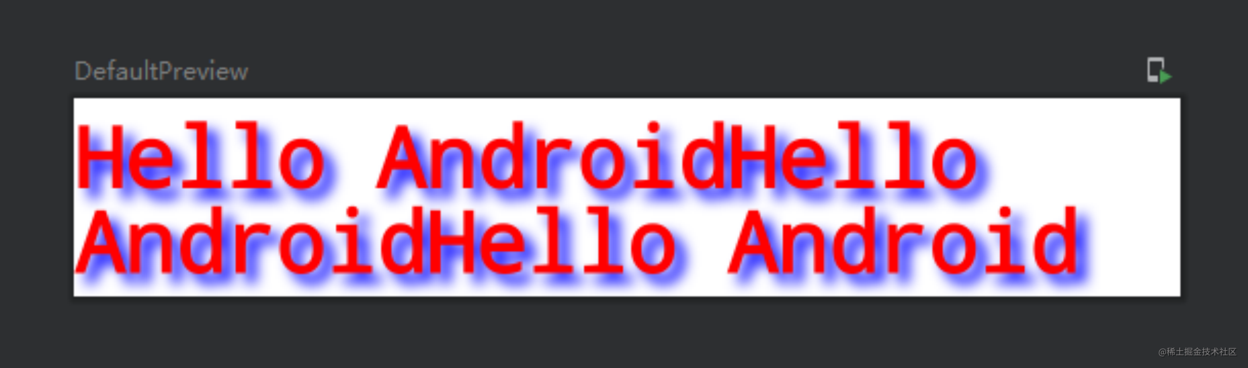
Text(text = "Hello Android".repeat(3),
style = androidx.compose.ui.text.TextStyle(color = Red,fontSize = 30.sp,lineHeight = 30.sp,fontWeight = FontWeight.Bold,fontFamily = FontFamily.Monospace,fontStyle = FontStyle.Normal,shadow = Shadow(color = Blue,offset = Offset(10.0f,10.0f),blurRadius = 10.0f)
))
对应的效果为:
多样式单行文本
实际开发中经常会遇到这样的需求,一行文本中,其中某个字符可以点击,或者某个词语需要加粗变色显示,一般都用TextView进行封装来实现这样效果。但在Compose中可以使用Text的AnnotatedString属性来实现。
AnnotatedString:一种具有多种样式的文本的基本数据结构。
官方推荐可以使用构建器来生成对象,即buildAnnotatedString()函数。
Text(buildAnnotatedString {withStyle(style = ParagraphStyle(lineHeight = 20.sp)) {withStyle(style = SpanStyle(color = Color.RED)) {  //设置为红色字体append("Hello Android")}}}
)
对应的预览显示为:
这段代码中buildAnnotatedString()函数里的withStyle和append函数其实是AnnotatedString.Builder类里的函数(lambda表达式,buildAnnotatedString花括号里的对象实例即为AnnotatedString.Builder类型)。
withStyle函数可以设置:
· 段落、多行样式:ParagraphStyle()
· 单行样式:SpanStyle()
SpanStyle的构造函数:
@Immutable
class SpanStyle(val color: Color = Color.Unspecified,val fontSize: TextUnit = TextUnit.Unspecified,val fontWeight: FontWeight? = null,val fontStyle: FontStyle? = null,val fontSynthesis: FontSynthesis? = null,val fontFamily: FontFamily? = null,val fontFeatureSettings: String? = null,val letterSpacing: TextUnit = TextUnit.Unspecified,val baselineShift: BaselineShift? = null,val textGeometricTransform: TextGeometricTransform? = null,val localeList: LocaleList? = null,val background: Color = Color.Unspecified,val textDecoration: TextDecoration? = null,val shadow: Shadow? = null
)
可以看出跟Text还是比较像的,除了没有内容外。当然,如果这个可以设置文本内容属性,那还要Text干啥。
ParagraphStyle的构造函数则简洁得多:
@Immutable
class ParagraphStyle constructor(val textAlign: TextAlign? = null,val textDirection: TextDirection? = null,val lineHeight: TextUnit = TextUnit.Unspecified,val textIndent: TextIndent? = null
)
主要是一些行高,对齐方向,index位置等。
append()的作用就更容易理解了,就是把前面声明的段落对象赋值给相应的文本。
这些组合一起就可以玩出更多花样出来。
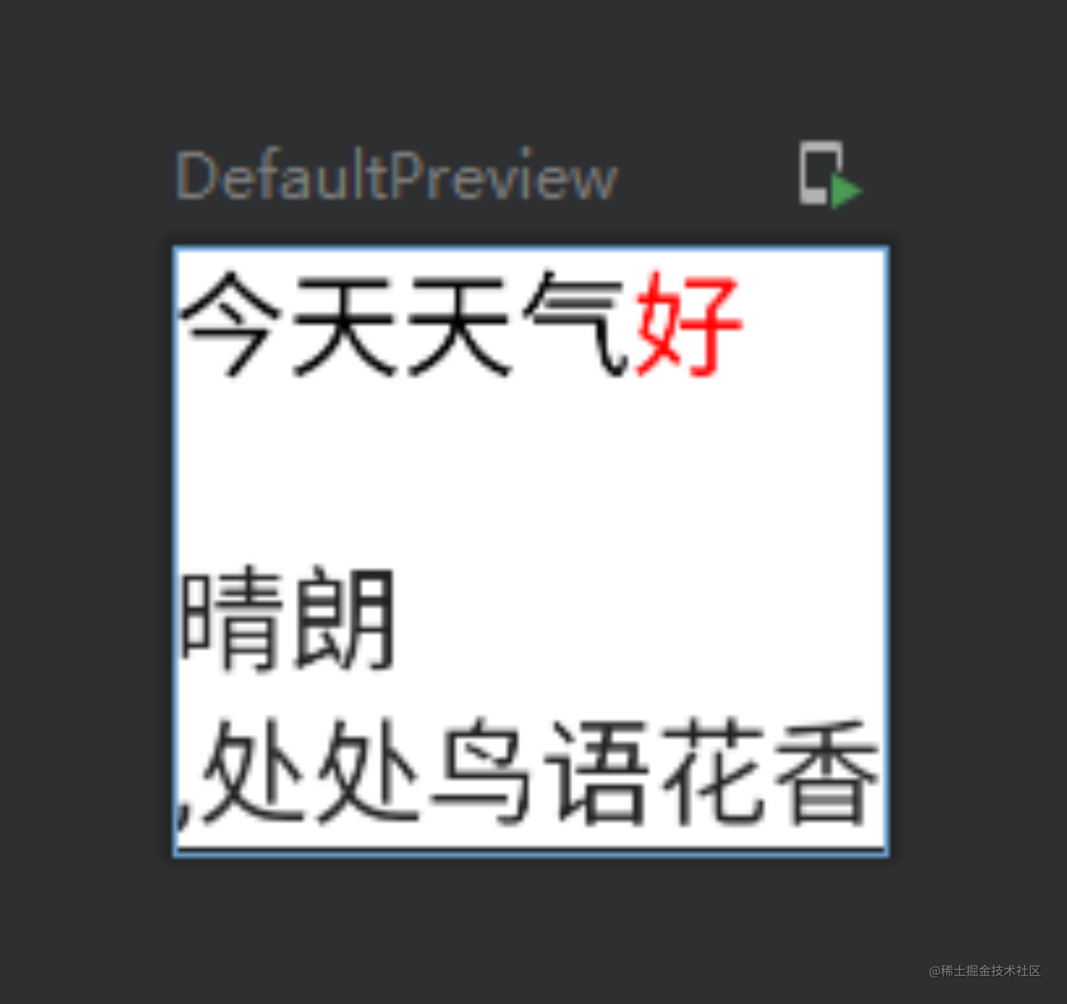
Text(buildAnnotatedString {withStyle(ParagraphStyle()) {withStyle(SpanStyle(color = Black)) {append("今天天气")}withStyle(SpanStyle(color = Red)) {append("好 \n")    //这里支持换行转义符 \n}}withStyle(ParagraphStyle()) {append("晴朗")}append(",处处鸟语花香")
})
对应的预览为:
长按可选择文本
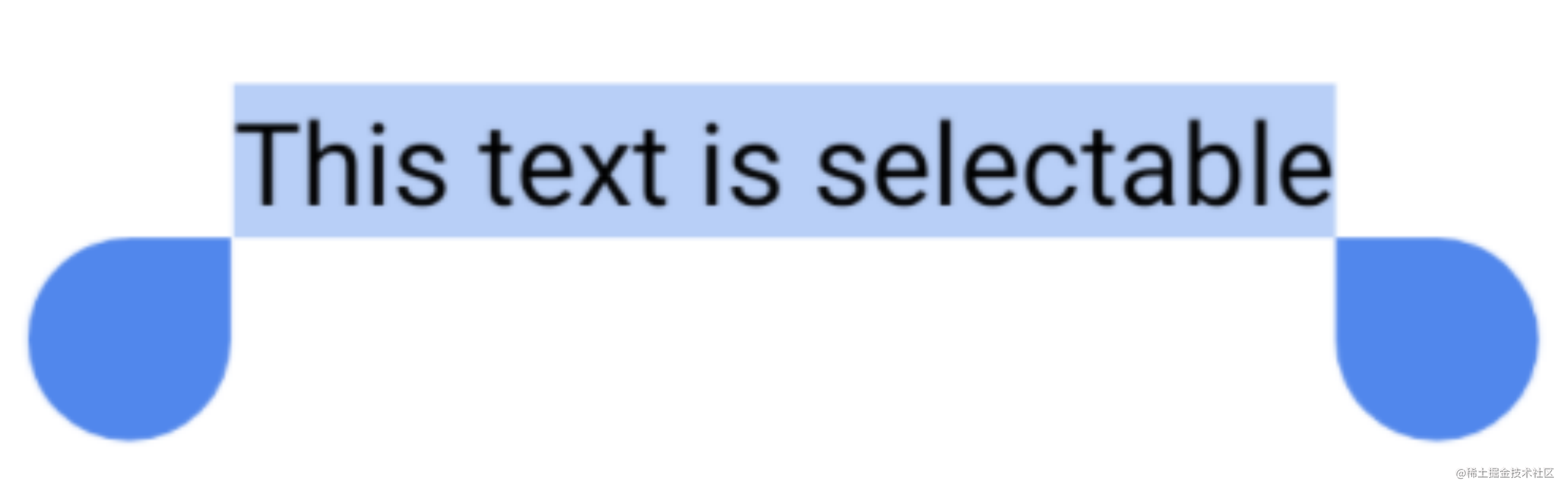
Text默认情况下是无法被选中的,SelectionContainer函数的出现即为了实现选择效果。例如:
SelectionContainer {Text("This text is selectable")
}
对应生成的Text即可选中:
ClickableText(可点击文本)
在之前的文章中说过,设置点击事件可通过Modifier的clickable函数,且点击会有水波纹。但这样的点击事件响应的是text的整体,在想要部分文本可点击的情况下就显得不是那么灵活。
对此,官方推荐使用 ClickableText 控件,与其他控件不同,此控件只接受AnnotatedString文本,不接受常规字符串文本参数。
ClickableText(text = AnnotatedString("Click Me"),onClick = { index ->//处理事件Log.i("clickabletext","you clicked the position $index")}
)
这里是明显的kotlin的lamba表达式,对应的index的值即是你点击的字符所在text中的位置。
点击文本超链接
平时开发中,也经常会被要求使用超链接(链接文本,点击会跳到浏览器里打开相应的web页面)实现某个需求。
官方建议,在AnnotatedString构造对象的时候,使用pushStringAnnotation()和pop()方法。
pushStringAnnotation():设置超链接存放的数据和标签。
pop():超链接段落结束。
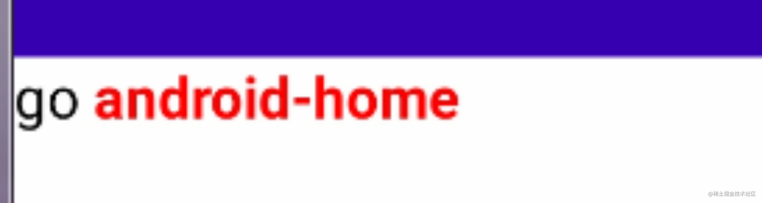
例如:
val annotatedText = buildAnnotatedString {append("Go ")pushStringAnnotation(tag = "URL",annotation = "https://developer.android.com")withStyle(style = SpanStyle(color = Red,fontWeight = FontWeight.Bold)) {append("android-home")}pop()
}
ClickableText(text = annotatedText,onClick = { index ->val stringAnnotations = annotatedText.getStringAnnotations("URL", index, index)stringAnnotations.firstOrNull()?.let { annotation ->//可继续逻辑操作...}}
)
对应运行界面显示为:
PS:firstOrNull()是找List中的第一个对象,找不到则则返回null。
以上代码可以看出,在声明AnnotatedString对象的时候,使用pushStringAnnotation()存下相应的标签和数据,之后在点击事件中通过AnnotatedString的getStringAnnotations()方法获取内容,进行标签匹配(没错,这里可以写多个,然后根据标签去匹配是哪个链接)。然后进行跳转地址等逻辑操作。
· pushStringAnnotation()方法中的两个参数,一个是Tag即标签,这里写的是“URL”,请确保Tag标签的唯一性,对应一个annotation数据只有唯一一个标签。另一个参数annotation是数据,只支持String格式。另外一点注意后面需要调用pop()方法。
· getStringAnnotations()返回的是一个List对象,有两个构造函数,这里只用到了一个,感兴趣的可以自行验证,这里不做赘述。
以上内容便是JetpackCompose中的Text组件的使用方法。
这篇关于JetPackCompose之Text使用指北的文章就介绍到这儿,希望我们推荐的文章对编程师们有所帮助!