本文主要是介绍vue 中使用 iframe 嵌入网页,页面可自适应,希望对大家解决编程问题提供一定的参考价值,需要的开发者们随着小编来一起学习吧!
在项目中遇到要嵌入第三方网页的需求,因为没有同第三方页面交互的需求,只需展示即可,所以最终决定使用 iframe 将第三方的网页嵌入到系统中,并且做到自适应效果。考虑到以后可能会增加嵌入页面的数量,故而封装成组件,供以后复用:
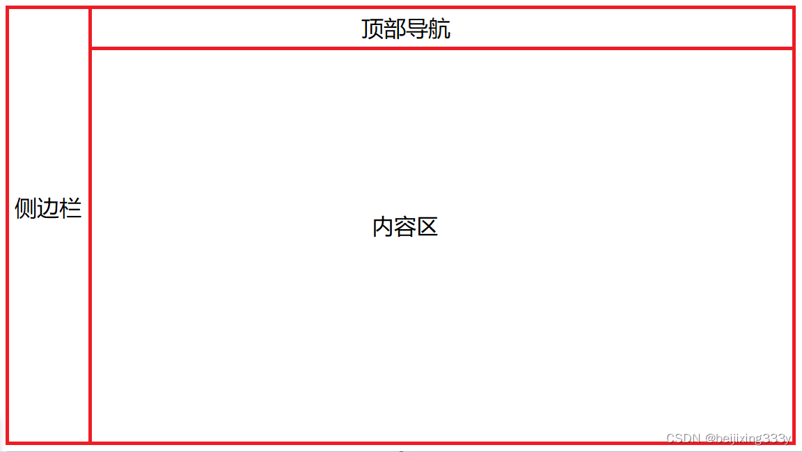
上图为系统整体结构图,需要在内容区内展示 iframe 的内容,并且做到自适应。整体代码如下:
<template><div class="iframe-container"><iframe id="iframeContainer" :src="iframeUrl" frameborder="0" /></div>
</template><script>
import { mapGetters } from 'vuex'export default {name: 'IframeContainer',props: {iframeUrl: {type: String,default: ''}},data() {return {}},computed: {...mapGetters(['sidebar'])},watch: {'sidebar.opened': {handler: function() {this.initIframe()},immediate: true}},mounted() {this.initIframe()window.onresize = () => {this.initIframe()}},methods: {initIframe() {const iframeContainer = document.getElementById('iframeContainer')const deviceWidth = document.body.clientWidthconst deviceHeight = document.body.clientHeightiframeContainer.style.width = this.sidebar.opened ? (Number(deviceWidth) - 293) + 'px' : (Number(deviceWidth) - 71) + 'px'iframeContainer.style.height = (Number(deviceHeight) - 110) + 'px'}}
}
</script><style lang="scss" scoped>.iframe-container {width: 100%;height: 100%;}
</style>
要确保嵌入的页面做到自适应的效果,首先保证 iframe 是自适应的,此处关键代码:
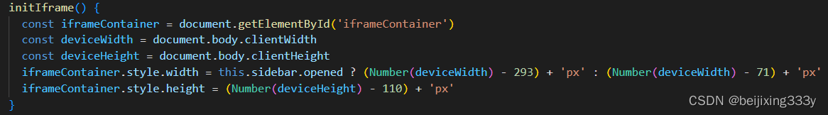
动态计算 iframe 的宽度和高度,计算时需要减去侧边栏宽度、内容区 padding、顶部导航高度等。
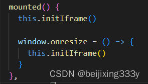
监听窗口大小改变事件,触发 iframe 宽度高度计算方法,重新为 iframe 设置宽度和高度:
如果系统侧边栏或者顶部导航是可收缩的,还需监听收缩事件,进而改变 iframe 高度和宽度:
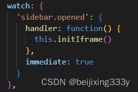
此处监听 sidebar 的展开状态,在此不做过多赘述。
这篇关于vue 中使用 iframe 嵌入网页,页面可自适应的文章就介绍到这儿,希望我们推荐的文章对编程师们有所帮助!