本文主要是介绍styled-components 的用法,希望对大家解决编程问题提供一定的参考价值,需要的开发者们随着小编来一起学习吧!
用于给标签或组件添加样式
给标签或组件添加样式
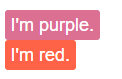
import styled from 'styled-components'// styled.button : 给button标签添加样式
const Button = styled.button`background: palevioletred;border-radius: 3px;border: none;color: white;
`// styled(Button) : 给Button组件添加样式
const TomatoButton = styled(Button)`background: tomato;
`render(<><Button>I'm purple.</Button><br /><TomatoButton>I'm red.</TomatoButton></>
)
通过变量赋值
import styled from 'styled-components'const padding = '3em'const Section = styled.section`color: white;/* Pass variables as inputs *//* 使用变量赋值 */padding: ${padding};/* Adjust the background from the properties *//* 通过props改变背景 */background: ${props => props.background};
`render(<Section background="cornflowerblue">✨ Magic</Section>
)

同时设置属性和样式
import styled from 'styled-components'const Input = styled.input.attrs(props => ({type: 'text',size: props.small ? 5 : undefined,}))`border-radius: 3px;border: 1px solid palevioletred;display: block;margin: 0 0 1em;padding: ${props => props.padding};::placeholder {color: palevioletred;}`render(<><Input small placeholder="Small" /><Input placeholder="Normal" /><Input padding="2em" placeholder="Padded" /></>
)

临时的props
防止样式组件使用的props传递给Dom元素或其底层React节点,可以使用$标识一个只用于样式的临时props属性
const Comp = styled.div`color: ${props =>props.$draggable || 'black'};
`;render(<Comp $draggable="red" draggable="true">Drag me!</Comp>
);

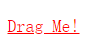
shouldForwardProp
通过数组过滤不需要透传的props属性,!['hidden'].includes(prop)
const Comp =
styled('div')
.withConfig({shouldForwardProp: (prop, defaultValidatorFn) =>!['hidden'].includes(prop)&& defaultValidatorFn(prop),
})
.attrs({ className: 'foo' })
`color: red;&.foo {text-decoration: underline;}
`;render(<Comp hidden draggable="true">Drag Me!</Comp>
);
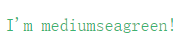
ThemeProvider
用于注入主题的辅助组件
import styled, { ThemeProvider } from 'styled-components'const Box = styled.div`color: ${props => props.theme.color};
`render(<ThemeProvider theme={{ color: 'mediumseagreen' }}><Box>I'm mediumseagreen!</Box></ThemeProvider>
)
直接添加样式,不生成多余的组件
前提:配置Babel
<divcss={`background: papayawhip;color: ${props => props.theme.colors.text};`}
/><Buttoncss="padding: 0.5em 1em;"
/>
Babel会把带有css属性的元素转换为样式组件
import styled from 'styled-components';const StyledDiv = styled.div`background: papayawhip;color: ${props => props.theme.colors.text};
`const StyledButton = styled(Button)`padding: 0.5em 1em;
`<StyledDiv />
<StyledButton />
createGlobalStyle
生成全局样式的辅助函数
import { createGlobalStyle } from 'styled-components'const GlobalStyle = createGlobalStyle`body {color: ${props => (props.whiteColor ? 'white' : 'black')};}
`// later in your app<React.Fragment>// 放在React树的顶端,当组件被渲染时,全局样式就会被注入<GlobalStyle whiteColor /><Navigation /> {/* example of other top-level stuff */}
</React.Fragment>
可以获取 ThemeProvider 提供的主题
import { createGlobalStyle, ThemeProvider } from 'styled-components'const GlobalStyle = createGlobalStyle`body {color: ${props => (props.whiteColor ? 'white' : 'black')};font-family: ${props => props.theme.fontFamily};}
`// later in your app<ThemeProvider theme={{ fontFamily: 'Helvetica Neue' }}><React.Fragment><Navigation /> {/* example of other top-level stuff */}<GlobalStyle whiteColor /></React.Fragment>
</ThemeProvider>
keyframes
添加动画
import styled, { keyframes } from 'styled-components'const fadeIn = keyframes`0% {opacity: 0;}100% {opacity: 1;}
`const FadeInButton = styled.button`animation: 1s ${fadeIn} ease-out;
`
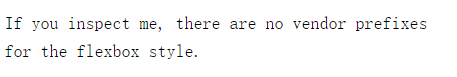
StyleSheetManager
修改或覆盖子组件样式、更改样式的渲染行为 的辅助组件
disableVendorPrefixes 重置组件样式
import styled, { StyleSheetManager } from 'styled-components'const Box = styled.div`color: ${props => props.theme.color};display: flex;
`render(<StyleSheetManager disableVendorPrefixes><Box>If you inspect me, there are no vendor prefixes for the flexbox style.</Box></StyleSheetManager>
)
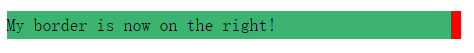
stylisRTLPlugin 改变样式渲染方式 从右到左
import styled, { StyleSheetManager } from 'styled-components'
import stylisRTLPlugin from 'stylis-plugin-rtl';const Box = styled.div`background: mediumseagreen;border-left: 10px solid red;
`render(<StyleSheetManager stylisPlugins={[stylisRTLPlugin]}><Box>My border is now on the right!</Box></StyleSheetManager>
)
isStyledComponent
用于判断组件是否被 styled 渲染过
import React from 'react'
import styled, { isStyledComponent } from 'styled-components'
import MaybeStyledComponent from './somewhere-else'let TargetedComponent = isStyledComponent(MaybeStyledComponent)? MaybeStyledComponent: styled(MaybeStyledComponent)``const ParentComponent = styled.div`color: cornflowerblue;${TargetedComponent} {color: tomato;}
`
withTheme
一个高阶函数,用于从 ThemeProvider 获取当前主题并将其作为props传递给包装的组件
import { withTheme } from 'styled-components'class MyComponent extends React.Component {render() {console.log('Current theme: ', this.props.theme)// ...}
}export default withTheme(MyComponent)
所有 styled 组件都会收到主题的props,因此仅当你有其它原因需要访问主题时才这样用
ThemeConsumer
ThemeProvider的配套组件,可以在渲染期间动态访问主题
import { ThemeConsumer } from 'styled-components'export default class MyComponent extends React.Component {render() {return (<ThemeConsumer>{theme => <div>The theme color is {theme.color}.</div>}</ThemeConsumer>)}
}
所有 styled 组件都会收到主题的props,因此仅当你有其它原因需要访问主题时才这样用
支持的样式写法
& 是我们为该样式组件生成的唯一类名替换,从而可以易于拥有复杂的逻辑
const Example = styled.div`/* all declarations will be prefixed */padding: 2em 1em;background: papayawhip;/* pseudo selectors work as well */&:hover {background: palevioletred;}/* media queries are no problem */@media (max-width: 600px) {background: tomato;/* nested rules work as expected */&:hover {background: yellow;}}> p {/* descendant-selectors work as well, but are more of an escape hatch */text-decoration: underline;}/* Contextual selectors work as well */html.test & {display: none;}
`;render(<Example><p>Hello World!</p></Example>
);
这篇关于styled-components 的用法的文章就介绍到这儿,希望我们推荐的文章对编程师们有所帮助!