本文主要是介绍GEO生信数据挖掘(九)WGCNA分析,希望对大家解决编程问题提供一定的参考价值,需要的开发者们随着小编来一起学习吧!
第六节,我们使用结核病基因数据,做了一个数据预处理的实操案例。例子中结核类型,包括结核,潜隐进展,对照和潜隐,四个类别。第七节延续上个数据,进行了差异分析。 第八节对差异基因进行富集分析。本节进行WGCNA分析。
目录
加载数据,进行聚类
初次聚类观察
自己定义红线位置,进行切割划分
载入性状数据
增加形状信息后,再次聚类
网络构建
选取soft-thresholding powers
基于tom的差异的基因聚类,绘制聚类树
根据聚类情况,设置颜色
计算eigengenes
模块的自动合并
模块与临床形状的关系热图 (关键数据)
红色模块样本表达情况(相关性大)
产生了很多数据(各个模块的和临床性状)
后续挖掘核心基因时,需要用到Cytoscape,生成绘图所需要的数据
加载数据,进行聚类
library(WGCNA)
#读取目录名称,方便复制粘贴
dir()
#加载数据
load('DEG_TB_LTBI_step13.Rdata')#这里行为样品名,列为基因名
################################样品聚类####################
datExpr = t(dataset_TB_LTBI_DEG)
#初次聚类
sampleTree = hclust(dist(datExpr), method = "average")
# Plot the sample tree: Open a graphic output window of size 20 by 15 inches
# The user should change the dimensions if the window is too large or too small.
sizeGrWindow(12,9)
#pdf(file='sampleCluestering.pdf',width = 12,height = 9)
par(cex=0.6)
par(mar=c(0,4,2,0))
plot(sampleTree, main = "Sample clustering to detect outliers", sub="", xlab="", cex.lab = 1.5,cex.axis = 1.5, cex.main = 2)#结果图片自己导出PDF,文件名=1_sampleClustering.pdf### Plot a line to show the cut
abline(h = 87, col = "red")##剪切高度不确定,故无红线dev.off()
初次聚类观察

自己定义红线位置,进行切割划分
本例发现右侧有些样本孤立,适合被剔除,设置红线87切割。
左侧也被切成两块,需要做处理,保留。
### Determine cluster under the line
clust = cutreeStatic(sampleTree, cutHeight = 87, minSize = 10)
table(clust)
#clust
#0  1  2
#5 57 40### clust 1 contains the samples we want to keep.
keepSamples = (clust==1|clust==2)
datExpr0 = datExpr[keepSamples, ]
dim(datExpr0) #[1]   97 2813
#保存数据
save(datExpr0,file='datExpr0_cluster_filter.Rdata')
载入性状数据
匹配样本名称,性状数据与表达数据保证一致
#################### 载入性状数据###########################
#加载自己的性状数据
load('design_TB_LTBI.Rdata')
traitData=design
#Loading clinical trait data
#traitData = read.table("trait_D.txt",row.names=1,header=T,comment.char = "",check.names=F)########trait file name can be changed######性状数据文件名,根据实际修改,如果工作路径不是实际性状数据路径,需要添加正确的数据路径
dim(traitData)
#names(traitData)
# remove columns that hold information we do not need.
#allTraits = traitData
dim(traitData)
names(traitData)# Form a data frame analogous to expression data that will hold the clinical traits.
fpkmSamples = rownames(datExpr0)
traitSamples =rownames(traitData)
#匹配样本名称,性状数据与表达数据保证一致
traitRows = match(fpkmSamples, traitSamples)
datTraits = traitData[traitRows,]
rownames(datTraits)
collectGarbage()
增加形状信息后,再次聚类
# Re-cluster samples
sampleTree2 = hclust(dist(datExpr0), method = "average")
# Convert traits to a color representation: white means low, red means high, grey means missing entry
traitColors = numbers2colors(datTraits, signed = FALSE)
# Plot the sample dendrogram and the colors underneath.#sizeGrWindow(20,20)
##pdf(file="2_Sample dendrogram and trait heatmap.pdf",width=12,height=12)
plotDendroAndColors(sampleTree2, traitColors,groupLabels = names(datTraits),main = "Sample dendrogram and trait heatmap")dev.off()
下方红色,大致分成了两类,效果不错。

网络构建
#############################network constr######################################### Allow multi-threading within WGCNA. At present this call is necessary.
# Any error here may be ignored but you may want to update WGCNA if you see one.
# Caution: skip this line if you run RStudio or other third-party R environments.
# See note above.
enableWGCNAThreads()# Choose a set of soft-thresholding powers
powers = c(1:15)# Call the network topology analysis function
sft = pickSoftThreshold(datExpr0, powerVector = powers, verbose = 5)# Plot the results:
sizeGrWindow(15, 9)
#pdf(file="3_Scale independence.pdf",width=9,height=5)
#pdf(file="Rplot03.pdf",width=9,height=5)
par(mfrow = c(1,2))
cex1 = 0.9
# Scale-free topology fit index as a function of the soft-thresholding power
plot(sft$fitIndices[,1], -sign(sft$fitIndices[,3])*sft$fitIndices[,2],xlab="Soft Threshold (power)",ylab="Scale Free Topology Model Fit,signed R^2",type="n",main = paste("Scale independence"));
text(sft$fitIndices[,1], -sign(sft$fitIndices[,3])*sft$fitIndices[,2],labels=powers,cex=cex1,col="red");
# this line corresponds to using an R^2 cut-off of h
abline(h=0.90,col="red")
# Mean connectivity as a function of the soft-thresholding power
plot(sft$fitIndices[,1], sft$fitIndices[,5],xlab="Soft Threshold (power)",ylab="Mean Connectivity", type="n",main = paste("Mean connectivity"))
text(sft$fitIndices[,1], sft$fitIndices[,5], labels=powers, cex=cex1,col="red")
dev.off()
选取soft-thresholding powers
测试阈值,注意观察,突破红线的附近时取值,下方代码时候的是自适应的方法选取 soft-thresholding powers

######chose the softPower
#datExpr0= datExpr0[,-1]
softPower =sft$powerEstimate
adjacency = adjacency(datExpr0, power = softPower)##### Turn adjacency into topological overlap
TOM = TOMsimilarity(adjacency);
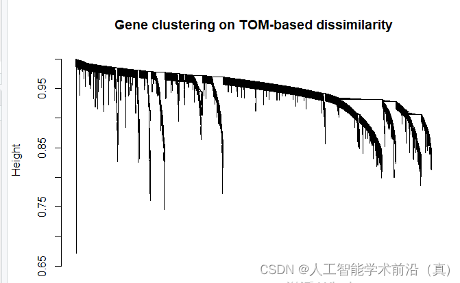
dissTOM = 1-TOM# Call the hierarchical clustering function
geneTree = hclust(as.dist(dissTOM), method = "average");
# Plot the resulting clustering tree (dendrogram)#sizeGrWindow(12,9)
pdf(file="4_Gene clustering on TOM-based dissimilarity.pdf",width=12,height=9)
plot(geneTree, xlab="", sub="", main = "Gene clustering on TOM-based dissimilarity",labels = FALSE, hang = 0.04)
dev.off()基于tom的差异的基因聚类,绘制聚类树
根据聚类情况,设置颜色
# We like large modules, so we set the minimum module size relatively high:
minModuleSize = 30
# Module identification using dynamic tree cut:
dynamicMods = cutreeDynamic(dendro = geneTree, distM = dissTOM,deepSplit = 2, pamRespectsDendro = FALSE,minClusterSize = minModuleSize);
table(dynamicMods)# Convert numeric lables into colors
dynamicColors = labels2colors(dynamicMods)
table(dynamicColors)
# Plot the dendrogram and colors underneath
#sizeGrWindow(8,6)
pdf(file="5_Dynamic Tree Cut.pdf",width=8,height=6)
plotDendroAndColors(geneTree, dynamicColors, "Dynamic Tree Cut",dendroLabels = FALSE, hang = 0.03,addGuide = TRUE, guideHang = 0.05,main = "Gene dendrogram and module colors")
dev.off()

计算eigengenes
# Calculate eigengenes
MEList = moduleEigengenes(datExpr0, colors = dynamicColors)
MEs = MEList$eigengenes
# Calculate dissimilarity of module eigengenes
MEDiss = 1-cor(MEs);
# Cluster module eigengenes
METree = hclust(as.dist(MEDiss), method = "average")
# Plot the result
#sizeGrWindow(7, 6)
pdf(file="6_Clustering of module eigengenes.pdf",width=7,height=6)
plot(METree, main = "Clustering of module eigengenes",xlab = "", sub = "")
MEDissThres = 0.25######剪切高度可修改
# Plot the cut line into the dendrogram
abline(h=MEDissThres, col = "red")
dev.off()
模块的自动合并
# Call an automatic merging function
merge = mergeCloseModules(datExpr0, dynamicColors, cutHeight = MEDissThres, verbose = 3)
# The merged module colors
mergedColors = merge$colors
# Eigengenes of the new merged modules:
mergedMEs = merge$newMEs#sizeGrWindow(12, 9)
pdf(file="7_merged dynamic.pdf", width = 9, height = 6)
plotDendroAndColors(geneTree, cbind(dynamicColors, mergedColors),c("Dynamic Tree Cut", "Merged dynamic"),dendroLabels = FALSE, hang = 0.03,addGuide = TRUE, guideHang = 0.05)
dev.off()# Rename to moduleColors
moduleColors = mergedColors
# Construct numerical labels corresponding to the colors
colorOrder = c("grey", standardColors(50))
moduleLabels = match(moduleColors, colorOrder)-1
MEs = mergedMEs# Save module colors and labels for use in subsequent parts
save(MEs, TOM, dissTOM,  moduleLabels, moduleColors, geneTree, sft, file = "networkConstruction-stepByStep.RData")

模块与临床形状的关系热图 (关键数据)
#############################relate modules to external clinical triats######################################
# Define numbers of genes and samples
nGenes = ncol(datExpr0)
nSamples = nrow(datExpr0)moduleTraitCor = cor(MEs, datTraits, use = "p")
moduleTraitPvalue = corPvalueStudent(moduleTraitCor, nSamples)#sizeGrWindow(10,6)
pdf(file="8_Module-trait relationships.pdf",width=10,height=6)
# Will display correlations and their p-values
textMatrix = paste(signif(moduleTraitCor, 2), "\n(",signif(moduleTraitPvalue, 1), ")", sep = "")dim(textMatrix) = dim(moduleTraitCor)
par(mar = c(6, 8.5, 3, 3))# Display the correlation values within a heatmap plot #修改性状类型 data.frame
labeledHeatmap(Matrix = moduleTraitCor,xLabels = names(data.frame(datTraits)),yLabels = names(MEs),ySymbols = names(MEs),colorLabels = FALSE,colors = greenWhiteRed(50),textMatrix = textMatrix,setStdMargins = FALSE,cex.text = 0.5,zlim = c(-1,1),main = paste("Module-trait relationships"))
dev.off()
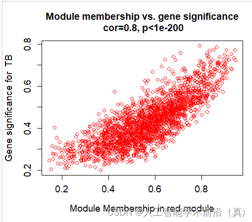
挑选相关性最高的,具有统计学意义的(p<0.05),red模块最佳!

红色模块样本表达情况(相关性大)
产生了很多数据(各个模块的和临床性状)
######## Define variable weight containing all column of datTraits###MM and GS# names (colors) of the modules
modNames = substring(names(MEs), 3)geneModuleMembership = as.data.frame(cor(datExpr0, MEs, use = "p"))
MMPvalue = as.data.frame(corPvalueStudent(as.matrix(geneModuleMembership), nSamples))names(geneModuleMembership) = paste("MM", modNames, sep="")
names(MMPvalue) = paste("p.MM", modNames, sep="")#names of those trait
traitNames=names(data.frame(datTraits))
class(datTraits)geneTraitSignificance = as.data.frame(cor(datExpr0, datTraits, use = "p"))
GSPvalue = as.data.frame(corPvalueStudent(as.matrix(geneTraitSignificance), nSamples))names(geneTraitSignificance) = paste("GS.", traitNames, sep="")
names(GSPvalue) = paste("p.GS.", traitNames, sep="")####plot MM vs GS for each trait vs each module##########example:royalblue and CK
module="red"
column = match(module, modNames)
moduleGenes = moduleColors==moduletrait="TB"
traitColumn=match(trait,traitNames)sizeGrWindow(7, 7)#par(mfrow = c(1,1))
verboseScatterplot(abs(geneModuleMembership[moduleGenes, column]),
abs(geneTraitSignificance[moduleGenes, traitColumn]),
xlab = paste("Module Membership in", module, "module"),
ylab = paste("Gene significance for ",trait),
main = paste("Module membership vs. gene significance\n"),
cex.main = 1.2, cex.lab = 1.2, cex.axis = 1.2, col = module)
######for (trait in traitNames){traitColumn=match(trait,traitNames)for (module in modNames){column = match(module, modNames)moduleGenes = moduleColors==moduleif (nrow(geneModuleMembership[moduleGenes,]) > 1){####进行这部分计算必须每个模块内基因数量大于2,由于前面设置了最小数量是30,这里可以不做这个判断,但是grey有可能会出现1个gene,它会导致代码运行的时候中断,故设置这一步#sizeGrWindow(7, 7)pdf(file=paste("9_", trait, "_", module,"_Module membership vs gene significance.pdf",sep=""),width=7,height=7)par(mfrow = c(1,1))verboseScatterplot(abs(geneModuleMembership[moduleGenes, column]),abs(geneTraitSignificance[moduleGenes, traitColumn]),xlab = paste("Module Membership in", module, "module"),ylab = paste("Gene significance for ",trait),main = paste("Module membership vs. gene significance\n"),cex.main = 1.2, cex.lab = 1.2, cex.axis = 1.2, col = module)dev.off()}}
}#####
names(datExpr0)
probes = names(datExpr0)#################export GS and MM############### geneInfo0 = data.frame(probes= probes,moduleColor = moduleColors)for (Tra in 1:ncol(geneTraitSignificance))
{oldNames = names(geneInfo0)geneInfo0 = data.frame(geneInfo0, geneTraitSignificance[,Tra],GSPvalue[, Tra])names(geneInfo0) = c(oldNames,names(geneTraitSignificance)[Tra],names(GSPvalue)[Tra])
}for (mod in 1:ncol(geneModuleMembership))
{oldNames = names(geneInfo0)geneInfo0 = data.frame(geneInfo0, geneModuleMembership[,mod],MMPvalue[, mod])names(geneInfo0) = c(oldNames,names(geneModuleMembership)[mod],names(MMPvalue)[mod])
}
geneOrder =order(geneInfo0$moduleColor)
geneInfo = geneInfo0[geneOrder, ]write.table(geneInfo, file = "10_GS_and_MM.xls",sep="\t",row.names=F)
####################################################Visualizing the gene network#######################################################nGenes = ncol(datExpr0)
nSamples = nrow(datExpr0)# Transform dissTOM with a power to make moderately strong connections more visible in the heatmap
plotTOM = dissTOM^7
# Set diagonal to NA for a nicer plot
diag(plotTOM) = NA# Call the plot functionsizeGrWindow(9,9) #这个耗电脑内存
pdf(file="12_Network heatmap plot_all gene.pdf",width=9, height=9)
TOMplot(plotTOM, geneTree, moduleColors, main = "Network heatmap plot, all genes")
dev.off()nSelect = 400
# For reproducibility, we set the random seed
set.seed(10)
select = sample(nGenes, size = nSelect)
selectTOM = dissTOM[select, select]
# There's no simple way of restricting a clustering tree to a subset of genes, so we must re-cluster.
selectTree = hclust(as.dist(selectTOM), method = "average")
selectColors = moduleColors[select]# Open a graphical window
#sizeGrWindow(9,9)
# Taking the dissimilarity to a power, say 10, makes the plot more informative by effectively changing
# the color palette; setting the diagonal to NA also improves the clarity of the plot
plotDiss = selectTOM^7
diag(plotDiss) = NApdf(file="13_Network heatmap plot_selected genes.pdf",width=9, height=9)
TOMplot(plotDiss, selectTree, selectColors, main = "Network heatmap plot, selected genes")
dev.off()####################################################Visualizing the gene network of eigengenes#####################################################sizeGrWindow(5,7.5)
pdf(file="14_Eigengene dendrogram and Eigengene adjacency heatmap.pdf", width=5, height=7.5)
par(cex = 0.9)
plotEigengeneNetworks(MEs, "", marDendro = c(0,4,1,2), marHeatmap = c(3,4,1,2), cex.lab = 0.8, xLabelsAngle= 90)
dev.off()#or devide into two parts
# Plot the dendrogram
#sizeGrWindow(6,6);
pdf(file="15_Eigengene dendrogram_2.pdf",width=6, height=6)
par(cex = 1.0)
plotEigengeneNetworks(MEs, "Eigengene dendrogram", marDendro = c(0,4,2,0), plotHeatmaps = FALSE)
dev.off()pdf(file="15_Eigengene adjacency heatmap_2.pdf",width=6, height=6)
# Plot the heatmap matrix (note: this plot will overwrite the dendrogram plot)
par(cex = 1.0)
plotEigengeneNetworks(MEs, "Eigengene adjacency heatmap", marHeatmap = c(3,4,2,2), plotDendrograms = FALSE, xLabelsAngle = 90)
dev.off()后续挖掘核心基因时,需要用到Cytoscape,生成绘图所需要的数据
###########################Exporting to Cytoscape all one by one ########################### Select each module
'''
Error in exportNetworkToCytoscape(modTOM, edgeFile = paste("CytoscapeInput-edges-",  : Cannot determine node names: nodeNames is NULL and adjMat has no dimnames.datExpr0 格式需要dataframe
'''
modules =module
for (mod in 1:nrow(table(moduleColors)))
{modules = names(table(moduleColors))[mod]# Select module probesprobes = names(data.frame(datExpr0))  # inModule = (moduleColors == modules)modProbes = probes[inModule]modGenes = modProbes# Select the corresponding Topological OverlapmodTOM = TOM[inModule, inModule]dimnames(modTOM) = list(modProbes, modProbes)# Export the network into edge and node list files Cytoscape can readcyt = exportNetworkToCytoscape(modTOM,edgeFile = paste("CytoscapeInput-edges-", modules , ".txt", sep=""),nodeFile = paste("CytoscapeInput-nodes-", modules, ".txt", sep=""),weighted = TRUE,threshold = 0.02,nodeNames = modProbes,altNodeNames = modGenes,nodeAttr = moduleColors[inModule])
}
关系网络的构建完毕,绘图找核心基因,Cytoscape 到底怎么玩?
这篇关于GEO生信数据挖掘(九)WGCNA分析的文章就介绍到这儿,希望我们推荐的文章对编程师们有所帮助!