本文主要是介绍自己动手丰衣足食之气泡框和常见css图形(三角),希望对大家解决编程问题提供一定的参考价值,需要的开发者们随着小编来一起学习吧!
原文地址:http://www.cnblogs.com/keepfool/p/5616326.html
参考链接:http://www.cnblogs.com/sdjiegeng/p/5836239.html
<!doctype html>
<html lang="en"><head><meta charset="UTF-8" /><title>Document</title><style type="text/css">div {float: left;margin: 10px;}div.main0 {width: 0;height: 0;border-bottom: 100px solid red;border-left: 50px solid transparent;border-right: 50px solid transparent;}div.main1 {width: 200px;/*width和height相等时就是园*/height: 100px;background: red;border-radius: 50%;}div.main2 {width: 100px;/*width和height相等时就是园*/height: 100px;background: red;border-radius: 100px/50px;}div.main3 {width: 0;height: 0;border-top: 100px solid red;border-left: 50px solid transparent;border-right: 50px solid transparent;}div.main4 {width: 0;height: 0;border-top: 50px solid transparent;border-left: 100px solid red;border-bottom: 50px solid transparent;}div.main5 {width: 0;height: 0;border-top: 50px solid transparent;border-right: 100px solid red;border-bottom: 50px solid transparent;}div.main6 {width: 80px;height: 80px;background: red;transform: rotate(-45deg);margin-left: 20px;}div.main7 {height: 0;width: 100px;border-bottom: 100px solid red;border-left: 50px solid transparent;border-right: 50px solid transparent;}div.main8 {width: 160px;height: 100px;background: red;transform: skew(30deg);}</style></head><body><div class="main0"></div><div class="main1"></div><div class="main2"></div><div class="main3"></div><div class="main4"></div><div class="main5"></div><div class="main6"></div><div class="main7"></div><div class="main8"></div></body></html>
<!DOCTYPE html>
<html><head><meta charset="UTF-8"><title></title><style>/* [01.基础样式] */* {font-family: simhei, sans-serif;box-sizing: border-box;}html {font-size: 62.5%;}body {background-color: black;}div {margin: 20px auto;}/* [02.旗帜样式 ]*/.flag {width: 0;height: 0;border: 2rem solid #FF6600;border-top-width: 4rem;border-bottom-color: transparent;border-bottom-width: 2rem;}/* [03.向右的双实心箭头样式] */.rds-arrow-wrapper {position: relative;width: 20em;text-align: center;}.rds-arrow,.rds-arrow:after {display: inline-block;position: relative;width: 0;height: 0;border-top: 1rem solid transparent;border-left: 2rem solid #fff;border-bottom: 1rem solid transparent;border-right: 2rem solid transparent;}.rds-arrow {margin-left: 1rem;}.rds-arrow:after {content: "";position: absolute;left: 100%;top: -1rem;bottom: 0;}/* [04.气泡样式] */.bubble {position: relative;background-color: #33AAEE;width: 10rem;height: 3rem;font-size: 2rem;line-height: 3rem;color: #FFF;text-align: center;}.bubble:before {position: absolute;content: "";right: 100%;top: 1rem;width: 0;height: 0;border-top: 0.6rem solid transparent;border-right: 0.6rem solid #33AAEE;border-bottom: 0.6rem solid transparent;border-left: 0.6rem solid transparent;}.bubble .text {display: inline-block;}/* [05.丝带样式] *//* 丝带主体长方形 */.ribbon {position: relative;width: 10rem;height: 3rem;padding: 0.7rem 0;font-size: 1.6rem !important;color: #fff;text-align: center;background: #ff0066;}/* 丝带左右两侧的耳朵 */.ribbon:before,.ribbon:after {content: "";position: absolute;display: block;bottom: -0.6rem;border: 1.5rem solid #ff0066;z-index: -1;}.ribbon:before {left: -2.4rem;border-right-width: 1.5rem;border-left-color: transparent;box-shadow: 1px 1px 0 rgba(176, 102, 166, 0.8);}.ribbon:after {right: -2.4rem;border-left-width: 1.5rem;border-right-color: transparent;box-shadow: 0 1px 0 rgba(176, 102, 166, 0.8);}/* 丝带阴影 */.ribbon .ribbon-content:before,.ribbon .ribbon-content:after {content: "";position: absolute;display: block;border-style: solid;border-color: #bf004c transparent transparent transparent;bottom: -0.6rem;}.ribbon .ribbon-content:before {left: 0;border-width: 0.6rem 0 0 0.6rem;}.ribbon .ribbon-content:after {right: 0;border-width: 0.6rem 0.6rem 0 0;}</style></head><body><div class="flag"></div><div class="rds-arrow-wrapper"><span class="rds-arrow"></span></div><div class="bubble"><span class="text">立即查看</span></div><div class="ribbon"><span class="ribbon-content">金卡会员</span></div></body></html>
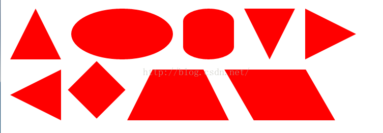
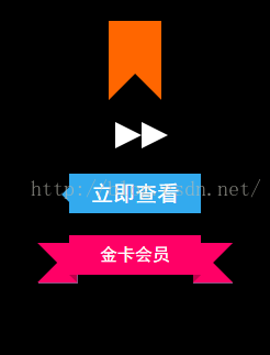
气泡框(或者提示框)是网页中一种很常见的元素,大多用来展示提示信息,如下图所示:

拆分来看,形如这种气泡框无外乎就是一个矩形框+一个指示方向的三角形小箭头,要制作出这样的气泡框,如果解决了三角形小箭头就容易了。一种方法就是制作这样一个三角形箭头的图片,然后定位在矩形框上。但这种解决办法在后期更改气泡框会很不方便,可能每修改一次气泡框都要重新制作一个三角形小图标。如果我们能够直接用HTML和CSS代码实现这样一个三角形小箭头一切都迎刃而解了。
首先我们来看一下border这个属性,当我们把一个div的border-color设为不同值的时候,可以看到四边都成了一个梯形。
| 1 | # test{ width : 50px ; height : 50px ; border-width : 50px ; border-style : solid ; border-color : #09F #990 #933 #0C9 ;} |

如果我们继续把这个div的width和height都设为0,可以看到四边都成了一个三角形。
| 1 | # test{ width : 0 ; height : 0 ; border-width : 75px ; border-style : solid ; border-color : #09F #990 #933 #0C9 ;} |

在主流浏览器中检测一下,发现IE6中存在一个小问题,上下边能形成三角形,左右两边仍然还是梯形

通过实验发现当把div的font-size和line-height都设为0的时候,div的四边在IE6下都能形成完美的三角形:
| 1 | #test{ width : 0 ; height : 0 ; border-width : 75px ; border-style : solid ; border-color : #09F #990 #933 #0C9 ; font-size : 0 ; line-height : 0 ;} |

很显然我们只需要其中的一个三角形,那么只需要将其他三边的color设置为透明或者跟页面背景一样的颜色,就能模拟出一个三角来,推荐将其他三边颜色设置为透明,即color的值为transparent,如果其他三边颜色跟页面背景一样,虽然视觉上只能看到一个三角,但背景颜色一旦改变,其他三边颜色也要随之改变。
| 1 | #test{ width : 0 ; height : 0 ; border-width : 75px ; border-style : solid ; border-color : #09F transparent transparent ; font-size : 0 ; line-height : 0 ;} |

问题又来了,IE6下transparent无效!其他三边被设置成默认的黑色了。

但通过实验发现把border-style设置为dashed后,IE6下其他三边就能透明了!
| 1 | #test{ width : 0 ; height : 0 ; border-width : 75px ; border-style : solid dashed dashed ; border-color : #09F transparent transparent ; font-size : 0 ; line-height : 0 ;} |
到这一步我们已经成功的模拟出了一个小三角,下一步我们把这个小三角同矩形框结合起来。先设置一个矩形框,然后把小三角定位到矩形框上。先来写出HTML结构:
| 1 2 3 4 | < div class="tag"> < em ></ em > CSS气泡框实现 </ div > |
CSS样式:
| 1 2 | .tag{ width : 300px ; height : 100px ; border : 5px solid #09F ; position : relative ;} .tag em{ display : block ; border-width : 20px ; position : absolute |
这篇关于自己动手丰衣足食之气泡框和常见css图形(三角)的文章就介绍到这儿,希望我们推荐的文章对编程师们有所帮助!