本文主要是介绍基于.NET6的WPF基础总结(上),希望对大家解决编程问题提供一定的参考价值,需要的开发者们随着小编来一起学习吧!
目录
一.常用属性介绍
二、 程序退出方式
三、布局样式
3.1 Panel的附加属性ZIndex
3.2 Grid(网格)布局
3.3 UniformGrid(均分布局)
3.4 StackPanel(堆积面板)
3.5 WrapPanel(换行面板)
3.6 DockPanel(停靠面板)
3.7 Canvas(画布布局)
3.8 个性化Border
3.9 GridSplitter(分割窗口)
四、内容控件
4.1 Control类
4.2 Button按钮
4.3 CheckBox复选框
4.4 RadioButton单选框
4.5 RepeatButton重复按钮
4.6 Label控件
4.6.1 Label直接显示文本
4.6.2 label和访问修饰符
4.6.3 使用控件作为Label的内容
4.7 TextBox
4.8 PasswordBox密码框
4.9 RichTextBox富文本控件
4.9.1 获取富文本内容
4.9.2 动态创建富文本内容
4.9.3 加载文件内容到富文本
4.10 ToolTip提示工具
4.10.1 自定义ToolTip内容
4.11 Popup弹出窗口
4.12 Image图片
4.12.1 圆形图片
4.13 GroupBox分组容器
4.13.1 基本使用
4.13.2 自定义header属性
4.14 ScrollViewer 视图滚动控件
4.15 Slider 滑块
4.16 ProgressBar进度条
4.17 Calendar日历控件
4.18 DatePicker日期选择控件
一.常用属性介绍
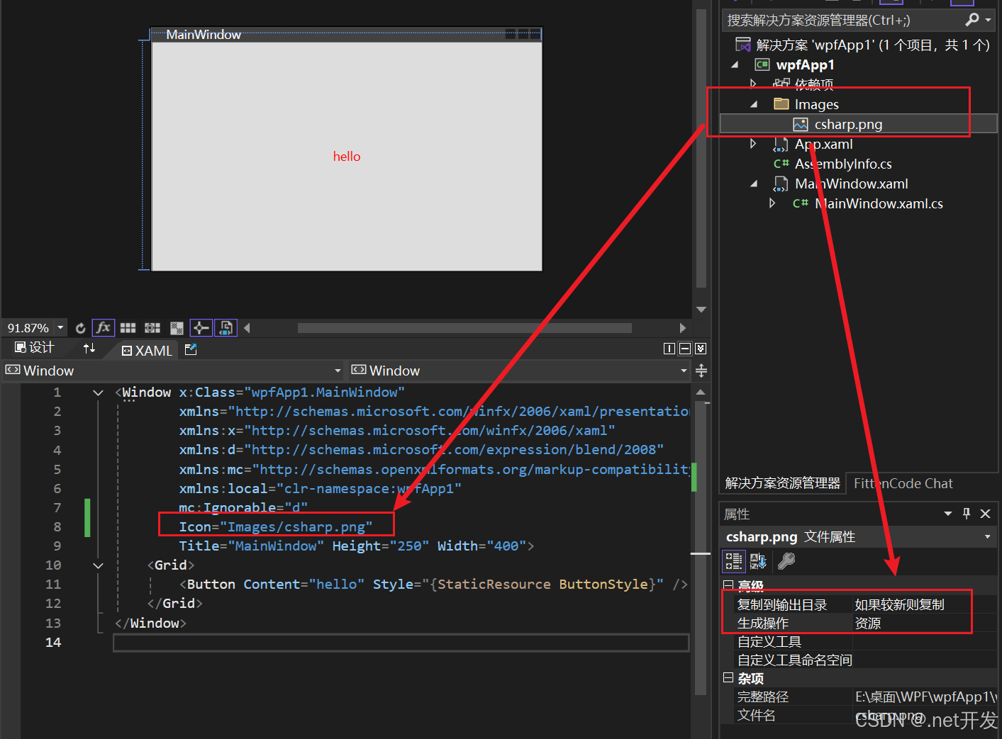
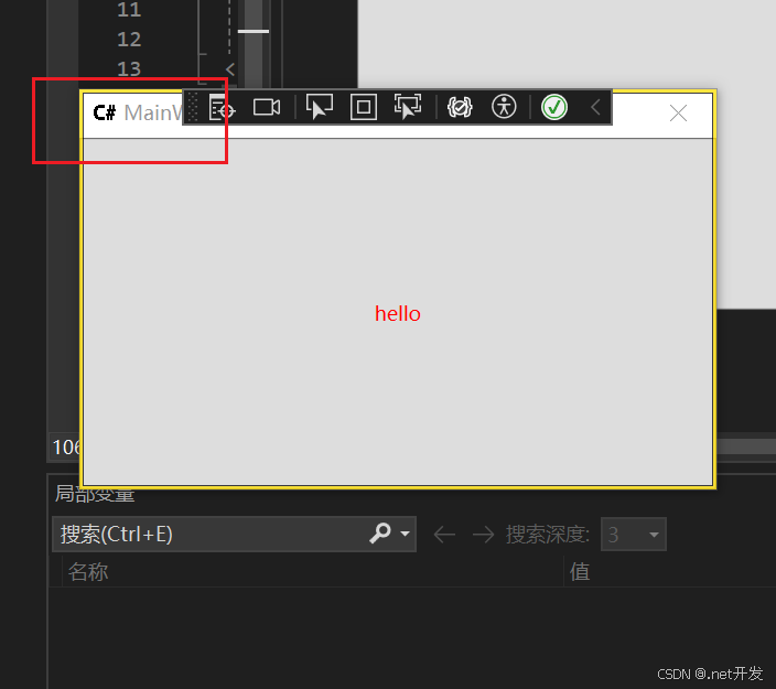
- Icon: 指定窗口的图标
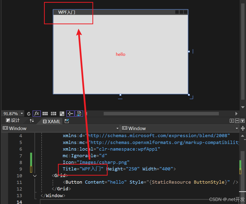
- Title: 窗口标题
- WindowStyle:控制界面边框样式
- None-无边框 (窗口无法拖动)
- SingleBorderWindow-单边框(默认)
- ThreeDBorderWindow-3D边框
- ToolWindow-工具箱窗口(只有标题和删除界面图标)
- ResizeMode:指定窗口大小调节样式
- NoResize:不能调节、并且没有窗口最大最小按钮
- CanMinimize:不能调节,有最小化按钮
- CanResize:可调节(默认)
- CanResizeWithGrip: 可根据网格调节
- Topmost: 调节窗口前后顺序,为true时窗口位于最前,都为true时根据顺序决定
- Height、Width、MaxHeight、MaxWidth:高度、宽度、最大高度、最大宽度
- SizeToContent:表示窗体大小决定方式
- Manual:手工决定(可以自由改变)
- Width:宽度决定
- Height:高度决定
- WidthAndHeight:内容决定
- Visibility:窗口可见性
- Visible:可见
- Hidden:隐藏
- Collapsed:折叠
- WindowState: 窗口状态
- Normal:正常
- Maximized:最大化
- Minimized:最小化
- WindowStartupLocation:窗口启动时位置
- CenterScreen:正中间
二、 程序退出方式
- close():关闭当前窗口
private void Button_Close(object sender, RoutedEventArgs e)
{this.Close();
}- Application.Current.Shutdown():关闭UI,但后台进程没有关闭,只到所有后台进程关闭才关闭
private void Button_Exit(object sender, RoutedEventArgs e)
{Application.Current.Shutdown();
}- Environment.Exit(0):强制退出(不会执行finally,但是会进行资源清理)
private void Button_Exit(object sender, RoutedEventArgs e)
{Environment.Exit(0);
}- Process.GetCurrentProcess().Kill():强制退出(不会进行资源清理)
private void Button_Exit(object sender, RoutedEventArgs e)
{Process.GetCurrentProcess().Kill();
}
三、布局样式
3.1 Panel的附加属性ZIndex
当我们在Grid中定义两个Button的时候,我们可以看到只会显示出按钮2,因为两个按钮重叠在了一起,那么如果我们要自由选择显示哪一个按钮改怎么实现呢?
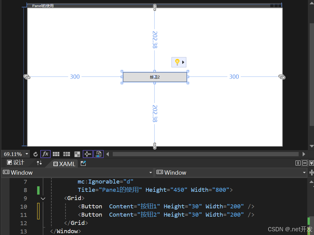
我们在Button中加上Panel的附加属性ZIndex后,就可以根据值的大小选择需要显示的内容,比如下面的代码展示的效果则是按钮1被显示
<Grid><Button Panel.ZIndex="1" Content="按钮1" Height="30" Width="200" /><Button Panel.ZIndex="0" Content="按钮2" Height="30" Width="200" />
</Grid>
3.2 Grid(网格)布局
- 定义行和列
<Grid ShowGridLines="True"><!--两行--><Grid.RowDefinitions><RowDefinition /><RowDefinition /></Grid.RowDefinitions><!--两列--><Grid.ColumnDefinitions><ColumnDefinition /><ColumnDefinition /></Grid.ColumnDefinitions><!--不写默认是第一行 or 第一列--><TextBlock Text="文本1" /><!--Grid.Row: 哪一行 Grid.Column:那一列--><TextBlock Grid.Row="1" Grid.Column="0" Text="文本2" /><TextBlock Grid.Row="0" Grid.Column="1" Text="文本3" /><TextBlock Grid.Row="1" Grid.Column="1" Text="文本4" /></Grid>
- 合并行和合并列
<Grid ShowGridLines="True"><!--两行--><Grid.RowDefinitions><RowDefinition /><RowDefinition /></Grid.RowDefinitions><!--两列--><Grid.ColumnDefinitions><ColumnDefinition /><ColumnDefinition /></Grid.ColumnDefinitions><!--Grid.ColumnSpan:合并列  Grid.RowSpan:合并行--><TextBlock Grid.ColumnSpan="2" Text="合并列" VerticalAlignment="Center" HorizontalAlignment="Center" /><TextBlock Grid.RowSpan="2" Text="合并行" VerticalAlignment="Center" HorizontalAlignment="Center" />
</Grid>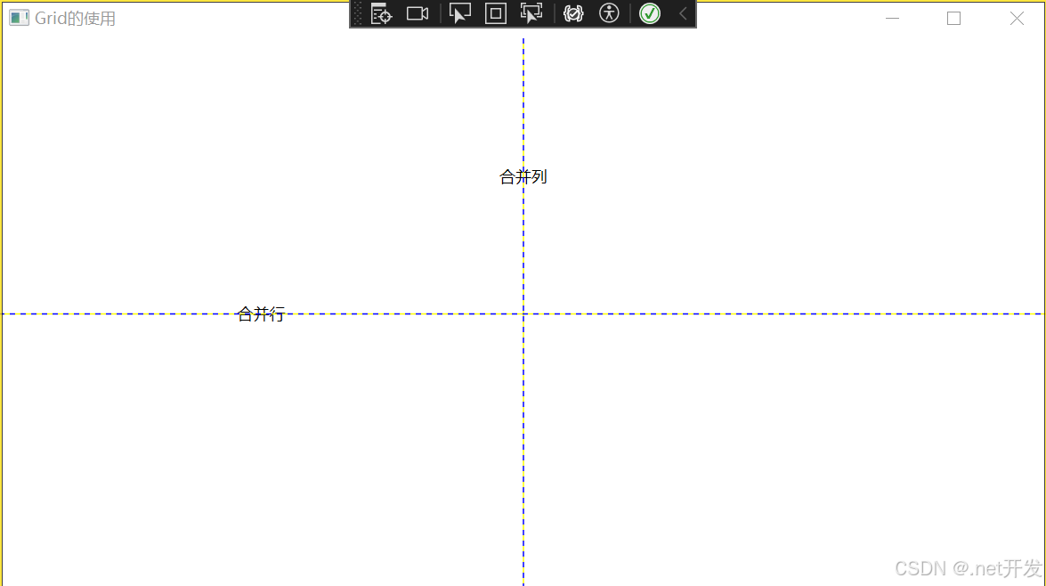
- 设置行和列高度的几种方式
1. 给具体的值
<Grid.RowDefinitions><RowDefinition Height="120" /><RowDefinition />
</Grid.RowDefinitions>
2. 根据内容大小自动变换
<Grid.RowDefinitions><RowDefinition Height="Auto" /><RowDefinition />
</Grid.RowDefinitions>
3. 设置比例
如下表示将整个网格设置为8等份,第一行占3份,第二行占五份
<Grid.RowDefinitions><RowDefinition Height="3*" /><RowDefinition Height="5*" /></Grid.RowDefinitions>3.3 UniformGrid(均分布局)
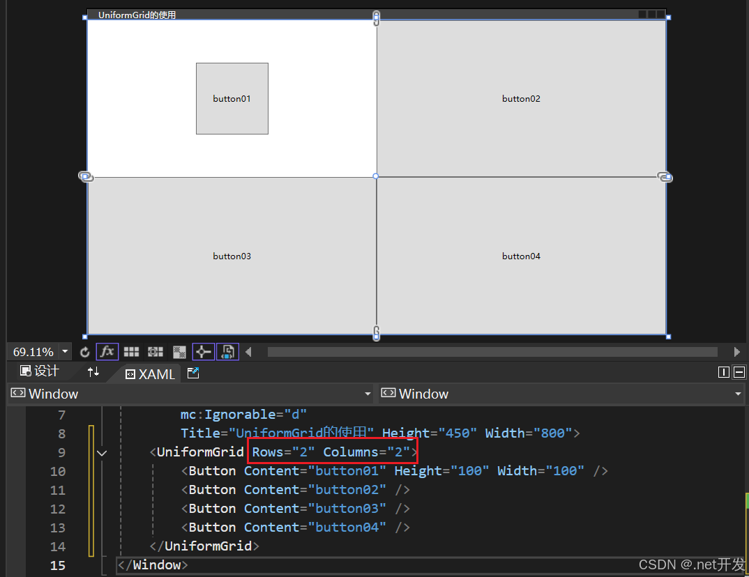
UniformGrid与Grid网格布局十分相似,只是UniformGrid的每个单元格面积都是相等的,单元格会平分整个UniformGrid。
- 定义一个两行两列的单元格
定义方式特别简单,只需要在UniformGrid中设置Rows和Columns即可
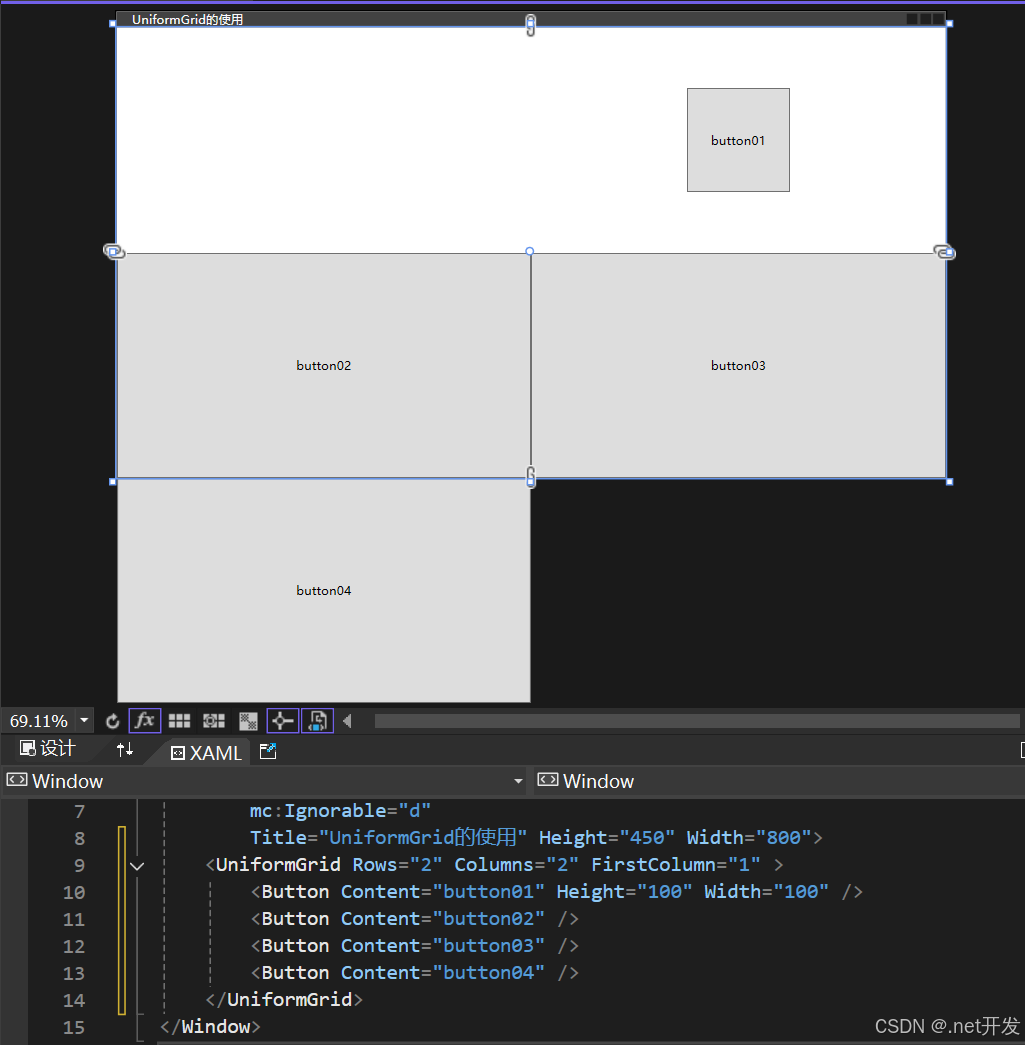
- FirstColumn属性的使用
FirstColumn代表第一行我要空多少格,被挤掉的格子会在布局外部显示,但是运行项目的时候是看不到的
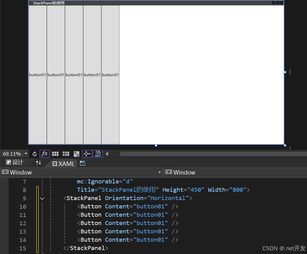
3.4 StackPanel(堆积面板)
StackPanel用于水平或者垂直堆叠子元素
<StackPanel><Button Content="button01" /><Button Content="button01" /><Button Content="button01" /><Button Content="button01" /><Button Content="button01" />
</StackPanel>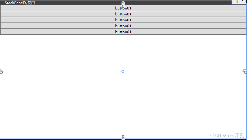
设置Orientation="Horizontal"后
3.5 WrapPanel(换行面板)
当一行或者一列内容放不下时,自动切换到另一行或另一列,提供了三个参数:Orientation-设置排列方式,ItemWidth-设置子项宽度,ItemHeight-设置子项高度
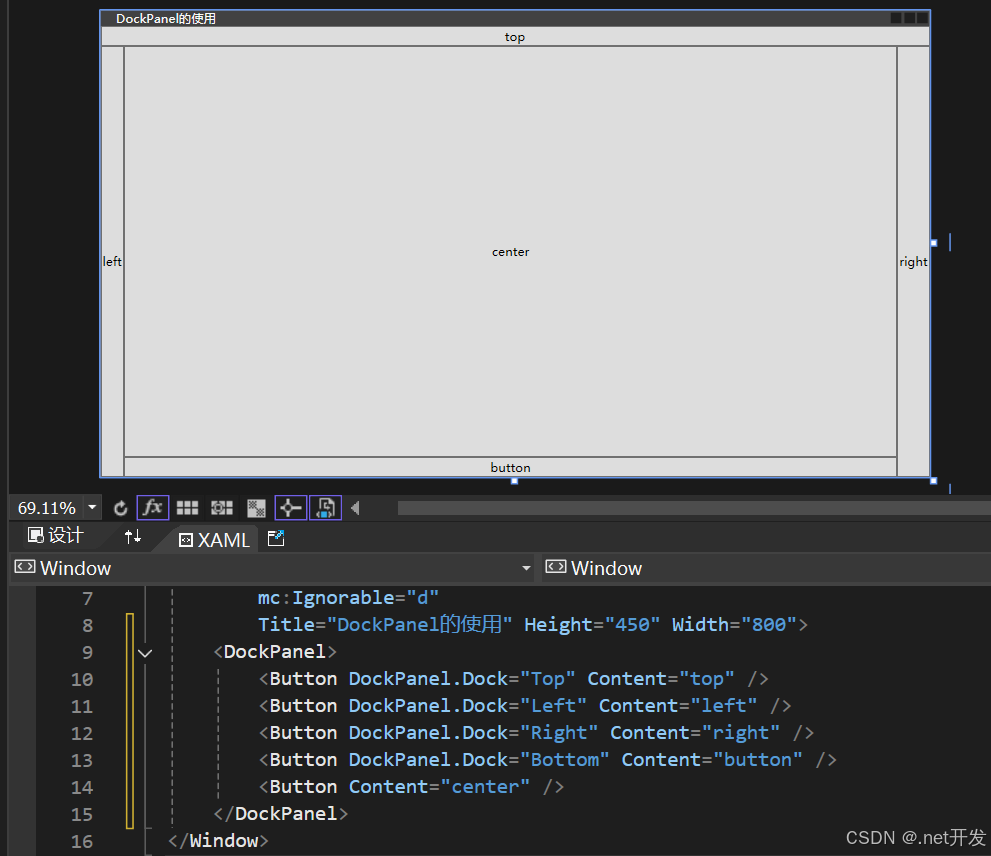
3.6 DockPanel(停靠面板)
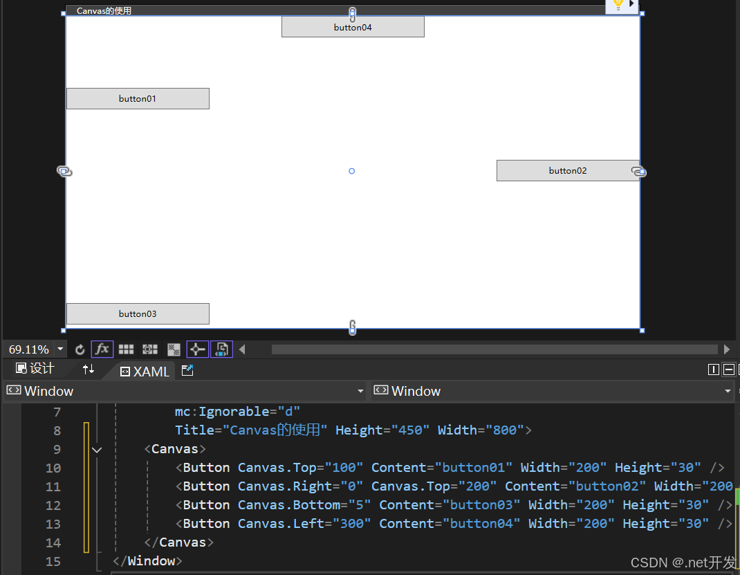
3.7 Canvas(画布布局)
3.8 个性化Border
<Canvas><!--BorderThickness:边框厚度,可以设置为BorderThickness="左,上,右,下" BorderBrush:边框颜色 CornerRadius:边框圆角--><Border Canvas.Left="20" Canvas.Top="20" BorderThickness="1" Width="100" Height="30" BorderBrush="red"><TextBlock Text="button" VerticalAlignment="Center" HorizontalAlignment="Center" /></Border><Border Canvas.Left="20" Canvas.Top="80" BorderThickness="1" Width="100" Height="30" BorderBrush="Blue" CornerRadius="10" Background="Coral"><TextBlock Text="button" VerticalAlignment="Center" HorizontalAlignment="Center" /></Border><!--需要注意,设置圆的时候长和宽需要一样,并且CornerRadius >= Width/2 or Height/2 --><Border Canvas.Left="20" Canvas.Top="150" BorderThickness="1" Width="100" Height="100"BorderBrush="Green" Background="Yellow" CornerRadius="50"><TextBlock Text="button" VerticalAlignment="Center" HorizontalAlignment="Center" /></Border>
</Canvas>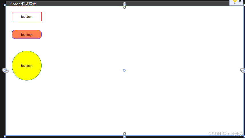
3.9 GridSplitter(分割窗口)
GridSplitter用于分割窗口的布局,可以通过鼠标实现左右或者上下的拖动
使用注意事项:
- 该属性必须在Grid布局中使用。
- 如果要实现左右拖动改变窗口的大小需要设置HorizontalAlignment="Center";
- 如果要实现上下拖动改变窗口的大小需要设置VerticalAlignment="Center";
- 默认是实时查看改变大小,当设置ShowsPreview="True"时,鼠标取消拖动后才会显示。
<Grid><Grid.ColumnDefinitions><ColumnDefinition /><ColumnDefinition Width="Auto" /><ColumnDefinition /></Grid.ColumnDefinitions><Border Background="Aqua"><!--TextWrapping="Wrap": 自动换行--><TextBlock TextWrapping="Wrap">1111111111111111111111111111111111111111111111</TextBlock></Border><GridSplitter Grid.Column="1" Width="5" HorizontalAlignment="Center" ShowsPreview="True" /><Border Grid.Column="2" Background="Yellow"><TextBlock TextWrapping="Wrap">2222222222222222222222222222222222222222222222222222222</TextBlock></Border>
</Grid>
四、内容控件
4.1 Control类
Control类是很多控件的基类,而内容控件与布局控件的不同在于布局控件专注于界面设计,内容控件专注于数据。
Control在界面上不会有任何的显示,但是Control提供了一个控件模板Control.Template,几乎所有子类对Control.Template都进行了各自的实现,所以只有继承了Control的子类才会在界面上显示。
<Control><Control.Template><ControlTemplate TargetType="Control"><Border Width="200" Height="200" Background="Yellow" CornerRadius="100"><TextBlock Text="button" VerticalAlignment="Center" HorizontalAlignment="Center"></TextBlock></Border></ControlTemplate></Control.Template>
</Control>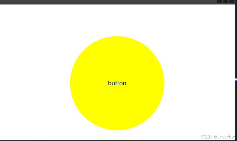
4.2 Button按钮
Button按钮自带的有三个属性:
- IsDefault:表示该Button是一个默认按钮,可以直接通过Enter键调用
- IsCancel:表示该Button是一个取消按钮,可以通过Esc键直接调用
- IsDefaulted:表示是否在用户按下Enter后才激活的按钮
Button自定义样式:
<Canvas><Button Width="120" Height="30" Content="圆角按钮" Canvas.Left="50" Canvas.Top="50"><Button.Template><ControlTemplate TargetType="Button"><!--TemplateBinding BorderBrush: 获取边框默认的颜色--><Border CornerRadius="15" BorderBrush="{TemplateBinding BorderBrush}" BorderThickness="1" Background="Yellow"><Grid><Grid.ColumnDefinitions><ColumnDefinition Width="Auto" /><ColumnDefinition /></Grid.ColumnDefinitions><Image Source="Images/csharp.png" Width="60" Height="20" /><!--ContentPresenter:自动获取Button中content的值--><ContentPresenter Grid.Column="1" VerticalAlignment="Center" HorizontalAlignment="Center" /></Grid></Border></ControlTemplate></Button.Template></Button>
</Canvas>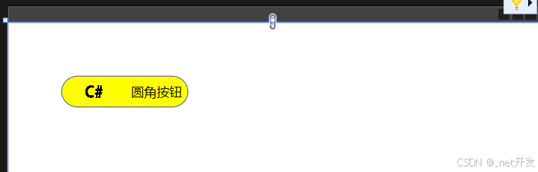
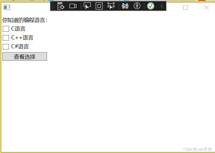
4.3 CheckBox复选框
我们在StackPanel布局中定义三个复选框,为每个复选框绑定OnCheck检查事件,判断该复选框是被被选择,然后定义一个Button,绑定事件Show
<StackPanel x:Name="Select"><TextBlock Text="你知道的编程语言:" Margin="5,5,0,0" /><CheckBox Content="C语言" Checked="OnCheck" Margin="5,5,0,0" /><CheckBox Content="C++语言" Checked="OnCheck" Margin="5,5,0,0" /><CheckBox Content="C#语言" Checked="OnCheck" Margin="5,5,0,0" /><Button Content="查看选择" Width="100" HorizontalAlignment="Left" Margin="5,5,0,0" Click="Show" />
</StackPanel>
private void Show(object sender, RoutedEventArgs e)
{StringBuilder show = new StringBuilder();// 遍历Select下的所有子控件,Select是我在xaml中给Pannel布局定义的名字foreach (var item in Select.Children){if (item is CheckBox){// 判断是否选中if ((item as CheckBox).IsChecked == true){show.Append((item as CheckBox).Content + " ");}}}if (show.Length > 0){MessageBox.Show(show.ToString());}
}private void OnCheck(object sender, RoutedEventArgs e)
{int total = 0;foreach (var item in Select.Children){if (item is CheckBox){total += (item as CheckBox).IsChecked == true? 1 : 0;}}// 最多选择两个if (total > 2){// sender: 是当前选中的CheckBoxvar cbx = sender as CheckBox;if (cbx.IsChecked == true) // 判断是否是选中状态{cbx.IsChecked = false;MessageBox.Show("最多只能选两个");}}
}
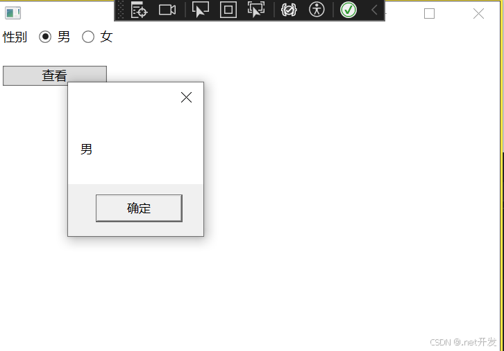
4.4 RadioButton单选框
<StackPanel><StackPanel Orientation="Horizontal" x:Name="Select"><TextBlock Text="性别" Margin="5,0,0,0" /><!--GroupName用于对单选框进行分组--><RadioButton Content="男" GroupName="sex" Margin="10,0,0,0" /><RadioButton Content="女" GroupName="sex" Margin="10,0,0,0" /></StackPanel><Button Content="查看" Width="100" HorizontalAlignment="Left" Margin="5,20,0,0" Click="Show" />
</StackPanel>
private void Show(object sender, RoutedEventArgs e)
{foreach (var sex in Select.Children){if (sex is RadioButton { IsChecked: true } str){MessageBox.Show(str.Content.ToString());}}
}
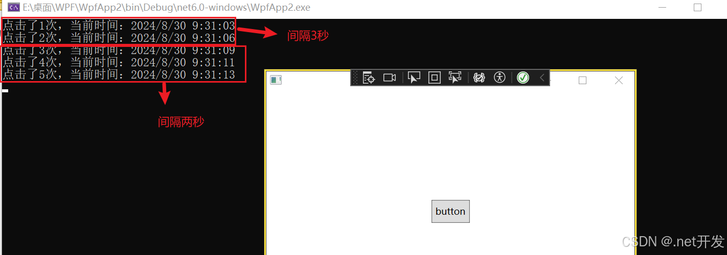
4.5 RepeatButton重复按钮
这个按钮事件是当我们按下鼠标后会一直重复执行,直到我们松开鼠标键,其中具有两个重要的属性:
- Delay:点击后隔多久开始重复执行
- Interval:重复执行函数的间隔时间
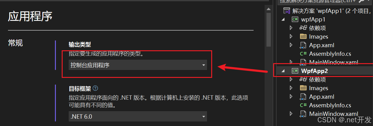
注意:想要打开控制台查看输出效果需要设置:鼠标右键点击你的解决方案,选择【属性】--> 输出类型修改为控制台应用程序
<Grid><RepeatButton Width="50" Height="30" Content="button" Click="repeatButton" Delay="3000" Interval="2000" />
</Grid>
private int total = 0;
private void repeatButton(object sender, RoutedEventArgs e)
{Console.WriteLine($"点击了{++total}次,当前时间:{DateTime.Now}");
}
4.6 Label控件
4.6.1 Label直接显示文本
当我们在Label中添加Content时,Label实际上会在内部创建一个TextBlock来显示我们的内容,但是Label会默认为其加上边距
<StackPanel><Label Content="hello" />
</StackPanel>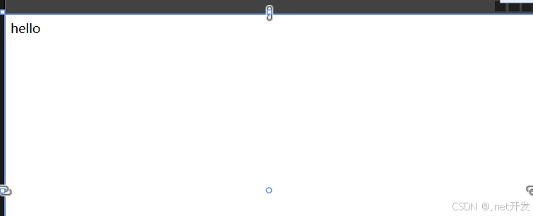
4.6.2 label和访问修饰符
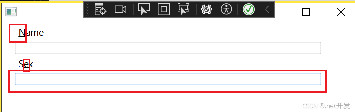
当我们设置了访问修饰符后,程序运行时我们按住【Alt】键,被我们修饰的子元符会高亮显示,通过【Alt】+"所设置的字符"可以将焦点切换到对应的Label中。
<StackPanel><!--_后面的字符就是被我们修饰的字符,可以放在任何字符的前面--><Label Margin="20,0,0,0" Content="_Name" Target="{Binding ElementName=txtName}" /><TextBox x:Name="txtName" Margin="20,0,50,0" /><Label Margin="20,0,0,0" Content="S_ex" Target="{Binding ElementName=txtSex}" /><TextBox x:Name="txtSex" Margin="20,0,50,0" />
</StackPanel>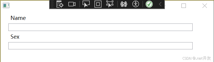
此时运行项目,点击【Alt】,会将我们修饰的字符通过下划线的方式进行显示,如果我们再按“e”,焦点会在Sex中。
4.6.3 使用控件作为Label的内容
<StackPanel><!--Binding ElementName=txtName:绑定需要被聚焦的文本框--><Label Target="{Binding ElementName=txtName}"><StackPanel Orientation="Horizontal" Margin="50,0"><Image Source="Images/csharp.png" Width="20" Height="20" /><!--AccessText才可以定义访问键--><AccessText Text="_CSharp" VerticalAlignment="Center" /></StackPanel></Label><TextBox x:Name="txtName" Margin="50,0" />
</StackPanel>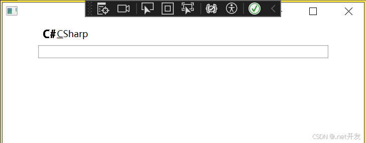
4.7 TextBox
在TextBox中具有许多的属性,下面我列举一些比较常用的
| MinLines | 最小可见行数 |
| MaxLines | 最大可见行数 |
| Text | 文本内容 |
| CharacterCasing | 是否转换成大小写 |
| VerticalScrollBarVisibility | 是否显示拉条 |
| MaxLength | 一行的最大字符长度 |
| TextAlignment | 设置文本水平方向位置 |
| VerticalContentAlignment | 设置文本垂直方向位置 |
| TextWrapping | 是否自动换行 |
4.8 PasswordBox密码框
- PasswordChar:改变密码框中内容默认显示符号
- PasswordChanged: 密码改变时执行事件
<StackPanel Margin="20"><PasswordBox />
</StackPanel>
4.9 RichTextBox富文本控件
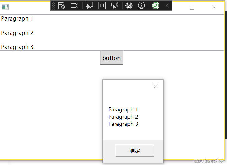
RichTextBox可用于显示,输入和操作格式文本。可以实现TextBox的全部功能外,还提供了富文本的显示功能,同时我们可以对文本内容进行编辑。
需要注意:FlowDocumentFlowDocument RichTextBoxRichTextBox唯一支持的子元素是FlowDocument RichTextBox。
<StackPanel><RichTextBox x:Name="content"><FlowDocument><Paragraph><Run>Paragraph 1</Run></Paragraph><Paragraph><Run>Paragraph 2</Run></Paragraph><Paragraph><Run>Paragraph 3</Run></Paragraph></FlowDocument></RichTextBox>
</StackPanel>
4.9.1 获取富文本内容
给RichTextBox设置Name,通过button可以获取富文本的内容
private void getContent(object sender, RoutedEventArgs e)
{// 获取文本框内容,content是我们给RichTextBox设置的NameTextRange tr = new TextRange(content.Document.ContentStart, content.Document.ContentEnd);MessageBox.Show(tr.Text);
}
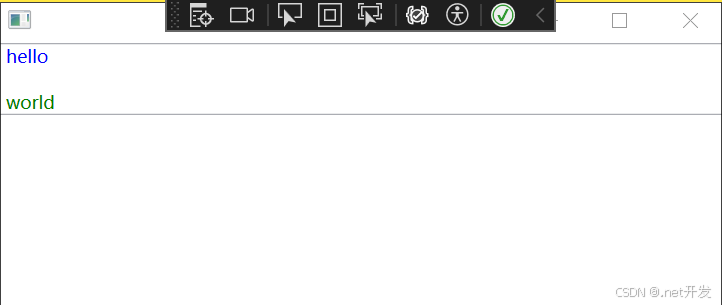
4.9.2 动态创建富文本内容
<StackPanel><RichTextBox x:Name="content"></RichTextBox>
</StackPanel>
public partial class MainWindow : Window
{public MainWindow(){InitializeComponent();// 创建FlowDocument对象FlowDocument flowDocument = new FlowDocument();content.Document = flowDocument;// 创建段落Paragraph paragraph = new Paragraph();paragraph.Foreground = Brushes.Blue;paragraph.Inlines.Add("hello");Paragraph paragraph2 = new Paragraph();paragraph2.Foreground = Brushes.Green;paragraph2.Inlines.Add("world");// 将段落添加到文档中flowDocument.Blocks.Add(paragraph);flowDocument.Blocks.Add(paragraph2);}
}
4.9.3 加载文件内容到富文本
可以设置一个Button,然后给Button绑定事件,可以实现将文件中的内容显示出来
private void Upload(object sender, RoutedEventArgs e)
{OpenFileDialog file = new OpenFileDialog();file.Filter = "Text files (*.txt)|*.txt|All files (*.*)|*.*";if (file.ShowDialog() == true){TextRange txt = new TextRange(content.Document.ContentStart, content.Document.ContentEnd);using var stream = new FileStream(file.FileName, FileMode.Open, FileAccess.Read);txt.Load(stream, DataFormats.Text);}
}
4.10 ToolTip提示工具
ToolTip可以显示所有 任何类型,比如图像,字符, 其他控件等
当我们将鼠标放在Button上时,会显示出设定好的文字“hello”
<StackPanel><Button Content="鼠标放过来" ToolTip="hello" />
</StackPanel>
4.10.1 自定义ToolTip内容
<StackPanel><Button Width="100" Content="鼠标放过来"><Button.ToolTip><StackPanel><TextBlock>hello</TextBlock><Border Width="100" Height="100"><Image Source="Images/csharp.png" /></Border></StackPanel></Button.ToolTip></Button>
</StackPanel>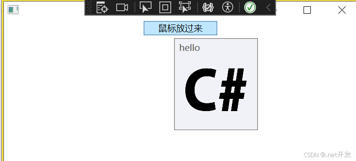
4.11 Popup弹出窗口
| AllowsTransparency | 控件是否包含透明内容 |
| PopupAnimation | 控件打开或关闭时的动画效果。None:没有效果;Fade:逐渐显示或淡出;Slide:向上向下划入;Scroll:滚动效果 |
| PlacementRectangle | 弹窗打开的位置 |
| PlacementTarget | 在那个控件身边打开 |
| StaysOpen | 默认为true,表示弹窗打开后,如果失去焦点是否继续显示 |
| IsOpen | 设置弹窗是否显示 |
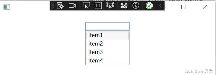
小案例如下:
<StackPanel><TextBox x:Name="Menu" Width="100" Margin="0,20" GotFocus="got" LostFocus="lost" /><Popup x:Name="myPopup" PlacementTarget="{Binding ElementName=Menu}"Width="{Binding ElementName=Menu,Path=ActualWidth}" ><ListBox x:Name="list" SelectionChanged="ListBoxSelect"><ListBoxItem Content="item1" /><ListBoxItem Content="item2" /><ListBoxItem Content="item3" /><ListBoxItem Content="item4" /></ListBox></Popup>
</StackPanel>
private void got(object sender, RoutedEventArgs e)
{myPopup.IsOpen = true;
}private void lost(object sender, RoutedEventArgs e)
{myPopup.IsOpen = false;
}private void ListBoxSelect(object sender, SelectionChangedEventArgs e)
{Menu.Text = (list.SelectedItem as ListBoxItem).Content.ToString();
}
4.12 Image图片
| Source | 图片来源 |
| StretchDirection | 图片缩放条件。 UpOnly:仅在小于父级时缩放;DownOnly:仅在大于父级时缩放;Both:兼容前两者 |
| Stretch | 图片缩放模式。 None:保持原始大小;Fill:调整内容大小以填充目标尺寸;Uniform:保持纵横比基础上缩放;UniformToFill:保持纵横比基础上缩放,还具有裁剪功能; |
4.12.1 圆形图片
<StackPanel><Ellipse Width="200" Height="200"><Ellipse.Fill><ImageBrush ImageSource="Images/csharp.png" /></Ellipse.Fill></Ellipse>
</StackPanel>
4.13 GroupBox分组容器
4.13.1 基本使用
<Grid Width="400" Margin="0,40"><!--定义行--><Grid.RowDefinitions><RowDefinition /><RowDefinition /></Grid.RowDefinitions><GroupBox Header="基本信息"><!--定义第一行内部--><Grid><Grid.RowDefinitions><RowDefinition /><RowDefinition /></Grid.RowDefinitions><Grid.ColumnDefinitions><ColumnDefinition Width="Auto" /><ColumnDefinition /></Grid.ColumnDefinitions><TextBlock Text="姓名:" VerticalAlignment="Center" Margin="2,0" /><TextBox Grid.Column="1" Width="200" Height="20" HorizontalAlignment="Left" Margin="5,0" /><TextBlock Grid.Row="1" Text="性别:" VerticalAlignment="Center" Margin="2,0" /><WrapPanel Grid.Row="1" Grid.Column="1" Width="200" Height="30" HorizontalAlignment="Left"><RadioButton Content="男" GroupName="sex" Margin="7" /><RadioButton Content="女" GroupName="sex" Margin="7" /></WrapPanel></Grid></GroupBox>
</Grid>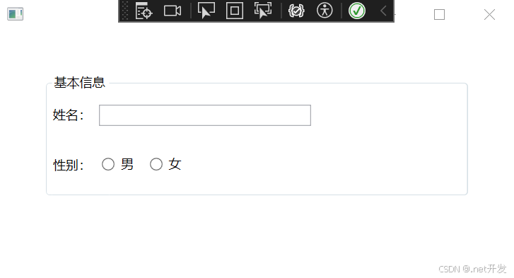
4.13.2 自定义header属性
<GroupBox.Header><StackPanel Orientation="Horizontal"><Image Source="Images/csharp.png" Width="20" /><TextBlock Text="基本信息" VerticalAlignment="Center" Margin="5,0" /></StackPanel>
</GroupBox.Header>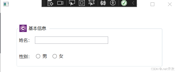
4.14 ScrollViewer 视图滚动控件
当在一个固定大小的布局格子中的内容查出格子范围时可以使用ScrollViewer;
<ScrollViewer><!--定义第一行内部--><Grid><Grid.RowDefinitions><RowDefinition Height="200" /><RowDefinition /></Grid.RowDefinitions><Grid.ColumnDefinitions><ColumnDefinition Width="Auto" /><ColumnDefinition /></Grid.ColumnDefinitions><TextBlock Text="姓名:" VerticalAlignment="Center" Margin="2,0" /><TextBox Grid.Column="1" Width="200" Height="20" HorizontalAlignment="Left" Margin="5,0" /><TextBlock Grid.Row="1" Text="性别:" VerticalAlignment="Center" Margin="2,0" /><WrapPanel Grid.Row="1" Grid.Column="1" Width="200" Height="30" HorizontalAlignment="Left"><RadioButton Content="男" GroupName="sex" Margin="7" /><RadioButton Content="女" GroupName="sex" Margin="7" /></WrapPanel></Grid>
</ScrollViewer>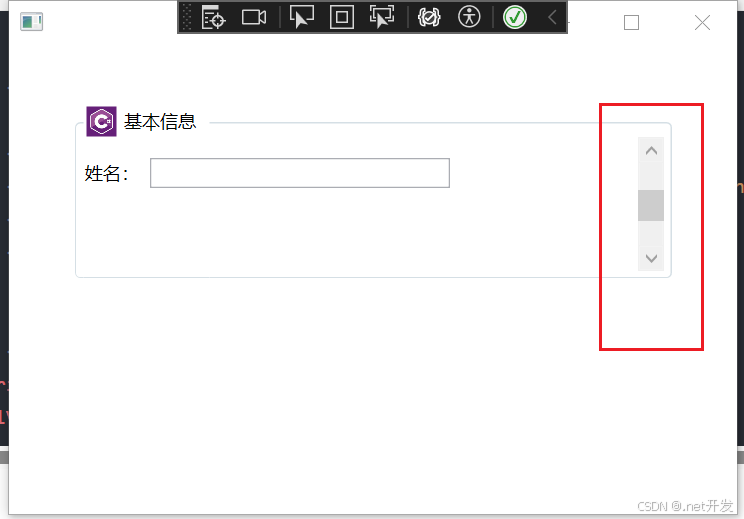
4.15 Slider 滑块
案例:通过Slider控制图片的透明度
<Grid Width="400" Margin="0,40"><Grid.RowDefinitions><RowDefinition /><RowDefinition Height="Auto" /></Grid.RowDefinitions><Image Source="Images/csharp.png" Width="200" Height="200" Opacity="{Binding ElementName=slider, Path=Value}"/><!--Value:默认透明度 Maximum:最大值--><Slider x:Name="slider" Value="0.3" Grid.Row="1" Maximum="1" />
</Grid>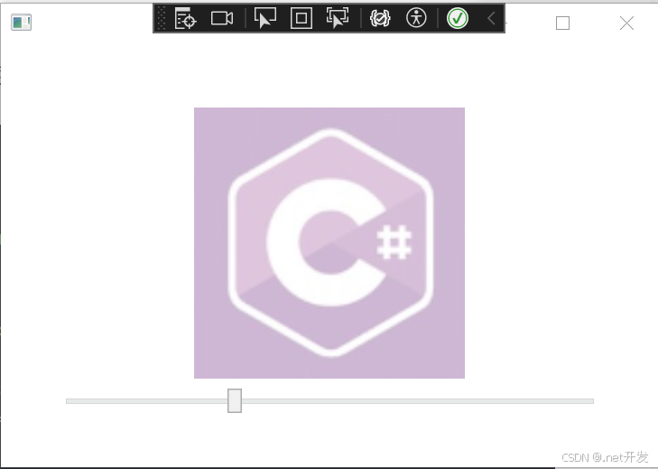
4.16 ProgressBar进度条
<StackPanel VerticalAlignment="Center"><ProgressBar x:Name="progress" Width="200" Height="10" Maximum="100" /><TextBlock x:Name="txt" VerticalAlignment="Center" HorizontalAlignment="Center">0%</TextBlock>
</StackPanel>
4.17 Calendar日历控件
4.18 DatePicker日期选择控件
这篇关于基于.NET6的WPF基础总结(上)的文章就介绍到这儿,希望我们推荐的文章对编程师们有所帮助!