本文主要是介绍RN组件库 - Button 组件,希望对大家解决编程问题提供一定的参考价值,需要的开发者们随着小编来一起学习吧!
从零构建 React Native 组件库,作为一个前端er~谁不想拥有一个自己的组件库呢
1、定义 Button 基本类型 type.ts
import type {StyleProp, TextStyle, ViewProps} from 'react-native';
import type {TouchableOpacityProps} from '../TouchableOpacity/type';
import type Loading from '../Loading';// 五种按钮类型
export type ButtonType =| 'primary'| 'success'| 'warning'| 'danger'| 'default';
// 四种按钮大小
export type ButtonSize = 'large' | 'small' | 'mini' | 'normal';
// 加载中组件类型
type LoadingProps = React.ComponentProps<typeof Loading>;
// 按钮的基本属性
// extends Pick的作用是:
// 继承父类型的属性和方法:通过extends关键字,子类型可以继承父类型的所有属性和方法。
// 选取父类型的特定属性:通过Pick工具类型,从父类型中选取需要的属性,并将其添加到子类型中。
export interface ButtonPropsextends Pick<ViewProps, 'style' | 'testID'>,Pick<TouchableOpacityProps,'onPress' | 'onLongPress' | 'onPressIn' | 'onPressOut'> {/*** 类型,可选值为 primary success warning danger* @default default*/type?: ButtonType;/*** 尺寸,可选值为 large small mini* @default normal*/size?: ButtonSize;/*** 按钮颜色,支持传入 linear-gradient 渐变色*/color?: string;/*** 左侧图标名称或自定义图标组件*/icon?: React.ReactNode;/*** 图标展示位置,可选值为 right* @default left*/iconPosition?: 'left' | 'right';/*** 是否为朴素按钮*/plain?: boolean;/*** 是否为方形按钮*/square?: boolean;/*** 是否为圆形按钮*/round?: boolean;/*** 是否禁用按钮*/disabled?: boolean;/*** 是否显示为加载状态*/loading?: boolean;/*** 加载状态提示文字*/loadingText?: string;/*** 加载图标类型*/loadingType?: LoadingProps['type'];/*** 加载图标大小*/loadingSize?: number;textStyle?: StyleProp<TextStyle>;children?: React.ReactNode;
}2、动态生成样式对象style.ts
import {StyleSheet} from 'react-native';
import type {ViewStyle, TextStyle} from 'react-native';
import type {ButtonType, ButtonSize} from './type';type Params = {type: ButtonType;size: ButtonSize;plain?: boolean;
};type Styles = {button: ViewStyle;disabled: ViewStyle;plain: ViewStyle;round: ViewStyle;square: ViewStyle;text: TextStyle;
};const createStyle = (theme: DiceUI.Theme,{type, size, plain}: Params,
): Styles => {// Record 是一种高级类型操作,用于创建一个对象类型// 其中键的类型由第一个参数指定(ButtonType),值的类型由第二个参数指定(ViewStyle)const buttonTypeStyleMaps: Record<ButtonType, ViewStyle> = {default: {backgroundColor: theme.button_default_background_color,borderColor: theme.button_default_border_color,borderStyle: 'solid',borderWidth: theme.button_border_width,},danger: {backgroundColor: theme.button_danger_background_color,borderColor: theme.button_danger_border_color,borderStyle: 'solid',borderWidth: theme.button_border_width,},primary: {backgroundColor: theme.button_primary_background_color,borderColor: theme.button_primary_border_color,borderStyle: 'solid',borderWidth: theme.button_border_width,},success: {backgroundColor: theme.button_success_background_color,borderColor: theme.button_success_border_color,borderStyle: 'solid',borderWidth: theme.button_border_width,},warning: {backgroundColor: theme.button_warning_background_color,borderColor: theme.button_warning_border_color,borderStyle: 'solid',borderWidth: theme.button_border_width,},};const buttonSizeStyleMaps: Record<ButtonSize, ViewStyle> = {normal: {},small: {height: theme.button_small_height,},large: {height: theme.button_large_height,width: '100%',},mini: {height: theme.button_mini_height,},};const contentPadding: Record<ButtonSize, ViewStyle> = {normal: {paddingHorizontal: theme.button_normal_padding_horizontal,},small: {paddingHorizontal: theme.button_small_padding_horizontal,},large: {},mini: {paddingHorizontal: theme.button_mini_padding_horizontal,},};const textSizeStyleMaps: Record<ButtonSize, TextStyle> = {normal: {fontSize: theme.button_normal_font_size,},large: {fontSize: theme.button_default_font_size,},mini: {fontSize: theme.button_mini_font_size,},small: {fontSize: theme.button_small_font_size,},};const textTypeStyleMaps: Record<ButtonType, TextStyle> = {default: {color: theme.button_default_color,},danger: {color: plain? theme.button_danger_background_color: theme.button_danger_color,},primary: {color: plain? theme.button_primary_background_color: theme.button_primary_color,},success: {color: plain? theme.button_success_background_color: theme.button_success_color,},warning: {color: plain? theme.button_warning_background_color: theme.button_warning_color,},};return StyleSheet.create<Styles>({button: {alignItems: 'center',borderRadius: theme.button_border_radius,flexDirection: 'row',height: theme.button_default_height,justifyContent: 'center',overflow: 'hidden',position: 'relative',...buttonTypeStyleMaps[type],...buttonSizeStyleMaps[size],...contentPadding[size],},disabled: {opacity: theme.button_disabled_opacity,},plain: {backgroundColor: theme.button_plain_background_color,},round: {borderRadius: theme.button_round_border_radius,},square: {borderRadius: 0,},text: {...textTypeStyleMaps[type],...textSizeStyleMaps[size],},});
};export default createStyle;
3、实现 Button 组件
import React, {FC, memo} from 'react';
import {View, ViewStyle, StyleSheet, Text, TextStyle} from 'react-native';
import TouchableOpacity from '../TouchableOpacity';
import {useThemeFactory} from '../Theme';
import Loading from '../Loading';
import createStyle from './style';
import type {ButtonProps} from './type';const Button: FC<ButtonProps> = memo(props => {const {type = 'default',size = 'normal',loading,loadingText,loadingType,loadingSize,icon,iconPosition = 'left',color,plain,square,round,disabled,textStyle,children,// 对象的解构操作,在末尾使用...会将剩余的属性都收集到 rest 对象中。...rest} = props;// useThemeFactory 调用 createStyle 函数根据入参动态生成一个 StyleSheet.create<Styles> 对象const {styles} = useThemeFactory(createStyle, {type, size, plain});const text = loading ? loadingText : children;// 将属性合并到一个新的样式对象中,并返回这个新的样式对象。const textFlattenStyle = StyleSheet.flatten<TextStyle>([styles.text,!!color && {color: plain ? color : 'white'},textStyle,]);// 渲染图标const renderIcon = () => {const defaultIconSize = textFlattenStyle.fontSize;const iconColor = color ?? (textFlattenStyle.color as string);let marginStyles: ViewStyle;if (!text) {marginStyles = {};} else if (iconPosition === 'left') {marginStyles = {marginRight: 4};} else {marginStyles = {marginLeft: 4};}return (<>{icon && loading !== true && (<View style={marginStyles}>{/* React 提供的一个顶层 API,用于检查某个值是否为 React 元素 */}{React.isValidElement(icon)? React.cloneElement(icon as React.ReactElement<any, string>, {size: defaultIconSize,color: iconColor,}): icon}</View>)}{loading && (<Loading// ?? 可选链操作符,如果 loadingSize 为 null 或 undefined ,就使用 defaultIconSize 作为默认值size={loadingSize ?? defaultIconSize}type={loadingType}color={iconColor}style={marginStyles}/>)}</>);};// 渲染文本const renderText = () => {if (!text) {return null;}return (<Text selectable={false} numberOfLines={1} style={textFlattenStyle}>{text}</Text>);};return (<TouchableOpacity{...rest}disabled={disabled}activeOpacity={0.6}style={[styles.button,props.style,plain && styles.plain,round && styles.round,square && styles.square,disabled && styles.disabled,// !!是一种类型转换的方法,它可以将一个值转换为布尔类型的true或false!!color && {borderColor: color},!!color && !plain && {backgroundColor: color},]}>{iconPosition === 'left' && renderIcon()}{renderText()}{iconPosition === 'right' && renderIcon()}</TouchableOpacity>);
});export default Button;
4、对外导出 Botton 组件及其类型文件
import Button from './Button';export default Button;
export {Button};
export type {ButtonProps, ButtonSize, ButtonType} from './type';
5、主题样式
动态生成样式对象调用函数
import {useMemo} from 'react';
import {createTheming} from '@callstack/react-theme-provider';
import type {StyleSheet} from 'react-native';
import {defaultTheme} from '../styles';
// 创建主题对象:调用 createTheming 函数并传入一个默认主题作为参数
export const {ThemeProvider, withTheme, useTheme} = createTheming<DiceUI.Theme>(defaultTheme as DiceUI.Theme,
);type ThemeFactoryCallBack<T extends StyleSheet.NamedStyles<T>> = {styles: T;theme: DiceUI.Theme;
};export function useThemeFactory<T extends StyleSheet.NamedStyles<T>, P>(fun: (theme: DiceUI.Theme, ...extra: P[]) => T,...params: P[]
): ThemeFactoryCallBack<T> {// 钩子,用于在函数组件中获取当前的主题const theme = useTheme();const styles = useMemo(() => fun(theme, ...params), [fun, theme, params]);return {styles, theme};
}export default {ThemeProvider,withTheme,useTheme,useThemeFactory,
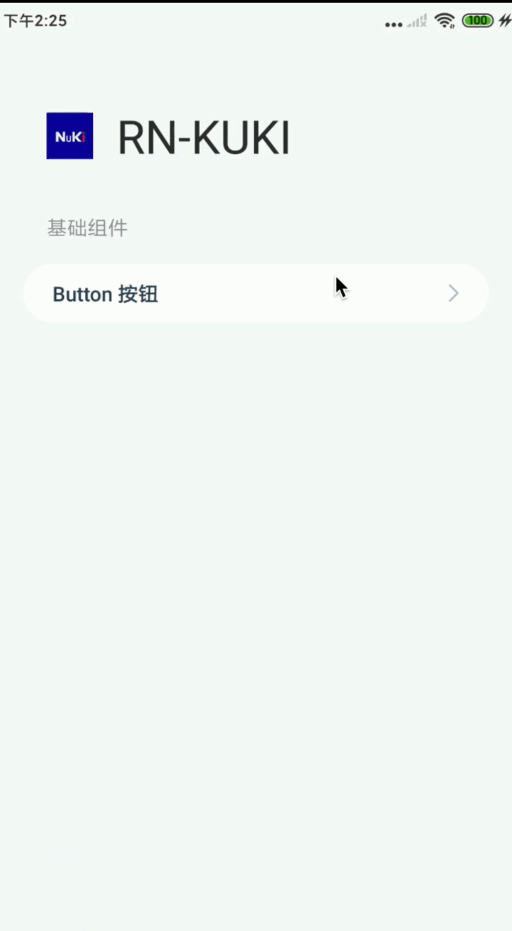
};6、Demo 演示
这篇关于RN组件库 - Button 组件的文章就介绍到这儿,希望我们推荐的文章对编程师们有所帮助!