本文主要是介绍pandas库中数据结构DataFrame的绘制函数,希望对大家解决编程问题提供一定的参考价值,需要的开发者们随着小编来一起学习吧!
在使用Canopy进行数据分析时,我们会用到pandas库,通过它我们可以灵活的对数据进行处理、转换和绘图等操作。其中非常重要的数据结构就是DataFrame。
本文主要整理一下对DataFrame对象进行plot操作的使用说明。
函数名称:
pandas.DataFrame.plot
函数参数列表及缺省值:
DataFrame.plot(data, x=None, y=None, kind=’line’, ax=None, subplots=False, sharex=True, sharey=False, layout=None, figsize=None, use_index=True, title=None, grid=None, legend=True, style=None, logx=False, logy=False, loglog=False, xticks=None, yticks=None, xlim=None, ylim=None, rot=None, fontsize=None, colormap=None, table=False, yerr=None, xerr=None, secondary_y=False, sort_columns=False, **kwds)
Make plots of DataFrame using matplotlib / pylab.
相关参数说明:
Parameters :
data : DataFrame
# 需要绘制的数据对象
x : label or position, default None
# x轴的标签值,缺省值是 None
y : label or position, default None
Allows plotting of one column versus another
# y轴的标签值,缺省值是 None
kind : str
‘line’ : line plot (default)
‘bar’ : vertical bar plot
‘barh’ : horizontal bar plot
‘hist’ : histogram
‘box’ : boxplot
‘kde’ : Kernel Density Estimation plot
‘density’ : same as ‘kde’
‘area’ : area plot
‘pie’ : pie plot
‘scatter’ : scatter plot
‘hexbin’ : hexbin plot
# 标识绘制方式的字符串,缺省值是 ‘line’
ax : matplotlib axes object, default None
# 当使用到subplots绘图时,会得到包含子图对象的参数,
再完善子图内容时需要指定该参数,缺省值是 None [可参照后面示例1]
subplots : boolean, default False
Make separate subplots for each column
# 所绘制对象数据 data 是否需要分成不同的子图, 缺省值是 False [可参照后面示例2]
sharex : boolean, default True
In case subplots=True, share x axis
# 当参数subplots 为 True时,该值表示各子图是否共享x轴标签值,缺省值是 True
sharey : boolean, default False
In case subplots=True, share y axis
# 当参数subplots 为 True时,该值表示各子图是否共享x轴标签值,缺省值为 True
layout : tuple (optional)
(rows, columns) for the layout of subplots
figsize : a tuple (width, height) in inches
use_index : boolean, default True
Use index as ticks for x axis
title : string
# 图的标题
Title to use for the plot
grid : boolean, default None (matlab style default)
Axis grid lines
# 是否需要显示网格,缺省值是 None[需要留意的是,在Canopy中默认是显示网格的]
legend : False/True/’reverse’
Place legend on axis subplots
# 添加子图的图例,缺省值是True
style : list or dict
matplotlib line style per column
# 设置绘制线条格式,仅当参数kind 设置为 ‘line’ [可参照后面示例3]
logx : boolean, default False
Use log scaling on x axis
# 将x轴设置成对数坐标,缺省值是False
logy : boolean, default False
Use log scaling on y axis
# 将y轴设置成对数坐标,缺省值是False
loglog : boolean, default False
Use log scaling on both x and y axes
# 将x轴、y轴都设置成对数坐标,缺省值是False
xticks : sequence
Values to use for the xticks
# 指定 x轴标签的取值范围(或步长)
yticks : sequence
Values to use for the yticks
# 指定 y轴标签的取值范围(或步长)
xlim : 2-tuple/list
ylim : 2-tuple/list
rot : int, default None
Rotation for ticks (xticks for vertical,
yticks for horizontal plots)
fontsize : int, default None
Font size for xticks and yticks
# 字体大小,缺省值是 None
colormap : str or matplotlib colormap object,
default None
Colormap to select colors from. If string,
load colormap with that name from matplotlib.
# 指定具体颜色取值或对应对象名称,缺省值是 None
colorbar : boolean, optional
If True, plot colorbar (only relevant for
‘scatter’ and ‘hexbin’ plots)
# 是否显示颜色条,如果设为 True,则仅当参数kind 设置为 ‘scatter’、 ‘hexbin’时有效
position : float
Specify relative alignments for bar plot layout.
From 0 (left/bottom-end) to 1 (right/top-end).
Default is 0.5 (center)
layout : tuple (optional)
(rows, columns) for the layout of the plot
table : boolean, Series or DataFrame, default False
If True, draw a table using the data in the
DataFrame and the data will be transposed to meet
matplotlib’s default layout. If a Series or
DataFrame is passed, use passed data to draw a table.
yerr : DataFrame, Series, array-like, dict and str
See Plotting with Error Bars for detail.
xerr : same types as yerr.
stacked : boolean, default False in line and
bar plots, and True in area plot.
If True, create stacked plot.
# 参数kind 设置为 ‘line’、’bar’时,该值默认为False,
# 参数 kind 设置为’area’时,该值默认为True
# 当该参数设置为True时,生成对应的堆积图
sort_columns : boolean, default False
Sort column names to determine plot ordering
secondary_y : boolean or sequence, default False
Whether to plot on the secondary y-axis If a list/tuple,
which columns to plot on secondary y-axis
mark_right : boolean, default True
When using a secondary_y axis, automatically mark the
column labels with “(right)” in the legend
kwds : keywords
Options to pass to matplotlib plotting method
Returns : axes : matplotlib.AxesSubplot or np.array of them
示例:
示例1:
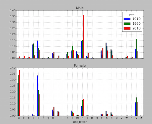
参照《Python 数据分析(三)[MAC]》中第7个分析任务—男孩女孩名字中各个末字母的比例
1 | <pre>### 7. count the sum of each last letter of names of diferent 'sex' in each year |
2 | get_last_letter = lambda x: x[-1] |
3 | last_letters = names.name.map(get_last_letter) |
4 | last_letters.name = 'last_letter' |
5 | table = names.pivot_table('births', rows=last_letters, cols=['sex', 'year'], aggfunc=sum) |
6 | subtable = table.reindex(columns=[1910, 1960, 2010], level='year') |
7 | letter_prop = subtable / subtable.sum().astype(float) |
8 | import matplotlib.pyplot as plt |
9 | fig, axes = plt.subplots(2, 1, figsize=(10, 8)) |
10 | letter_prop['M'].plot(kind='bar', rot=0, ax=axes[0], title='Male') |
11 | letter_prop['F'].plot(kind='bar', rot=0, ax=axes[1], title='Female', legend=False) |
说明:
先调用plt(matplotlib.pyplot)绘制两个空白子图,再通过对应数据对象(letter_prop[‘M’]、letter_prop[‘F’])依次绘制不同的子图,这时调用plot函数时就需要设置ax参数,让其指定到待显示的子图对象。对应绘制结果如下。
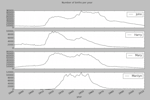
示例2:
参照《Python 数据分析(三)[MAC]》中第4个分析任务—获取’John’、’Harry’、’Mary’、’Marilyn’随时间变化的使用数量
1 | ### 4. get the sum of names['John', 'Harry', 'Mary', 'Marilyn'] of diferent 'sex' in each year |
2 | subset = total_births[['John', 'Harry', 'Mary', 'Marilyn']] |
3 | subset.plot(subplots=True, figsize=(12, 10), grid=False, title="Number of births per year", xticks=range(1880, 2020, 10)) |
说明:
先获取含有不同子图所涉及的数据对象subset,再在调用plot时,设置参数 subplots = True。对应绘制结果如下。
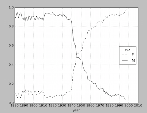
示例3:
参照《Python 数据分析(三)[MAC]》中第4个分析任务—各年度使用包含’lesl’名字的男女比例
1 | ### 9. count the ratio of names[contain 'lesl'] of diferent 'sex' in each year |
2 | all_names = top1000.name.unique() |
3 | mask = np.array(['lesl' in x.lower() for x in all_names]) |
4 | lesley_like = all_names[mask] |
5 | filtered = top1000[top1000.name.isin(lesley_like)] |
6 | filtered.groupby('name').births.sum() |
7 | table = filtered.pivot_table('births', rows='year', cols='sex', aggfunc='sum') |
8 | table = table.div(table.sum(1), axis=0) |
9 | table.plot(style={'M':'k-','F': 'k--'}, xticks=range(1880, 2020, 10)) |
说明:
对同一个图形中的两条直线使用不同的图形,style={‘M':’k-‘,’F': ‘k–‘}。对应绘制结果如下。
这篇关于pandas库中数据结构DataFrame的绘制函数的文章就介绍到这儿,希望我们推荐的文章对编程师们有所帮助!